

On the Wall

Bathroom Wallpaper in Real Homes — Our Customers Prove It Works
Can you wallpaper a bathroom? It is the question we hear more than any other. The concern is always the same: humidity, steam, water splashes — will the wallpaper survive? The answer, as these eleven real bathrooms prove, is yes. Our customers have wallpapered powder rooms, ensuites, family bathrooms, and spa-style spaces. Some of these installations are years old. They are holding up, they look considered, and they transformed rooms that most people treat as an afterthought into the most interesting spaces in the house. The truth about bathroom wallpaper is that it works when two things are right: the substrate and the ventilation. Our Paste the Wall Smooth substrate is water and humidity resistant — it is designed for rooms that get wet. Pair that with a functioning exhaust fan or an openable window, and wallpaper performs in a bathroom the same way it performs anywhere else. These customers understood that, committed to it, and the results speak for themselves. Why Wallpaper Works in a Bathroom A bathroom is typically the smallest room in a house with the least natural light and the most hard surfaces. Tile, glass, chrome, porcelain — every surface is cold, smooth, and reflective. Wallpaper introduces the one thing every bathroom is missing: warmth and texture. A botanical pattern behind a freestanding tub turns a functional wet room into a retreat. A damask on the vanity wall turns a builder-grade bathroom into something with character. The design principle at work is contrast. Hard against soft. Smooth tile against textured pattern. Cold chrome against warm botanical. When you introduce wallpaper into a room dominated by hard surfaces, the contrast creates visual interest that tile alone never achieves. These customers understood that intuitively. Real Bathrooms, Real Decisions The Spa Retreat Botanical leaves in sage green and grey-blue on cream, behind a freestanding white soaking tub. This is the image people picture when they imagine bathroom wallpaper done right. The frosted glass window above lets light through without compromising privacy. The black matte wall-mounted faucet and warm timber cabinetry ground the room with materials that complement the organic pattern. Notice the restraint: the wallpaper is on one wall only, behind the tub. The remaining walls are clean white. The tub is the centrepiece, the wallpaper is the backdrop, and together they create a room that feels like a day spa rather than a bathroom. The Mountain Mural A panoramic misty mountain landscape behind a freestanding tub — fog rolling through layered valleys, soft greens fading to cream. This is wallpaper as immersion. When you are lying in this tub, you are looking at a view. Not a pattern on a wall, but a scene that creates depth and distance in a room that might otherwise feel enclosed. The muted earth tones and sage greens keep the room calm. Chrome fixtures and a metal shelving unit maintain the functional edge. This is the kind of installation that makes guests ask whether the mural is hand-painted. It is not — it is manufactured to this wall's exact measurements. The Luxury Ensuite Ornate damask in sage green and cream in a luxury master bathroom — marble countertops, dark timber vanity, brass fixtures, glass pendant lights. This customer paired a traditional wallpaper pattern with traditional materials and the result is a bathroom that feels like it belongs in a boutique hotel. The wallpaper covers the wall above the vanity, where the marble backsplash ends. The sage green in the pattern picks up the grey-green veining in the marble. That kind of colour connection — wallpaper echoing the tones in your stone — is what makes a room feel designed rather than decorated. The Powder Room Powder rooms are where you can take the biggest risks. They are small, they are visited briefly, and they are the one room where guests expect to be surprised. A botanical leaf pattern behind the toilet in muted blue-grey on cream transforms a functional space into a moment of considered design. A toile de jouy with wildlife illustrations in taupe on cream paired with a contrasting lime green accent wall shows a customer with real confidence — mixing traditional pattern with a bold colour hit. Both of these powder rooms prove the same point: the smaller the room, the bigger the impact wallpaper makes. What These Bathrooms Teach Us Across eleven bathrooms — from compact powder rooms to full spa ensuites — the same principles hold: The tub wall or the vanity wall. Every customer here chose one of these two walls. They are the natural focal points in a bathroom — the wall you face when you are soaking, or the wall you face when you are getting ready. Either one works. Both at once would overwhelm a small space. Muted tones outperform bold tones in wet rooms. Sage, cream, grey-blue, taupe — these customers gravitated toward softer palettes. Bold patterns work in a powder room you visit for thirty seconds. In a bathroom where you spend time, softer tones create the calm you actually want. Natural patterns suit wet rooms. Botanicals, landscapes, organic motifs — these feel at home near water. Geometric or abstract patterns can work, but nature-inspired designs have an inherent logic in a room where water is the dominant element. Hard fixtures need soft walls. Every bathroom here has tile, chrome, glass, or marble. The wallpaper provides the counterpoint. Without it, these rooms would be entirely hard surfaces. With it, they have warmth. The Substrate That Matters For bathrooms, we recommend our Paste the Wall Smooth substrate. It is water and humidity resistant, softly matte in finish, and designed for rooms that generate steam. Proper ventilation — an exhaust fan or openable window — is essential. With both in place, bathroom wallpaper performs as well as any other room in the house. Order a $4.99 sample (48cm x 40cm) and test it in your bathroom for a week. Hold it near the shower zone, run a few hot baths, and check how it responds to steam. Our samples are large enough to give you genuine confidence before you commit. Browse our bathroom wallpaper guide for detailed advice on substrate selection, ventilation, and installation. Explore our full wallpaper collection or see more real installations in our journal.
Learn more
Grasscloth Wallpaper in Real Homes — What Natural Fibre Looks Like Installed
Grasscloth wallpaper is the format that most often surprises people who see it installed for the first time. The photographs do not fully prepare you. In a photograph, grasscloth looks like a textured surface — interesting, warm, natural. In person, it is something else: a material that changes with every movement through the room, that catches directional light in ways that make the wall seem alive, that brings a physical warmth to the space that no printed pattern can replicate. It is the wallpaper format with the most sensory presence, and it is also the most technically demanding to specify, purchase, and install correctly. Grasscloth is exactly what the name suggests: natural grass fibres — seagrass, jute, sisal, abaca, or various blends — woven into a flat textile and bonded to a paper backing. The weave is typically open, allowing light to pass through the surface partially and creating the play of shadow that makes grasscloth so distinctive on the wall. Because the fibres are natural — grown, harvested, and processed without the uniformity that synthetic manufacturing produces — no two panels of grasscloth are identical. The colour varies panel by panel, the weave density varies, the texture varies. This is not a defect. It is the defining characteristic of the material, and it is the quality that makes grasscloth installations look handmade and genuinely considered in a way that printed wallpaper rarely achieves. We have manufactured and supplied grasscloth installations across Australia, the United Kingdom, the United States, and internationally for more than a decade from our Central Coast facility. The technical guidance in this article is drawn from that experience and from the feedback of the professional wallpaper hangers who install our products across these markets. What Grasscloth Is — And Is Not The term "grasscloth" is sometimes used loosely to describe any wallpaper with a textured, natural-looking appearance. For the purposes of this guide, we are talking specifically about genuinely woven natural fibre wallpaper — not embossed or printed facsimiles of grasscloth texture. The distinction matters because the visual quality, the installation requirements, and the in-use performance of genuine natural fibre grasscloth are meaningfully different from printed alternatives. Genuine grasscloth has the following characteristics that printed grasscloth-effect wallpaper does not: Panel-to-panel colour and texture variation (the defining quality) Light transmits through the surface in a way that creates glow rather than reflection The weave is three-dimensional — it has actual depth and casts actual shadow It cannot be cleaned with water — any moisture application will mark it permanently Seams are visible — this is inherent to the material and expected in professional installations The Natural Variation: Understanding Why It Is a Feature The panel-to-panel variation in grasscloth is the source of its most common misunderstanding. Customers who are not prepared for it experience their installation as inconsistent. Customers who understand it experience it as exactly what gives a grasscloth wall its character. Natural variation in grasscloth occurs because the fibres are agricultural products, harvested from living plants in conditions that vary seasonally and regionally. Even within a single harvest, the colour of the fibre varies based on the age of the plant, the part of the stalk used, and the dyeing process. When these panels are hung on a wall in sequence, the variation creates a pattern of its own — a horizontal banding effect that mirrors the landscape from which the material came. To minimise the visual impact of panel variation, professional installers alternate the orientation of panels when hanging — rotating every second panel 180 degrees. This distributes the colour variation more evenly across the wall rather than creating consistent top-to-bottom bands. It is a standard technique that all experienced grasscloth installers use, and it is essential to discuss with your installer before the job begins. How Light Interacts with Grasscloth Throughout the Day The most compelling quality of grasscloth, and the quality that is least visible in product photography, is how it responds to changing light. In the morning, with low-angle directional light from the east, a grasscloth wall casts subtle horizontal shadows from the weave that give the surface a strong three-dimensional quality. At midday, with diffused overhead light, the surface reads more evenly. In the afternoon, with warm directional light, the fibres catch the light individually, creating a luminous, almost golden quality. In the evening, with warm artificial light, grasscloth glows rather than reflects — a quality that is deeply flattering in dining rooms and living spaces where evening ambiance matters. Where Grasscloth Works — And Where It Does Not Ideal rooms: living rooms, dining rooms, studies, bedrooms. Spaces with moderate, consistent ambient humidity that are used and appreciated in varying lighting conditions throughout the day. Grasscloth performs best in spaces where you will notice and appreciate its light-responsive quality. Not suitable: bathrooms, kitchens, or any room with high humidity. Moisture is the enemy of natural fibre wallpaper. Any room where steam, condensation, or consistent high humidity is present will cause the fibres to swell, the paper backing to distort, and the seams to fail. This is not a product quality issue — it is inherent to the material. Do not install grasscloth in a bathroom, regardless of the ventilation quality. Installation: Professional Is Required Grasscloth is not a DIY installation. Professional installation by an experienced wallpaper hanger with specific grasscloth experience is strongly recommended and, for most installations over a small feature wall, essentially required. The reasons are technical: The paste-the-wall method is the only appropriate installation technique — paste is applied to the wall, not to the paper, and the panel is positioned and smoothed while the paste is wet. Panel alternation (rotating every second panel) requires a systematic approach that is difficult to maintain consistently without experience. Seam management requires skill — grasscloth seams will always be visible, but the goal is to make them look deliberate rather than accidental. Any paste that contacts the face of the grasscloth must be removed immediately with a barely damp cloth — paste residue left to dry on natural fibre is very difficult to remove without damaging the surface. Care and Maintenance Grasscloth maintenance is minimal but non-negotiable: dry dusting only. Use a soft brush attachment on a vacuum cleaner or a clean, dry cloth. Never apply moisture of any kind to the surface — water, cleaning solutions, or damp cloths will mark natural fibre permanently. Remove dust regularly to prevent it from becoming embedded in the open weave. Keep the room well-ventilated to prevent ambient humidity from accumulating in the fibres over time. Materials Timber: Light oak, ash, and bamboo sit naturally with grasscloth's organic, natural quality. Dark timbers can work but require careful balance — the combination of dark timber and grasscloth can read as heavy if not counterbalanced with light textiles and finishes. Stone: Unpolished stone, honed travertine, and rough-sawn sandstone share grasscloth's commitment to natural material authenticity. Highly polished stone creates a contrast that can feel deliberate and sophisticated or disconnected and contradictory, depending on the execution. Metals: Brushed brass and aged bronze — metals with warmth and patina — suit grasscloth's natural palette. Polished chrome and nickel can work in contemporary interpretations but require care. Fabrics: Boucle, rough linen, and woven cotton in cream and oat create the tactile richness that makes a grasscloth room feel layered and considered. Mix textures deliberately and generously. Designer Tips Order the $4.99 sample (48cm x 40cm) and apply it to your wall to see the actual material in your specific light before ordering. Hold it up in the morning, at midday, and in the evening — the difference will be significant. This is the most important thing you can do before committing to a grasscloth installation. Have a clear conversation with your installer about panel alternation before work begins. Ask specifically how they will manage the seams and what their approach to colour variation is. An experienced grasscloth installer will have specific answers to these questions. Our grasscloth is custom sized to your exact wall dimensions at our Central Coast NSW facility. Production takes 4 business days. We ship globally with all wallpaper import duties covered. See our paste-the-wall guide for installation reference. Browse our grasscloth wallpaper collection, explore the full wallpaper range, or read our guide to wallpaper types to understand the full spectrum of substrate options.
Learn more
Boys Bedroom Wallpaper — A Real Customer Room
Designing a boys bedroom is one of the more interesting challenges in residential interiors. The room needs to work for a child who is growing, changing interests every eighteen months, and spending more time in their space than any other room in the house. Get it right and you create a room that adapts with them. Get it wrong and you are redecorating in two years. These are real bedrooms from our customers — not styled shoots, not AI mockups. Real families who chose wallpaper and art to create rooms their boys actually want to spend time in. What stands out across all four is something worth noting: not one of them went for the obvious cartoon character route. They chose designs with enough sophistication to last, but enough personality to feel like it belongs to a child. Why Wallpaper Works in a Boys Room Paint is the safe choice for kids rooms. It is easy to touch up, inexpensive, and nobody thinks twice about it. But paint gives you colour and nothing else. Wallpaper gives you texture, pattern, depth, and a focal point that anchors the entire room — and that matters more in a small bedroom than anywhere else in the house. A feature wall behind the bed does what a headboard alone cannot. It creates a visual anchor that draws the eye, establishes the room's personality, and gives everything else in the space something to relate to. The bed, the bedside table, the lamp — they all feel more intentional when they are sitting in front of a wall that has been considered. Four Approaches That Work The Geometric Statement This room uses a geometric 3D cube pattern in teal and cream — an optical illusion that gives the wall real depth and movement. The wallpaper covers the upper portion of the wall with a solid teal below, creating a half wall effect that grounds the space. What makes this work is restraint everywhere else: a grey upholstered headboard, white bedding with simple stripes, and a brushed nickel reading lamp. The wallpaper is doing all the heavy lifting, and the rest of the room is letting it. This is the kind of pattern that suits a teenager who has outgrown dinosaurs but is not ready for a completely adult space. The geometric reads as grown-up and considered, but the teal keeps it youthful. It will carry them from thirteen through to leaving home. The Safari Mural A full wall mural in grayscale — giraffes, monkeys, palm trees, all rendered in detailed line work rather than cartoon illustration. This is the difference between a wallpaper that lasts two years and one that lasts ten. The monochromatic palette means it works with any bedding, any accessories, any rug the child chooses as their taste evolves. The only thing that stays constant is the mural, and because it is drawn in this naturalistic, almost engraved style, it never reads as juvenile. The wooden four-poster canopy bed with cream linen drapes turns the sleeping area into a den — which is exactly what a child wants their bed to feel like. Notice how the warm timber and cream linen against the cool grey wallpaper creates balance without any effort. Warm materials next to cool patterns. That is a fundamental interior design principle these customers have nailed instinctively. The Coastal Wave Blue and white waves behind a built-in desk — this customer has wallpapered the study wall rather than the bed wall, and it works. The wave pattern sits behind where their child does homework, reads, and daydreams. Navy and white striped bedding picks up the colours without competing. Plantation shutters keep it clean. The entire room follows a 60-30-10 rule without trying: 60% white (walls, ceiling, furniture), 30% navy (wallpaper, bedding), 10% warm timber and cream accents. This is a room for a child who lives near the coast — or wishes they did. The nautical theme is executed with enough sophistication that it reads as "coastal interior" rather than "pirate bedroom." That distinction matters once they hit double digits. The Terrazzo Terrazzo wallpaper — colourful stone chips scattered across a white base. This is one of those patterns that works at every age because it is abstract enough to never date and playful enough to suit a child. The blue gingham bedding and sheer white canopy keep the room feeling soft and inviting, while the terrazzo adds just enough visual texture to make the walls interesting without overwhelming a small space. What this customer has done well is colour coordination. The teal and blue tones in the terrazzo chips are picked up in the bedding, the neon sign adds a personal touch, and the light timber and cream palette keeps everything feeling airy. In a small room, this kind of subtle pattern works harder than a bold mural — it adds interest without closing the walls in. Choosing Wallpaper That Grows With Them The common thread across these four rooms is longevity. None of these wallpapers will need replacing in two years because none of them rely on a specific age or interest to work. A geometric pattern, a naturalistic mural, an ocean wave, a terrazzo — these are design choices, not theme choices. They create atmosphere rather than reference a character or franchise. When choosing wallpaper for a boys room, consider these principles: Pattern over theme. A wave pattern outlasts a specific surf brand. A jungle mural outlasts a specific cartoon. Choose the essence of what they love, not the branding. Neutral undertones give you flexibility. Grayscale, navy, teal, and warm neutrals all pair with whatever bedding, rug, or accessories they choose next. One feature wall is enough. Every room shown here uses wallpaper on one wall — the rest is painted. This gives the room personality without making it feel heavy or difficult to change later. Scale matters. A large mural suits a larger wall. A smaller repeat pattern suits a compact room. Order a $4.99 sample (48cm x 40cm) and hold it against the wall to check the scale before committing. The Practical Details All of our wallpaper is manufactured to your wall measurements — panels numbered in sequence, ready to install. For a boys bedroom, we recommend our Paste the Wall Smooth substrate for a long-lasting, durable finish. If you are in a rental or want the option to change later, our Peel and Stick substrate removes cleanly without damaging walls. Every wallpaper design can be colour-customised at no extra cost. If you love the safari mural but want it in soft green instead of grey, or the geometric in navy instead of teal — our team will adjust it for you. Browse our full wallpaper collection, explore kids wallpaper, or start with a removable wallpaper guide if this is your first project. More real customer rooms in our journal.
Learn more
Girls Bedroom Wallpaper — Real Rooms Styled by Our Customers
A girl's bedroom is one of the most frequently redesigned spaces in any home. Children's tastes evolve rapidly, and the bedroom that felt perfectly calibrated at three years old looks completely wrong at eight, and entirely different again at thirteen. The wallpaper decision in a girl's bedroom is therefore more consequential than in most other rooms — choose a design that is too character-specific or too trend-dependent, and it will look outdated within a few years, demanding an expensive and disruptive update. Choose a design that understands the room's longevity requirements, and it will serve the space well from nursery through adolescence. At Olive et Oriel, we manufacture wallpaper for girls' bedrooms from our Central Coast of New South Wales facility, shipping to homes across Australia, New Zealand, the United Kingdom, the United States, and more than forty other countries. Over more than a decade, we have watched the pattern choices that stand the test of time and those that date quickly. The guidance in this article is drawn from that experience, with particular attention to the design principles that produce rooms that feel genuinely personal rather than generically pink. Age-Appropriate Design: From Nursery to Teen 0–3: The nursery. In a nursery, the wallpaper serves the parents as much as the child. Infants do not have aesthetic preferences, but the adults who spend hours feeding, settling, and caring for the baby in this room are acutely aware of the visual environment. Soft, warm botanical prints, gentle abstract patterns, and muted-palette landscapes create the calm that supports the physical and emotional demands of early parenthood. Avoid high-contrast patterns (which can over-stimulate), character-licensed designs (which date immediately), and anything with text. The nursery wallpaper collections include the most carefully curated options for this stage. See our nursery wallpaper range. 3–8: The play years. This is the age where character and trend-licensed designs are at their most appealing — and at their most risky as a wallpaper investment. A four-year-old in love with a particular character franchise may be completely uninterested in that franchise by age six. Wallpaper, unlike bedding or accessories, is not easily replaced. Pattern families — botanical prints that use playful interpretations of flowers and leaves, geometric prints in child-friendly scales, abstract prints with a sense of movement and life — last through this stage far more reliably than any character-specific design. 8–12: The transitional years. This is the most design-complex stage. Children in this age range are developing genuine aesthetic opinions that are distinct from their parents' preferences, but they are often not yet able to articulate what they actually want. The wallpaper that works best at this stage is one that has sufficient visual interest to feel engaging but sufficient restraint to allow the room to be personalised through the accessories, art, and objects that the child curates themselves. A soft geometric or abstract botanical in a palette the child has genuine input in choosing creates the foundation for a room they will feel genuinely inhabits. Teen: Identity and expression. Teenage bedrooms are identity statements. The wallpaper should reflect a genuine design point of view — bolder pattern, more specific palette, more considered aesthetic direction. At this stage, it is worth having a genuine conversation with the teenager about what they actually want rather than what you think they should want. The rooms that function best for teenagers are those where they had meaningful input in the design decisions. Colour Psychology for Girls' Spaces The default assumption that girls' bedrooms should be pink is both limiting and inaccurate in design terms. The question is not whether to use pink but what kind of pink — and at what saturation. Bright, highly saturated pink is stimulating and high-energy. It is appropriate for play spaces but problematic in a bedroom where the goal is rest and sleep. Dusty rose, soft blush, and muted mauve — pink at reduced saturation with grey or beige undertones — create the warmth and femininity that many girls and parents want without the sleep-disrupting stimulation of high-saturation pink. The same principle applies to purple: lilac and dusty violet are liveable over many years; bright purple is not. Sage green, warm cream, dusty blue, and warm terracotta are all colours that read as personal and considered in girls' bedrooms without defaulting to the pink-and-purple convention. They photograph beautifully and create rooms that feel genuinely designed rather than generically gendered. Feature Wall vs. Full Room In girls' bedrooms, particularly at the younger end of the age range, the feature wall approach is almost always the better choice. A single wallpapered wall — typically the wall behind the bed — creates the most impact with the least risk. If the child's tastes change, one wall is far more manageable to update than four. Full-room wallpaper is appropriate when the design choice is confident and timeless: a soft botanical, an abstract pattern in a restrained palette, or a textured neutral that provides visual interest without strong character. These designs can be wrapped around all four walls without the room feeling overwhelming or visually dated within a few years. Safety and Materials All wallpaper we manufacture is printed with non-toxic, VOC-free inks on substrates that meet fire-rating requirements for residential use. This is not optional — it is a baseline specification of our production. The bedroom is a room where children spend a significant portion of their lives, and the materials in that room matter. Our Peel and Stick range is particularly well-suited to children's bedrooms because it can be removed and replaced as tastes evolve without requiring repainting or professional intervention. Room by Room Nursery: Soft botanical or gentle abstract on all four walls, or on the wall behind the cot. Pale palette. Nothing high-contrast or character-specific. Primary school age bedroom: Feature wall behind the bed. Pattern with life and movement. Palette selected with genuine input from the child. Tween bedroom: Feature wall or two walls. More considered pattern, more specific palette. Plenty of room left for the child to personalise through their own choices. Teen bedroom: Full room treatment is appropriate when the teenager has genuine design ownership. Bolder, more specific, more personal. Designer Tips Order the $4.99 sample (48cm x 40cm / 19in x 16in) and involve the child in assessing it against the room. Their genuine response to the sample is more useful than any amount of discussion about what they might like in theory. Custom sizing is particularly important in children's bedrooms, where the wall behind the bed is often a non-standard width. Our panels are manufactured to your exact dimensions at our Central Coast NSW facility. Production takes 4 business days. All import duties paid globally on wallpaper orders. When in doubt, choose a pattern family over a character design. Pattern families — florals, geometrics, botanicals, abstracts — evolve gracefully as children grow. Character designs are binary: loved or outgrown, with nothing in between. Explore our girls' bedroom wallpaper collection, browse our nursery wallpaper range for the youngest stages, or read our guide to measuring your walls before ordering.
Learn more
Canvas Art on Real Walls — How Our Customers Display Their Pieces
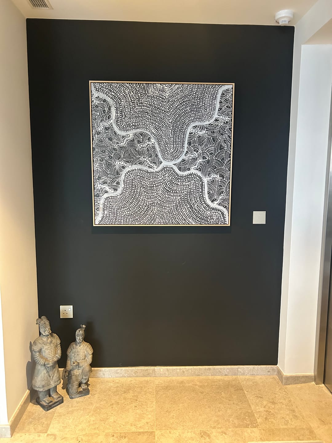
Canvas art occupies a specific and irreplaceable position in the spectrum of wall art formats. It is neither as formal as a framed print behind glass nor as casual as a paper poster pinned to the wall. It occupies a middle ground — tactile, unpretentious, inherently warm — that makes it the most versatile format for residential installation. The gallery-wrapped canvas, stretched over a timber frame with the image extending around the edges, is in particular a format that brings a dimensional quality to a wall that no framed print can replicate. Running your hand across a stretched canvas in a room where you have lived with it for months, you feel the texture of the surface, the slight give of the fabric, the realness of the object. That physicality is what distinguishes canvas from every other format. For the full range of gallery-quality pieces at accessible prices, explore affordable art prints — produced at our Central Coast NSW facility from $9.95. At Olive et Oriel, we produce gallery-wrapped canvas at our Central Coast of New South Wales facility using archival-quality inkjet printing on artist-grade canvas substrate, stretched over solid timber frames. Every canvas we produce is manufactured to the customer's exact specified dimensions — there is no standard size that you are expected to make do with. This custom approach is what ensures the canvas fits the wall it is intended for, at the scale the composition requires, rather than at whatever size happened to be available. We have shipped canvas art to homes across Australia, New Zealand, the United Kingdom, the United States, and more than forty other countries. Gallery-Wrapped Canvas vs. Framed Prints: Understanding the Difference The decision between a gallery-wrapped canvas and a framed print is the first and most significant design choice in wall art selection. Both formats have specific strengths, and understanding the distinction prevents the most common mistake — choosing a format that is wrong for the room or the image. Gallery-wrapped canvas presents the image without a frame, with the image extending around the side edges of the stretcher frame. This creates a dimensional, floating quality that suits contemporary and casual interiors. The absence of a frame means the art sits closer to the wall, with less visual separation between the image and its environment. Canvas has a natural texture (the woven weave of the fabric substrate) that adds tactile richness and differentiates it from print-on-paper. It is the format that reads most easily from a distance as genuine art rather than a reproduction. Framed prints have a more formal presentation — the combination of mat board (where present), print surface, and frame creates a visual hierarchy that signals care and consideration. Framed prints on paper or card have greater resolution potential at very large sizes because the substrate is flatter and the ink sits more precisely on the surface. They suit formal rooms, gallery-style installations, and interiors where the frame itself is a design element. The choice often comes down to the character of the room. Contemporary, casual, and coastal interiors almost universally suit gallery-wrapped canvas. Formal living rooms, studies, and dining rooms may benefit from the additional presence of a framed presentation. Grouping and Sizing: The Formulas That Work Canvas groupings are governed by a set of principles that, once understood, make every arrangement decision straightforward. Consistent spacing. When hanging two or more canvases in a horizontal arrangement, the gap between them should be consistent — typically 5–8cm (2–3 inches). Larger gaps make a grouping look like individual pieces that happen to be near each other. Smaller gaps create the sense of a unified composition. The gap should be decided in advance and measured precisely, not estimated by eye. Horizontal alignment. In horizontal groupings, align either the top edges or the bottom edges of the canvases consistently — not the centre-lines, which are harder to perceive visually. Top-edge alignment is most reliable. In vertical groupings, align the centre of each canvas on a single horizontal axis. Scale relative to the wall. A single canvas above a sofa should span between two-thirds and three-quarters of the sofa's width. A pair of canvases together should meet this measurement. A grouping of three should approach this measurement as a combined width. Odd numbers. Groupings of three or five almost always read more naturally than groupings of two or four. The odd number creates an inherent visual asymmetry that prevents the arrangement from feeling institutional. The Visual Weight of Canvas Canvas has more visual weight than framed prints of equivalent size. The dimensional quality of the stretched substrate — particularly when viewed from the side, where the depth of the frame is visible — creates a presence on the wall that paper prints lack. This is generally an advantage, particularly in rooms where you need the art to anchor a wall decisively. It is worth factoring into placement decisions: a canvas that would be the correct size as a framed print may read as too dominant when stretched over a deep frame. Hanging Approaches Canvas frames come with either hanging hardware pre-attached (D-rings on the sides, or a saw-tooth bracket across the top) or nothing, requiring you to add your own. D-rings with a hanging wire stretched between them are the most stable and most adjustable method — once the wire is in place, you can shift the canvas left and right by a few centimetres without changing the hook positions. Invisible French cleats provide the most secure connection for heavy canvases and allow very precise positioning, but require more precise installation. Picture-hanging strips (Command or similar) are appropriate for lightweight canvases in rental situations where wall damage must be avoided. All canvases over 80cm in any dimension should be hung from two attachment points — a single point allows the canvas to rotate on the hook over time, creating a visible tilt that is difficult to fully correct. How Canvas Ages Gallery-wrapped canvas, properly hung and cared for, should last for decades without significant degradation. The canvas substrate is stable under normal indoor conditions. The inks we use at our Central Coast facility are archival-quality pigment inks rated for 75+ years lightfastness under gallery conditions — meaning no significant visible fading when protected from direct UV exposure. The primary enemy of canvas longevity is direct sunlight. A canvas hung on a wall that receives direct sun for several hours per day will fade noticeably within five to ten years. Hang canvas on walls that receive indirect light only — the reflected and diffused light of a well-lit room rather than the direct beam of a window or skylight. Room by Room Living room: The primary art placement in any living room is the wall most visible from the main seating. A single large canvas (100×150cm or similar) above the sofa or on the primary wall creates the decisive anchor the room needs. Supplement with smaller works on adjacent walls. Bedroom: Canvas above the bed — either a single large work centred above the headboard, or a pair flanking the bed on the side walls. The canvas's warmth and texture make it particularly well-suited to bedrooms. Hallway and entry: A strong single canvas in the entry makes an immediate impression. In a narrow hallway, a vertical format canvas rather than a landscape — it gives the impression of height and draws the eye upward rather than emphasising the corridor's narrowness. Home office: A canvas that relates to the work done in the space — or one that provides the deliberate contrast of natural imagery against the discipline of work. Large and confident. Not decorative — definitive. Designer Tips If you want to sample first, order the artwork in its smallest size first — an A5 or A4 print (from $9.95) is made on the same 230gsm archival paper as the full-size piece, a true sample of colour and detail for your wall, then commit to the full canvas. For canvas specifically, the sample lets you assess the texture and the colour rendering of the print in your specific lighting conditions. Our canvases are manufactured to your exact dimensions, with 4 business days production time at our Central Coast facility. We ship globally to over 40 countries with all duties included. See our wall art hanging guide for detailed installation instructions. If hanging in a rental, French cleats or Command strips avoid wall damage. See our rental-specific guidance in the related articles section of this blog. Browse our full canvas wall art collection, explore all wall art formats, or read our guide to hanging wall art.
Learn more
Bedroom Wallpaper in Real Homes — Our Customers' Transformations
The bedroom is where wallpaper earns its keep. Not because it is the most visible room — guests rarely see it — but because it is the room where you spend the most time with your eyes open and unfocused. Lying in bed, waking up, reading at night, scrolling your phone in the morning. The wall behind the headboard is the surface you see more than any other in your house. If that wall has depth, texture, and pattern, it changes how the room feels at every hour of the day. These are real bedrooms from our customers. Not styled by a photographer with a van full of props — styled by the people who sleep in them. What makes them worth studying is the range: tropical botanicals, birch forests, hand-drawn florals, and moody atmospheric murals. Different patterns, different palettes, but the same fundamental decision — to give the most personal room in the house a wall worth looking at. Why the Bedroom Wall Matters Most In interior design, the wall behind the bed is called the anchor wall. It is the first thing you see when you walk into the room, the last thing you see before you close your eyes, and the surface that frames the largest piece of furniture in the space. Wallpaper on this wall does something paint cannot: it creates a headboard effect that extends the full width and height of the wall, giving the bed a visual weight and presence that makes the room feel finished. The principle is focal point theory. Every room needs one surface that draws the eye and tells you where the centre of the space is. In a bedroom, the bed is that centre. The wall behind it is the frame. When you wallpaper that wall, the frame becomes part of the composition rather than a blank background. The bed, the bedside tables, the lamps — they all feel more intentional when they are sitting in front of a wall that has been designed. The Tropical Retreat Large-scale palm fronds in warm beige and tan on cream — covering the full wall behind a dark timber bed with clean lines. This customer has committed to the pattern on every wall, not just the bed wall, and it works because the colours are so restrained. The monochromatic earth tones mean the pattern adds texture and movement without overwhelming. White bedding, striped natural-fibre cushions, a glowing timber sphere lamp on the nightstand. Every element is organic and warm. The room feels like a resort, but the materials are honest — timber, linen, natural fibre. No gold, no glass, no high-shine surfaces. That consistency is what makes the room feel considered. The Botanical Atmosphere A large-scale botanical illustration in soft blue-grey with hints of peachy pink at the base — palm fronds, ornamental grasses, flowering stems rendered in a hand-drawn style. This customer has layered the room with intention: a woven rattan headboard adds a second texture against the wallpaper, chunky knit throw adds a third, navy and burgundy cushions introduce deeper tones. Multiple amber candles create warm light that plays against the cool wallpaper. The contrast between cool walls and warm light is one of the most effective techniques in bedroom design — it gives the room energy during the day and intimacy at night. The Birch Forest Birch trees in grey on cream — bare white trunks with characteristic horizontal lenticels, fine branches reaching upward. This is a wallpaper for someone who wants nature in their bedroom without colour. The monochromatic palette is pure Scandinavian restraint: grey, cream, white. No accent colours needed. The trees create vertical rhythm that draws the eye upward, which makes the ceiling feel higher than it is. In a room with standard eight-foot ceilings, that vertical movement is valuable. This customer has kept the furniture simple — bookshelves, a white lamp, clean blinds — letting the forest do the talking. What These Bedrooms Teach Us Eleven different bedrooms, eleven different patterns, and the same principles appearing in every one: The bed wall is always the right wall. Every customer here wallpapered the wall behind the headboard. It is the natural focal point, it is the wall with the fewest interruptions (no doors, usually no windows), and it is the wall you see from the doorway. There is a reason designers call it the anchor wall. Muted tones help you sleep. Not one of these bedrooms uses a bold, saturated wallpaper. Warm beige, soft grey, dusty blue, cream — these are colours that recede rather than advance, which is exactly what you want in a room designed for rest. Save the bold patterns for the rooms where you want energy. Wallpaper replaces art. Several of these bedrooms have no art above the bed. They do not need it. The wallpaper is the art. A patterned wall behind the headboard gives you the visual interest that a framed print would, but at the scale of the entire wall rather than a single frame. It is more immersive and less cluttered. Layer textures, not patterns. These customers pair their patterned wallpaper with textured bedding — knit throws, linen sheets, woven cushions, rattan headboards. Pattern on the wall, texture on the bed. The two elements complement without competing. Getting Started All wallpaper is manufactured to your wall measurements — panels numbered in sequence. For bedrooms, any of our three substrates work: Peel and Stick if you rent or like to change, Paste the Wall Smooth for a permanent matte finish, or Paste the Wall Linen for added woven texture that catches light differently through the day. Order a $4.99 sample (48cm x 40cm) and lean it against your headboard wall at different times of day. Morning light and evening light change everything — and the bedroom is the room where you experience both. Every design can be colour-customised at no extra cost. Browse our full wallpaper collection, start with our wallpaper guide, or see more real rooms in our journal.
Learn more
Cobalt Blue Interiors: The Bold Mediterranean Colour Palette
Cobalt blue commands a room without shouting. It is the blue of deep ocean at midday, of old Delft pottery, of the Mediterranean seen from a whitewashed terrace. Unlike navy, which absorbs light and recedes, cobalt reflects it — it has enough white pigment in its composition to read as vivid without tipping into electric. This is a colour with history: used in Chinese porcelain since the ninth century, in Islamic tilework since the twelfth, in European painting since ultramarine was ground from lapis lazuli and traded by weight alongside gold. In contemporary interiors, cobalt works because it does what most blues refuse to do — it brings energy. Blue is typically prescribed as calming, restful, recessive. Cobalt is none of these things. It is confident, saturated, and present. It reads as bold in a way that other blues avoid, which makes it the right choice for rooms where you want impact — living rooms, dining rooms, entryways — and the wrong choice for rooms where you want to disappear, unless you balance it with enough warm material to take the edge off. Colour Psychology Blue is the world's most popular colour in every survey ever conducted — across cultures, genders, and age groups. The evolutionary explanation is straightforward: blue signals clear sky (safety) and clean water (survival). Our brains are wired to find it reassuring. But cobalt is not reassuring in the way that powder blue or duck egg is reassuring. Cobalt triggers a different response — focus and clarity. Research in colour psychology shows that saturated blues improve concentration, reduce heart rate without inducing drowsiness, and create a perception of spaciousness even when applied to a single wall. In a north-facing room that lacks natural warmth, cobalt's vivid saturation compensates — the colour provides visual energy that the light does not. The honest caveat: cobalt is cold. On its own, in a room without warm counterpoints, it can feel institutional — the blue of a hospital corridor or a government building. The key to using cobalt at home is always warmth alongside it: timber, brass, cream textiles, warm white walls. The blue provides the drama. The warm materials provide the welcome. Four Colour Palettes Palette 1: Cobalt and Cream The safest starting point. Cobalt as your 30% on a feature wall or in a pair of armchairs. Cream and warm white as your 60%. Natural brass or gold as your 10% accent. This palette references the Mediterranean — blue and white buildings, golden light, terracotta pots. Use light oak or ash timber to keep the warmth present. Avoid grey — it cools the cobalt further and the room feels like winter. Palette 2: Cobalt and Warm Brass Brass is cobalt's natural partner. The warm gold tone of brass occupies the opposite end of the colour temperature spectrum, which means the two create maximum contrast without visual conflict. A cobalt wallpaper wall with brass sconces, brass-framed art, and a brass coffee table reads as deliberately luxurious. The 60-30-10 split: 60% warm neutral (walls, floor, sofa), 30% cobalt (wallpaper, cushions, rug), 10% brass (hardware, lighting, frames). Palette 3: Cobalt and Coral Cobalt and coral are complementary — they sit opposite each other on the colour wheel, which means they intensify each other. This is a bold palette for confident rooms: a cobalt feature wall with coral cushions and a warm white sofa. The coral prevents the cobalt from feeling cold, and the cobalt prevents the coral from feeling saccharine. Together they reference Mediterranean ceramics, Greek island sunsets, and the kind of colour confidence that makes a room memorable. Not for bedrooms. For living rooms, dining rooms, and entertaining spaces where energy is the goal. Palette 4: Tonal Blues A gradient from ice blue through cobalt to navy — a single-colour story told in depth. This palette works in a bedroom where you want calm with character. The lightest blue on the ceiling (creates height), cobalt on the feature wall (creates anchor), navy in the bedding and cushions (creates grounding), and ice blue in the sheers and accessories (creates light). The room reads as enveloping rather than heavy because every surface is the same colour family at different depths. Wallpaper and Art Our blue wallpaper collection includes palm patterns, fan palms, trellis designs, and botanical motifs in cobalt and navy. White Luxe Palm in Blue is the hero — bold palm silhouettes in cobalt on a clean white base that reads as both tropical and architectural. For art, our blue art collection pairs perfectly. Clovellis I captures turquoise and cobalt ocean from above — the kind of photograph that becomes the colour reference for the entire room. Deep Ocean I goes darker and moodier — deep blue surface water that reads as abstract art from a distance. Materials Timber: Light oak and ash. The warm blonde tone of light timber is the essential counterbalance to cobalt's coolness. Walnut is too dark — it competes with the blue for visual weight. Pine is too yellow. Oak is the sweet spot. Stone: White marble with grey veining, or light travertine. Cool stone echoes the blue temperature without adding more warmth — which keeps the palette crisp. Avoid warm-toned stone (honey onyx, terracotta tile) unless you are deliberately pushing toward the Mediterranean register. Metals: Brass and warm gold exclusively. Chrome and silver amplify the coldness. Brass grounds cobalt with warmth. Every light fitting, every handle, every frame should be brass. Fabrics: Linen in cream and white for the 60%. Velvet in cobalt for statement cushions or a single armchair. Cotton in blue and white stripe for a coastal register. Avoid silk — too shiny, too formal for the relaxed confidence cobalt needs. Room by Room Living room: Cobalt palm wallpaper behind the sofa. Cream linen sofa, light oak coffee table, brass floor lamp. White and cream on the remaining walls. This room will feel like a Hamptons beach house — fresh, confident, and light. Dining room: Cobalt works at night. Candlelight on a deep blue wall creates an intimacy that no other colour achieves. Wallpaper on the feature wall, warm white on the others, brass chandelier, timber table. The room transforms between day and evening. Bedroom: Use cobalt as accent, not surround. A pair of cobalt cushions, a blue throw, ocean art above the bed. The walls should be warm white or cream — cobalt in a bedroom is energising, which is the opposite of what you want at midnight. Bathroom: Cobalt wallpaper above the tile line — this is where blue feels most natural, near water. Our Paste the Wall Smooth is water and humidity resistant. Brass fixtures, white tiles, a round mirror. Designer Tips Order the $4.99 sample (48cm x 40cm). Cobalt photographs more vivid than it reads in person — screens emit blue light, which amplifies the colour. The sample shows you the true depth on your wall. Never pair cobalt with grey. Grey cools it further and the result feels corporate. Pair with cream, sand, and warm white instead. Use cobalt in south-facing rooms for best results. South-facing rooms in Australia get abundant, warm-toned afternoon light that takes the edge off cobalt's coolness. North-facing rooms need more warm material (brass, timber, cream) to compensate. One cobalt wall is enough. This is a colour that holds a room from a single surface. Four cobalt walls would overwhelm. One cobalt wall anchors. Browse our blue wallpaper collection, explore blue art prints, or read more colour guides on On the Wall.
Learn more
Sage Green Palettes: 6 Combinations That Work
Sage green is no longer a trend — it has quietly become a default neutral. What started as the 2021–2023 soft-green wave has matured into something steadier: a grey-toned, grounded green that designers now reach for the way they once reached for greige or warm white. It calms a bedroom, dignifies a dining room, softens a home office, and layers as considerately with blush as it does with charcoal. If you are weighing up a colour for a feature wall, a whole-room drench, or a unifying thread across a renovation, sage is one of the most forgiving, longest-wearing choices on the palette. This guide walks through the five sage green colour palettes our design team returns to most — then a sixth we are watching closely for 2026. Each combination includes the mood it creates, the rooms it suits, the Olive et Oriel wallpapers and art prints that anchor it, and the Australian-light considerations most international guides miss. Every wallpaper we sell is made to your exact wall dimensions on the Central Coast of New South Wales, with free colour customisation on every design and all import duties paid to 40+ countries — so if you love a pattern but need it shifted slightly warmer, cooler, lighter or deeper, our team will adjust it at no extra cost before production. Tranquil Canopy in Sage Green · Olive Veil in Sage Green · Linen Double Stripe in Soft Sage Green What "sage" actually is — a short colour taxonomy "Sage" is a family, not a single colour. When a customer asks for sage green wallpaper, we usually ask a follow-up question first — because the five most common sages each behave differently on a wall, in Australian light, and alongside neutrals. Understanding which sage you are reaching for is the single biggest factor in whether the finished room feels restful or flat. Soft sage — the pale, milky, grey-cast sage you see in modern nurseries and bedrooms. Reads almost neutral in bright north-facing light and lifts a room without committing to a strong colour. Deep sage — a saturated, forest-adjacent sage that grounds a room the way a dark navy does. Excellent in studies, dining rooms and bedrooms where you want enclosure rather than airiness. Khaki sage — warmer, slightly olive-leaning. Pairs exceptionally with timber, leather, and terracotta. The sage most aligned with the 2026 earthy-luxury direction. Grey sage — cooler, closer to eucalyptus. The right choice in coastal homes and anywhere you want a green that reads almost as a neutral. Dusty sage — a muted, chalky sage with a hint of warmth. The softest of the family and the most flattering alongside blush, dusty rose, and warm whites. If you can only remember one rule: soft and grey sages cool a room, khaki and dusty sages warm it, and deep sage anchors it. Choose the temperature first, then choose the pattern. Combination #1 — Sage and Cream The most forgiving sage palette, and the one we specify most often for nurseries, primary bedrooms, and classic-feminine sitting rooms. Cream softens sage's grey undertones so the room reads gentle rather than cool, and the palette ages well — it will look as considered in ten years as it does on the day you install. Psychologically, sage calms (it is closely associated with the quiet restorative greens of eucalypt and olive foliage) and cream reassures; together they read as a nursery or bedroom that will still feel appropriate when the baby becomes a teenager. Olive Veil in Sage Green · Daisy in Soft Sage by William Morris Pair a soft or dusty sage wallpaper with cream linen bedding, unbleached calico curtains, and warm timber furniture. For nurseries specifically, our team usually recommends an organic, airy pattern rather than a dense floral — Olive Veil or Tranquil Canopy keep the space feeling soft and breathing. Read our full guide to designing a calming nursery for layout and textile pairings that work with this palette. Room use Nursery or child's bedroom: soft sage wallpaper on all four walls, cream linen, oak cot, a single muted sage print above the change table. Primary bedroom: deep sage on the bed wall only, cream on the remaining three; layered cream-and-sage bedding in mismatched textures. Living room: sage on a feature alcove behind a cream linen sofa, brushed brass lamp, warm oak coffee table. Combination #2 — Sage and Terracotta Sage and terracotta is the Mediterranean palette — the one that reads as collected, well-travelled, and warm. It works because the two colours sit opposite each other on the temperature scale: sage is cool and botanical, terracotta is warm and earthen, and the tension between them creates visual energy. Unlike the sage-and-cream palette, which whispers, sage-and-terracotta has volume. Use it where you want a room to feel lived-in and generous: dining rooms, kitchens, hallways, and larger family living spaces. Tuscany Stripe in Sage Green · Mineral Fade Panoramic Mural in Sage Green For dining rooms, we often specify Tuscany Stripe or the Mineral Fade panoramic mural — both hold their own beside terracotta tiles, clay-toned linen, and ironwork. If you lean towards warm terracotta throughout the home, our warm terracotta palette guide pairs naturally with this combination and covers complementary tonal ranges. Add a single grounded piece of abstract green art — Fields of Green I works consideredly in solid timber frames with oak finish above a sideboard. Combination #3 — Sage and Charcoal For the minimalist who wants warmth. Sage green and charcoal is the modern-moody palette: sophisticated, weighty, and free of the sterility that plagues grey-on-grey interiors. The sage contributes softness and life; the charcoal contributes depth and definition. Together they read as considered rather than cold. This is the palette we recommend for home offices (it is restful on long Zoom days), primary bedrooms in south-facing rooms that need warming, and the kind of media room you want to feel like a chapel rather than a cave. Stripe Weave in Sage Green Anchor with charcoal joinery, a dark linen sofa, and black-finish hardware. Stripe Weave in Sage Green has enough geometric rigour to sit alongside contemporary charcoal without looking fussy — and because it is a narrow vertical stripe, it quietly lifts the ceiling. Pair with a charcoal and warm black palette for the surrounding joinery and read our guide to colour drenching with wallpaper if you are tempted to extend sage onto the ceiling for a fully immersive drench. Combination #4 — Sage and Navy Coastal without the cliché. Sage and navy is the palette that updates the classic Hamptons look — replacing the expected navy-and-white with navy-and-sage keeps the coastal reference but removes the nautical literalism. The result is a room that feels coastal the way a quiet eucalypt stand feels coastal: sea-adjacent rather than sea-themed. This is the right direction for bedrooms in Byron Bay, Gold Coast and Central Coast homes where you want coastal character without anchor-print cushions. Sage Ripple in Sage Green · Linen Double Stripe in Deep Sage Green If you are drawn to the Hamptons direction specifically, our Hamptons interior design style guide and Hamptons wallpaper guide walk through the details — board-and-batten panels with sage-green wallpaper above, navy-linen sofas, brushed brass lighting, and framed coastal art. For coastal art specifically, read our notes on coastal art in real Australian homes. Combination #5 — Sage and Warm Brass or Gold The quiet-luxe sage palette. Where sage-and-charcoal reads modern, and sage-and-terracotta reads well-travelled, sage-and-brass reads discreetly expensive. Brass is sage's most flattering metallic — the warm gold tone sits exactly between botanical green and a warm neutral, so it unifies rather than contrasts. Specify it on lighting, tapware, and picture frames, and let every other metal in the room disappear. This is the palette for primary bedrooms, dressing rooms, powder rooms, and the kind of library-style home office that should feel as composed as a hotel suite. Brushed Lattice in Sage Green · Tranquil Canopy in Deep Sage Green For a quiet-luxe bedroom, we often specify the deep sage variant of Tranquil Canopy with brushed brass sconces, a linen upholstered bedhead, and framed botanical art. A pair of works like Petal Imprint I Sage and Petal Imprint II Sage in solid timber frames with oak finish sits consideredly against the deeper wallpaper. For the broader luxury direction, our luxury bedroom ideas guide covers materials and layout at this price point. Combination #6 — Sage and Dusty Rose (the 2026 direction we are watching) The pairing we recommend most often to customers who already own sage furnishings and are asking us what is next. Dusty rose — the muted, slightly greyed pink we covered in detail in our dusty rose colour palette trend — is sage's closest harmonic partner. Both sit at the same muted saturation level, both have grey undertones, and both read as adult neutrals rather than statement colours. Where blush reads sweet, dusty rose reads sophisticated, and sage moderates it further. This is the palette we expect to see most in 2026 primary bedrooms and softly feminine sitting rooms. Paradise Protea in Soft Pink & Sage Green · Cloudy Days in Sage Green If you want the palette embodied in a single wallpaper, Paradise Protea in Soft Pink & Sage Green does the work — a considered botanical that holds both tones without tipping either way. For a drencher's approach, use a soft-sage wallpaper across the room and layer dusty rose through bedding, upholstery, and a muted rose-toned artwork. The pairing is especially flattering under warm 2700K lighting, which pulls the rose forward at night without muddying the sage. Room-by-room application The five-plus-one combinations above are palette ideas — how you apply them depends on the room's function, orientation, and existing architecture. Here is how our design team typically specifies sage in each space. Primary bedroom: deep sage on the bed wall with soft-sage or off-white on remaining walls, or a full four-wall drench in dusty sage for a cocooned effect. Pair with bedroom wallpaper in a botanical or textural pattern. Nursery: soft sage across all walls, cream-and-warm-timber furniture. Use nursery wallpaper with breathing, organic patterns only — save dense florals for older children's rooms. Living room: accent-wall sage (behind the sofa or in a built-in alcove) paired with cream-linen seating and timber. Works in both modern and Hamptons-adjacent homes. Dining room: full sage-and-terracotta drench for warmth, or deep sage on the feature wall behind the sideboard with a panoramic wallpaper mural for the ceremonial moment. Kitchen: sage as splashback tile or on cabinetry, with a small run of sage wallpaper in the scullery or pantry for continuity — a quiet way to extend the palette without committing the whole kitchen to colour. Bathroom and powder room: deep sage on all walls with brass tapware for the quiet-luxe direction. For coastal bathrooms, read our coastal bathroom wallpaper guide — sage-grey variants suit humid Queensland and Northern NSW conditions especially well. Home office: sage on three walls with a darker accent wall (charcoal or deep navy) behind the desk. Restful without feeling sleepy. Hallway or entry: sage with warm-timber joinery and a single strong artwork. A full wallpaper mural in sage tones works especially well in a long hallway where you want movement. Australian light considerations Sage is a light-sensitive colour — which is why the same sage wallpaper can look fresh and restful in one home and flat or cold in another. Australian light is brighter, harsher, and more yellow-cast than the northern-European light most international sage case studies are shot in, and that changes the brief. North-facing rooms (in the Southern Hemisphere, the warmest, brightest aspect): sage reads warmer and slightly yellower. Soft and dusty sages flatter this light; deep and grey sages can look a little olive. Sample before committing. South-facing rooms: cooler, flatter light. Grey and deep sages can feel cold here — favour khaki sage, or warm the room with brass and cream textiles to push sage towards the warmer end of its range. East-facing rooms: flattering morning light — almost any sage works. Ideal orientation for nurseries and primary bedrooms. West-facing rooms: the strong late-afternoon light pushes sage quite warm. Grey sage holds its character best here; soft sage may drift towards yellow-green at sunset. Seasonal shift: in Australian summer, sage reads warmer against strong sun and longer daylight hours — it pairs naturally with linen, rattan, and tan leather. In winter, the same sage feels cooler and more restful, especially in Melbourne and Hobart homes, and benefits from warm-white lighting (2700K) and heavier textiles. If you are choosing a sage for a difficult room — south-facing, poor natural light, or a deep hallway — always order a $4.99 sample of your wallpaper (48cm x 40cm / 19in x 16in) and tape it to the wall for 48 hours. See the colour at breakfast, midday, afternoon, and under artificial light before you commit. A walk through our sage green wallpaper range Our green wallpaper collection carries more than a hundred sage green designs in soft, deep, khaki, grey and dusty variants — every one custom-made to your wall dimensions, with free colour customisation if you need the shade shifted. A few of the designs our customers return to most: Soft, neutral sages — Tranquil Canopy in Sage Green, Olive Veil in Sage Green, and Linen Double Stripe in Soft Sage Green for the quiet-neutral brief. Deep, saturated sages — Tranquil Canopy in Deep Sage Green and Linen Double Stripe in Deep Sage Green for drenching and cocooning. Structured, geometric sages — Stripe Weave in Sage Green, Sage Ripple, and Brushed Lattice for modern rooms that need pattern without maximalism. Panoramic sage murals — Mineral Fade, Vintage Tapestry, and Bush Walk in Sage Green for a full-wall moment. Heritage, period-appropriate sages — Daisy in Soft Sage by William Morris, Tulip in Sage Green by William Morris, and Larkspur in Sage Green by William Morris for Federation, Edwardian and period-home renovations. Bush Walk in Sage Green · Larkspur in Sage Green by William Morris If none of our stock sages are the exact shade you want, our custom studio rebuilds any design in your colour at no additional cost — including matching a fabric swatch, a paint chip, or a Pantone number. Our full custom wallpaper service walks through how that works, from swatch submission to proof approval to production. Art-side, the sage green canvas collection and our green abstract art print range carry the botanical and abstract companions we most often pair with these wallpapers. For sizing and hanging, read our how to hang wall art guide. Installation notes for sage wallpaper Sage is a flat, low-contrast colour, which means any seam or lift shows more obviously than it does on a busy pattern. Two practical notes. Paste-the-wall wallpaper is the longer-lasting choice for full-room sage installations — especially in humid Queensland and Northern NSW homes. Our paste-the-wall installation guide covers wall prep, alignment, and common mistakes. Peel-and-stick wallpaper is the right choice for renters and for single-wall installs where you may want to reposition the paper. Read our peel-and-stick wall preparation guide and our renter's guide to peel-and-stick in Australia first — surface preparation matters more than the product choice. Measuring is the single most common point of friction. Our how to measure guide covers standard rectangular walls, raked ceilings, and stairwells — but if the wall has awkward angles, double-stud returns, or complex joinery, submit photos via our site chat and our team will measure and quote for you. For installation, our Australia-wide wallpaper installer directory lists vetted professionals who have installed OEO wallpaper across every state. 2026 forecast — where sage is evolving Two directions our design team is watching. First, sage is drifting warmer — moving away from the cool grey-sage of 2021–2022 and towards khaki and dusty variants. This is partly a reaction to the broader move toward warm minimalism (read our 2026 wallpaper trends report for the full context) and partly because warmer sages sit more sympathetically alongside the terracottas, mushrooms and caramels that dominate 2026 interior palettes. If you are choosing a sage now for a ten-year install, specify khaki or dusty — they will date better than cool grey sage. Second, sage is being paired more often with unexpected partners — deep burgundy, dusty rose, cobalt blue — rather than its traditional neutral companions. The trend reports at burgundy and wine, cobalt blue, and our broader 2026 Australian interior trend report cover the direction in detail. The takeaway for sage-lovers: you can now pair sage with far bolder secondary colours than was fashionable even two years ago, and the palette will still read as considered. Frequently Asked Questions Is sage green too calming for a whole-home palette? No — but it needs contrast partners to stay interesting. Sage on its own across every room reads as flat; sage paired with a warm counter-colour (terracotta, dusty rose, brass) or a grounding anchor (charcoal, deep navy) gives the eye something to move through. The rooms that hold up best in full-drench sage tend to be bedrooms and studies; spaces where calm is the point. For living areas and kitchens, pair sage with a warmer or darker partner. Will sage green date quickly? The cool grey-sage of 2021–2022 has already dated. Khaki, dusty and deep sages have not — and because they sit more sympathetically alongside timber, leather, and the earthy-luxury direction driving 2026 interiors, they are likely to remain comfortable for the next decade. Specifying a wallpaper over paint extends the palette's life further: a patterned sage wallpaper reads as a design decision rather than a trend call. What rooms does sage green work best in? Primary bedrooms, nurseries, home offices, dining rooms, powder rooms, and hallways. Sage is excellent anywhere you want restorative calm or a grounded backdrop for furniture and art. Bathrooms work if you specify a coastal- or humidity-appropriate variant. Kitchens work in cabinetry and tile, and in small runs of wallpaper (scullery, pantry, breakfast nook). Children's playrooms are the one room where sage can read a little subdued — warmer pattern choices help. How do I pair sage wallpaper with existing furniture I already own? Work from the undertone outward. If your existing furniture is warm — timber, tan leather, brass, warm whites — specify khaki or dusty sage. If your furniture leans cool — black, chrome, cool grey, icy white — specify grey or soft sage. The palette fails most often when a customer buys a cool grey sage wallpaper for a room full of warm timber, and the wall reads as out of step with the rest of the room. Ordering a $4.99 sample and holding it against your key furniture pieces before committing is the fastest way to avoid this mistake. Is sage green better as an accent wall or a whole-room drench? Either works, and the right answer depends on the room's size and ceiling height. Small rooms — powder rooms, studies, nurseries — benefit most from a full drench, where all four walls (and often the ceiling) carry the sage; the effect is cocooning and considered. Larger rooms usually read better with an accent wall, most often behind the bed, sofa, or sideboard. Our feature wall guide covers the specifics. Is there a peel-and-stick version of sage wallpaper for renters? Yes — every design in our sage green range is available in both paste-the-wall and peel-and-stick finishes, so renters can install a full sage feature wall without permanent adhesive. The peel-and-stick version removes cleanly when you move out, provided the wall is prepped correctly. Read our peel-and-stick explainer and our installation guide before ordering. What kind of wall art complements a sage green room? Three directions work consistently. Tonal green art for a drenched, monochrome effect — Fields of Green II or Sage Vase I sit within the palette rather than against it. Warm-counterpoint art in dusty rose, terracotta, or brass-and-charcoal abstracts for contrast. And botanical art — Olive Haze II or abstract landscape works — to extend the nature reference sage already carries. Frame in solid timber with oak finish for the warmest pairing, or black finish for modern contrast. Can I order custom sage wallpaper in an exact shade? Yes. Every design in our 2,000+ catalogue can be colour-customised at no extra cost — you send us a paint chip, a fabric swatch, or a Pantone number, and our studio rebuilds the pattern in your exact shade before production. The service covers all sages — soft, deep, khaki, grey, dusty — as well as anything in between. Read the full process on our custom wallpaper page, then order a $4.99 sample (48cm x 40cm / 19in x 16in) to confirm the colour before placing your full order. Browse the full sage and green wallpaper collection, explore the sage green canvas art range, or read more on On the Wall. All Olive et Oriel wallpaper is manufactured to your exact wall dimensions on the Central Coast of New South Wales and ships duties-paid to 40+ countries — no rolls, no waste, no surprise fees at your door.
Learn more
How to Style a Half Wall of Wallpaper — The Look That's Taking Over Interiors
The half wall wallpaper trend is one of the most versatile ways to introduce pattern and texture into a room without overwhelming it. By applying wallpaper from the floor to dado or wainscoting height — typically 90 to 120 centimetres — you create a sophisticated layered look that works in bedrooms, hallways, dining rooms, and living spaces. At Olive et Oriel, we manufacture every wallpaper order to your wall measurements — panels numbered in sequence, ready to install. For half wall applications, this precision is especially valuable. Why the Half Wall Works A full wall of bold wallpaper can feel like a commitment. A half wall gives you the impact of pattern at eye level while keeping the upper portion clean and airy. The contrast between wallpaper and painted wall creates visual depth that makes rooms feel more considered and designed. This technique is particularly effective with our hand-painted murals — the panoramic artwork sits at the base of the wall where it catches the most light and draws the eye naturally. The painted wall above provides breathing room, letting the mural speak without competing for attention. How to Measure for a Half Wall For a standard half wall application, measure from your floor to your desired break point — usually 90cm to 120cm depending on your ceiling height and furniture placement. Add 5cm excess at the top for a clean trim line. When ordering from Olive et Oriel, enter your half wall height as the wall height. We will manufacture panels at exactly that dimension, plus our complimentary 10cm height margin for installation adjustments. Your panels arrive numbered — Panel 1, Panel 2, Panel 3 — so installation is straightforward even at a non-standard height. Choosing the Right Pattern Not every wallpaper works at half height. Patterns that work best include: Botanical and floral designs — the organic shapes create a natural garden-bed effect at the base of the wall Textured finishes — our Paste the Wall Linen substrate adds tactile depth that is enhanced by the half wall contrast Hand-painted murals — panoramic scenes that flow across the lower half create a genuine artwork-on-the-wall effect Geometric patterns — clean lines and structured repeats work consideredly against a solid-colour upper wall Because we offer free colour and scale customisation on every design, you can adjust any pattern to work at half wall height. Need the botanical slightly smaller so the repeat fits within 100cm? Done. Want the sage green shifted to match your existing paint? We will adjust it at no extra cost. The Finishing Touch: The Transition Line How you handle the line where wallpaper meets paint defines the entire look. Three options: Timber dado rail: The classic choice. A painted or natural timber moulding creates a clean, architectural break. Works consideredly in Hamptons, heritage, and farmhouse interiors. Shadow line: A recessed strip that creates a subtle groove between wallpaper and paint. Modern and minimal. Clean edge: Simply trim the wallpaper to a straight line with no moulding. Contemporary and understated. Whichever method you choose, use a sharp utility blade and a straight edge for the trim. Replace the blade frequently — dull blades grab and tear wallpaper. Three Substrate Options Substrate Best For Half Wall Notes Peel and Stick Renters, temporary looks Peels off clean when you want to change. Repositionable during install. Paste the Wall Smooth Permanent, classic finish Professional recommended. Softly matte finish. Water and humidity resistant. Paste the Wall Linen Textured, premium feel The woven texture adds tactile interest that is amplified at half wall height. Order Samples First Before committing to a half wall, order a $4.99 sample (48cm x 40cm) and hold it at your planned height against the wall. Step back and assess the proportion. The sample is large enough to see the full pattern repeat and gauge how the design will sit in your space. Browse our full wallpaper collection at oliveetoriel.com/wallpaper or explore our hand-painted murals for the ultimate half wall statement. Browse our full wallpaper collection to find the right pattern for your half wall, or start with our removable wallpaper guide for substrate advice. For bathroom half walls, our bathroom wallpaper guide covers humidity-resistant options. See more real installations in our On the Wall journal, including feature walls in real homes and nursery wallpaper installations.
Learn more