Sage green is no longer a trend — it has quietly become a default neutral. What started as the 2021–2023 soft-green wave has matured into something steadier: a grey-toned, grounded green that designers now reach for the way they once reached for greige or warm white. It calms a bedroom, dignifies a dining room, softens a home office, and layers as considerately with blush as it does with charcoal. If you are weighing up a colour for a feature wall, a whole-room drench, or a unifying thread across a renovation, sage is one of the most forgiving, longest-wearing choices on the palette.
This guide walks through the five sage green colour palettes our design team returns to most — then a sixth we are watching closely for 2026. Each combination includes the mood it creates, the rooms it suits, the Olive et Oriel wallpapers and art prints that anchor it, and the Australian-light considerations most international guides miss. Every wallpaper we sell is made to your exact wall dimensions on the Central Coast of New South Wales, with free colour customisation on every design and all import duties paid to 40+ countries — so if you love a pattern but need it shifted slightly warmer, cooler, lighter or deeper, our team will adjust it at no extra cost before production.


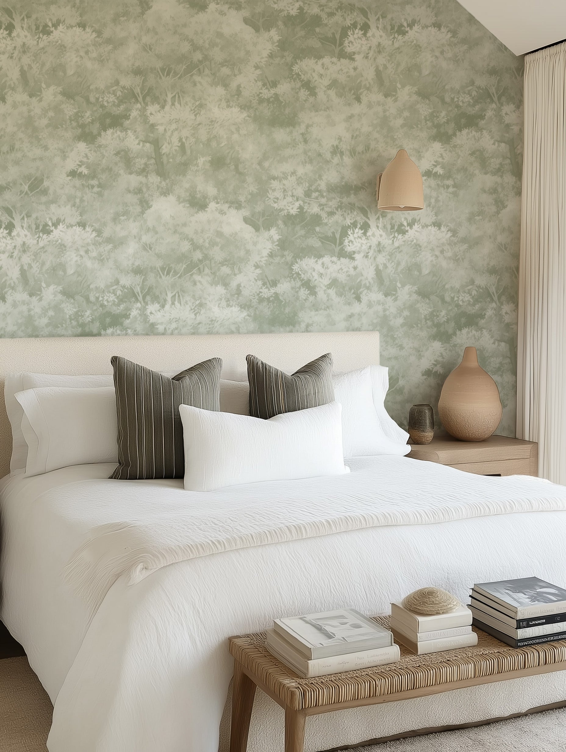
Tranquil Canopy in Sage Green · Olive Veil in Sage Green · Linen Double Stripe in Soft Sage Green
What "sage" actually is — a short colour taxonomy
"Sage" is a family, not a single colour. When a customer asks for sage green wallpaper, we usually ask a follow-up question first — because the five most common sages each behave differently on a wall, in Australian light, and alongside neutrals. Understanding which sage you are reaching for is the single biggest factor in whether the finished room feels restful or flat.
- Soft sage — the pale, milky, grey-cast sage you see in modern nurseries and bedrooms. Reads almost neutral in bright north-facing light and lifts a room without committing to a strong colour.
- Deep sage — a saturated, forest-adjacent sage that grounds a room the way a dark navy does. Excellent in studies, dining rooms and bedrooms where you want enclosure rather than airiness.
- Khaki sage — warmer, slightly olive-leaning. Pairs exceptionally with timber, leather, and terracotta. The sage most aligned with the 2026 earthy-luxury direction.
- Grey sage — cooler, closer to eucalyptus. The right choice in coastal homes and anywhere you want a green that reads almost as a neutral.
- Dusty sage — a muted, chalky sage with a hint of warmth. The softest of the family and the most flattering alongside blush, dusty rose, and warm whites.
If you can only remember one rule: soft and grey sages cool a room, khaki and dusty sages warm it, and deep sage anchors it. Choose the temperature first, then choose the pattern.
Combination #1 — Sage and Cream
The most forgiving sage palette, and the one we specify most often for nurseries, primary bedrooms, and classic-feminine sitting rooms. Cream softens sage's grey undertones so the room reads gentle rather than cool, and the palette ages well — it will look as considered in ten years as it does on the day you install. Psychologically, sage calms (it is closely associated with the quiet restorative greens of eucalypt and olive foliage) and cream reassures; together they read as a nursery or bedroom that will still feel appropriate when the baby becomes a teenager.


Olive Veil in Sage Green · Daisy in Soft Sage by William Morris
Pair a soft or dusty sage wallpaper with cream linen bedding, unbleached calico curtains, and warm timber furniture. For nurseries specifically, our team usually recommends an organic, airy pattern rather than a dense floral — Olive Veil or Tranquil Canopy keep the space feeling soft and breathing. Read our full guide to designing a calming nursery for layout and textile pairings that work with this palette.
Room use
- Nursery or child's bedroom: soft sage wallpaper on all four walls, cream linen, oak cot, a single muted sage print above the change table.
- Primary bedroom: deep sage on the bed wall only, cream on the remaining three; layered cream-and-sage bedding in mismatched textures.
- Living room: sage on a feature alcove behind a cream linen sofa, brushed brass lamp, warm oak coffee table.
Combination #2 — Sage and Terracotta
Sage and terracotta is the Mediterranean palette — the one that reads as collected, well-travelled, and warm. It works because the two colours sit opposite each other on the temperature scale: sage is cool and botanical, terracotta is warm and earthen, and the tension between them creates visual energy. Unlike the sage-and-cream palette, which whispers, sage-and-terracotta has volume. Use it where you want a room to feel lived-in and generous: dining rooms, kitchens, hallways, and larger family living spaces.


Tuscany Stripe in Sage Green · Mineral Fade Panoramic Mural in Sage Green
For dining rooms, we often specify Tuscany Stripe or the Mineral Fade panoramic mural — both hold their own beside terracotta tiles, clay-toned linen, and ironwork. If you lean towards warm terracotta throughout the home, our warm terracotta palette guide pairs naturally with this combination and covers complementary tonal ranges. Add a single grounded piece of abstract green art — Fields of Green I works consideredly in solid timber frames with oak finish above a sideboard.
Combination #3 — Sage and Charcoal
For the minimalist who wants warmth. Sage green and charcoal is the modern-moody palette: sophisticated, weighty, and free of the sterility that plagues grey-on-grey interiors. The sage contributes softness and life; the charcoal contributes depth and definition. Together they read as considered rather than cold. This is the palette we recommend for home offices (it is restful on long Zoom days), primary bedrooms in south-facing rooms that need warming, and the kind of media room you want to feel like a chapel rather than a cave.

Anchor with charcoal joinery, a dark linen sofa, and black-finish hardware. Stripe Weave in Sage Green has enough geometric rigour to sit alongside contemporary charcoal without looking fussy — and because it is a narrow vertical stripe, it quietly lifts the ceiling. Pair with a charcoal and warm black palette for the surrounding joinery and read our guide to colour drenching with wallpaper if you are tempted to extend sage onto the ceiling for a fully immersive drench.
Combination #4 — Sage and Navy
Coastal without the cliché. Sage and navy is the palette that updates the classic Hamptons look — replacing the expected navy-and-white with navy-and-sage keeps the coastal reference but removes the nautical literalism. The result is a room that feels coastal the way a quiet eucalypt stand feels coastal: sea-adjacent rather than sea-themed. This is the right direction for bedrooms in Byron Bay, Gold Coast and Central Coast homes where you want coastal character without anchor-print cushions.


Sage Ripple in Sage Green · Linen Double Stripe in Deep Sage Green
If you are drawn to the Hamptons direction specifically, our Hamptons interior design style guide and Hamptons wallpaper guide walk through the details — board-and-batten panels with sage-green wallpaper above, navy-linen sofas, brushed brass lighting, and framed coastal art. For coastal art specifically, read our notes on coastal art in real Australian homes.
Combination #5 — Sage and Warm Brass or Gold
The quiet-luxe sage palette. Where sage-and-charcoal reads modern, and sage-and-terracotta reads well-travelled, sage-and-brass reads discreetly expensive. Brass is sage's most flattering metallic — the warm gold tone sits exactly between botanical green and a warm neutral, so it unifies rather than contrasts. Specify it on lighting, tapware, and picture frames, and let every other metal in the room disappear. This is the palette for primary bedrooms, dressing rooms, powder rooms, and the kind of library-style home office that should feel as composed as a hotel suite.


Brushed Lattice in Sage Green · Tranquil Canopy in Deep Sage Green
For a quiet-luxe bedroom, we often specify the deep sage variant of Tranquil Canopy with brushed brass sconces, a linen upholstered bedhead, and framed botanical art. A pair of works like Petal Imprint I Sage and Petal Imprint II Sage in solid timber frames with oak finish sits consideredly against the deeper wallpaper. For the broader luxury direction, our luxury bedroom ideas guide covers materials and layout at this price point.
Combination #6 — Sage and Dusty Rose (the 2026 direction we are watching)
The pairing we recommend most often to customers who already own sage furnishings and are asking us what is next. Dusty rose — the muted, slightly greyed pink we covered in detail in our dusty rose colour palette trend — is sage's closest harmonic partner. Both sit at the same muted saturation level, both have grey undertones, and both read as adult neutrals rather than statement colours. Where blush reads sweet, dusty rose reads sophisticated, and sage moderates it further. This is the palette we expect to see most in 2026 primary bedrooms and softly feminine sitting rooms.


Paradise Protea in Soft Pink & Sage Green · Cloudy Days in Sage Green
If you want the palette embodied in a single wallpaper, Paradise Protea in Soft Pink & Sage Green does the work — a considered botanical that holds both tones without tipping either way. For a drencher's approach, use a soft-sage wallpaper across the room and layer dusty rose through bedding, upholstery, and a muted rose-toned artwork. The pairing is especially flattering under warm 2700K lighting, which pulls the rose forward at night without muddying the sage.
Room-by-room application
The five-plus-one combinations above are palette ideas — how you apply them depends on the room's function, orientation, and existing architecture. Here is how our design team typically specifies sage in each space.
- Primary bedroom: deep sage on the bed wall with soft-sage or off-white on remaining walls, or a full four-wall drench in dusty sage for a cocooned effect. Pair with bedroom wallpaper in a botanical or textural pattern.
- Nursery: soft sage across all walls, cream-and-warm-timber furniture. Use nursery wallpaper with breathing, organic patterns only — save dense florals for older children's rooms.
- Living room: accent-wall sage (behind the sofa or in a built-in alcove) paired with cream-linen seating and timber. Works in both modern and Hamptons-adjacent homes.
- Dining room: full sage-and-terracotta drench for warmth, or deep sage on the feature wall behind the sideboard with a panoramic wallpaper mural for the ceremonial moment.
- Kitchen: sage as splashback tile or on cabinetry, with a small run of sage wallpaper in the scullery or pantry for continuity — a quiet way to extend the palette without committing the whole kitchen to colour.
- Bathroom and powder room: deep sage on all walls with brass tapware for the quiet-luxe direction. For coastal bathrooms, read our coastal bathroom wallpaper guide — sage-grey variants suit humid Queensland and Northern NSW conditions especially well.
- Home office: sage on three walls with a darker accent wall (charcoal or deep navy) behind the desk. Restful without feeling sleepy.
- Hallway or entry: sage with warm-timber joinery and a single strong artwork. A full wallpaper mural in sage tones works especially well in a long hallway where you want movement.
Australian light considerations
Sage is a light-sensitive colour — which is why the same sage wallpaper can look fresh and restful in one home and flat or cold in another. Australian light is brighter, harsher, and more yellow-cast than the northern-European light most international sage case studies are shot in, and that changes the brief.
- North-facing rooms (in the Southern Hemisphere, the warmest, brightest aspect): sage reads warmer and slightly yellower. Soft and dusty sages flatter this light; deep and grey sages can look a little olive. Sample before committing.
- South-facing rooms: cooler, flatter light. Grey and deep sages can feel cold here — favour khaki sage, or warm the room with brass and cream textiles to push sage towards the warmer end of its range.
- East-facing rooms: flattering morning light — almost any sage works. Ideal orientation for nurseries and primary bedrooms.
- West-facing rooms: the strong late-afternoon light pushes sage quite warm. Grey sage holds its character best here; soft sage may drift towards yellow-green at sunset.
- Seasonal shift: in Australian summer, sage reads warmer against strong sun and longer daylight hours — it pairs naturally with linen, rattan, and tan leather. In winter, the same sage feels cooler and more restful, especially in Melbourne and Hobart homes, and benefits from warm-white lighting (2700K) and heavier textiles.
If you are choosing a sage for a difficult room — south-facing, poor natural light, or a deep hallway — always order a $4.99 sample of your wallpaper (48cm x 40cm / 19in x 16in) and tape it to the wall for 48 hours. See the colour at breakfast, midday, afternoon, and under artificial light before you commit.
A walk through our sage green wallpaper range
Our green wallpaper collection carries more than a hundred sage green designs in soft, deep, khaki, grey and dusty variants — every one custom-made to your wall dimensions, with free colour customisation if you need the shade shifted. A few of the designs our customers return to most:
- Soft, neutral sages — Tranquil Canopy in Sage Green, Olive Veil in Sage Green, and Linen Double Stripe in Soft Sage Green for the quiet-neutral brief.
- Deep, saturated sages — Tranquil Canopy in Deep Sage Green and Linen Double Stripe in Deep Sage Green for drenching and cocooning.
- Structured, geometric sages — Stripe Weave in Sage Green, Sage Ripple, and Brushed Lattice for modern rooms that need pattern without maximalism.
- Panoramic sage murals — Mineral Fade, Vintage Tapestry, and Bush Walk in Sage Green for a full-wall moment.
- Heritage, period-appropriate sages — Daisy in Soft Sage by William Morris, Tulip in Sage Green by William Morris, and Larkspur in Sage Green by William Morris for Federation, Edwardian and period-home renovations.


Bush Walk in Sage Green · Larkspur in Sage Green by William Morris
If none of our stock sages are the exact shade you want, our custom studio rebuilds any design in your colour at no additional cost — including matching a fabric swatch, a paint chip, or a Pantone number. Our full custom wallpaper service walks through how that works, from swatch submission to proof approval to production.
Art-side, the sage green canvas collection and our green abstract art print range carry the botanical and abstract companions we most often pair with these wallpapers. For sizing and hanging, read our how to hang wall art guide.
Installation notes for sage wallpaper
Sage is a flat, low-contrast colour, which means any seam or lift shows more obviously than it does on a busy pattern. Two practical notes.
- Paste-the-wall wallpaper is the longer-lasting choice for full-room sage installations — especially in humid Queensland and Northern NSW homes. Our paste-the-wall installation guide covers wall prep, alignment, and common mistakes.
- Peel-and-stick wallpaper is the right choice for renters and for single-wall installs where you may want to reposition the paper. Read our peel-and-stick wall preparation guide and our renter's guide to peel-and-stick in Australia first — surface preparation matters more than the product choice.
Measuring is the single most common point of friction. Our how to measure guide covers standard rectangular walls, raked ceilings, and stairwells — but if the wall has awkward angles, double-stud returns, or complex joinery, submit photos via our site chat and our team will measure and quote for you. For installation, our Australia-wide wallpaper installer directory lists vetted professionals who have installed OEO wallpaper across every state.
2026 forecast — where sage is evolving
Two directions our design team is watching. First, sage is drifting warmer — moving away from the cool grey-sage of 2021–2022 and towards khaki and dusty variants. This is partly a reaction to the broader move toward warm minimalism (read our 2026 wallpaper trends report for the full context) and partly because warmer sages sit more sympathetically alongside the terracottas, mushrooms and caramels that dominate 2026 interior palettes. If you are choosing a sage now for a ten-year install, specify khaki or dusty — they will date better than cool grey sage.
Second, sage is being paired more often with unexpected partners — deep burgundy, dusty rose, cobalt blue — rather than its traditional neutral companions. The trend reports at burgundy and wine, cobalt blue, and our broader 2026 Australian interior trend report cover the direction in detail. The takeaway for sage-lovers: you can now pair sage with far bolder secondary colours than was fashionable even two years ago, and the palette will still read as considered.
Frequently Asked Questions
Is sage green too calming for a whole-home palette?
No — but it needs contrast partners to stay interesting. Sage on its own across every room reads as flat; sage paired with a warm counter-colour (terracotta, dusty rose, brass) or a grounding anchor (charcoal, deep navy) gives the eye something to move through. The rooms that hold up best in full-drench sage tend to be bedrooms and studies; spaces where calm is the point. For living areas and kitchens, pair sage with a warmer or darker partner.
Will sage green date quickly?
The cool grey-sage of 2021–2022 has already dated. Khaki, dusty and deep sages have not — and because they sit more sympathetically alongside timber, leather, and the earthy-luxury direction driving 2026 interiors, they are likely to remain comfortable for the next decade. Specifying a wallpaper over paint extends the palette's life further: a patterned sage wallpaper reads as a design decision rather than a trend call.
What rooms does sage green work best in?
Primary bedrooms, nurseries, home offices, dining rooms, powder rooms, and hallways. Sage is excellent anywhere you want restorative calm or a grounded backdrop for furniture and art. Bathrooms work if you specify a coastal- or humidity-appropriate variant. Kitchens work in cabinetry and tile, and in small runs of wallpaper (scullery, pantry, breakfast nook). Children's playrooms are the one room where sage can read a little subdued — warmer pattern choices help.
How do I pair sage wallpaper with existing furniture I already own?
Work from the undertone outward. If your existing furniture is warm — timber, tan leather, brass, warm whites — specify khaki or dusty sage. If your furniture leans cool — black, chrome, cool grey, icy white — specify grey or soft sage. The palette fails most often when a customer buys a cool grey sage wallpaper for a room full of warm timber, and the wall reads as out of step with the rest of the room. Ordering a $4.99 sample and holding it against your key furniture pieces before committing is the fastest way to avoid this mistake.
Is sage green better as an accent wall or a whole-room drench?
Either works, and the right answer depends on the room's size and ceiling height. Small rooms — powder rooms, studies, nurseries — benefit most from a full drench, where all four walls (and often the ceiling) carry the sage; the effect is cocooning and considered. Larger rooms usually read better with an accent wall, most often behind the bed, sofa, or sideboard. Our feature wall guide covers the specifics.
Is there a peel-and-stick version of sage wallpaper for renters?
Yes — every design in our sage green range is available in both paste-the-wall and peel-and-stick finishes, so renters can install a full sage feature wall without permanent adhesive. The peel-and-stick version removes cleanly when you move out, provided the wall is prepped correctly. Read our peel-and-stick explainer and our installation guide before ordering.
What kind of wall art complements a sage green room?
Three directions work consistently. Tonal green art for a drenched, monochrome effect — Fields of Green II or Sage Vase I sit within the palette rather than against it. Warm-counterpoint art in dusty rose, terracotta, or brass-and-charcoal abstracts for contrast. And botanical art — Olive Haze II or abstract landscape works — to extend the nature reference sage already carries. Frame in solid timber with oak finish for the warmest pairing, or black finish for modern contrast.
Can I order custom sage wallpaper in an exact shade?
Yes. Every design in our 2,000+ catalogue can be colour-customised at no extra cost — you send us a paint chip, a fabric swatch, or a Pantone number, and our studio rebuilds the pattern in your exact shade before production. The service covers all sages — soft, deep, khaki, grey, dusty — as well as anything in between. Read the full process on our custom wallpaper page, then order a $4.99 sample (48cm x 40cm / 19in x 16in) to confirm the colour before placing your full order.
Browse the full sage and green wallpaper collection, explore the sage green canvas art range, or read more on On the Wall. All Olive et Oriel wallpaper is manufactured to your exact wall dimensions on the Central Coast of New South Wales and ships duties-paid to 40+ countries — no rolls, no waste, no surprise fees at your door.


