Dusty rose is pink's grown-up sister — the one who went to design school, moved to Copenhagen, and came home wearing linen. Where blush is barely there and hot pink is confrontational, dusty rose sits in the middle: confident enough to register as a decision, muted enough to live with every day. It is the colour of dried garden roses, of faded silk ribbons, of the sky ten minutes after sunset when the orange gives way to something softer and cooler. The grey undertone is the difference. It is what separates dusty rose from every other pink on the swatch, and it is the reason it has quietly become one of the most-requested interior colours of 2026.
If you have been watching the design trades, you already know. Luxe magazine's 2026 colour forecast names "dusky pinks and mauves with a bit of mood" as the tones clients are asking for. Benjamin Moore, Sherwin-Williams and Farrow & Ball have all released dusty rose variants in the last eighteen months. Pinterest searches for dusty rose bedroom and dusty rose wallpaper are up year over year. And unlike millennial pink — which burned brightly and then disappeared — dusty rose is not a trend. It is a return.
This is the complete designer's guide. Colour theory, the history, the pairings designers are specifying in 2026, room-by-room application, and — because we have been making custom wallpaper on the Central Coast of New South Wales for over a decade — the wallpapers, art prints and material combinations that make a dusty rose palette feel considered rather than cute. If you want a dusty rose room that ages into quiet luxury instead of dating by Christmas, start here.


Vintage Jungle in Dusty Pink Wallpaper Mural · Blush Peony Floral Wallpaper Mural · Pale Rose Square Art Print
What Dusty Rose Is — and What It Isn't
The confusion around dusty rose is a pigment problem. Most people use "dusty rose," "blush," "ballerina pink," "coral" and "millennial pink" interchangeably. They are not the same colour. Understanding the difference is the difference between a room that reads as considered and a room that reads as a Pinterest mood board.
- Blush is pink diluted with white — the palest, most ethereal pink. It reads as "barely a colour." Works in nurseries and boudoirs but can feel insubstantial on a full wall.
- Ballerina pink is warmer than blush and slightly more saturated — the colour of pointe shoes. Feminine but soft. Can veer toward sweet in strong afternoon light.
- Coral is pink leaning orange — warm, tropical, energetic. Reads as a statement colour. Dates faster than the greyer pinks because the orange content is fashion-sensitive.
- Millennial pink (Pantone's 2016 colour of the year, Rose Quartz) was a specific saturated pink with a clear commercial moment. It peaked around 2018 and has largely retired to branding.
- Dusty rose is pink plus grey plus a whisper of taupe. The grey content is the signature. It reads as a warm neutral first and a pink second. That inversion is its entire superpower.
Pure pink fatigues the eye. Dusty rose doesn't — the grey content acts as a filter, and the brain processes it as neutral-adjacent. That is why you can live with it.

The chameleon quality is the other thing to know. Dusty rose changes personality through the day. In warm afternoon light the pink undertone emerges and the colour reads blush-adjacent. In cool morning light the grey-blue undertone dominates and the colour reads almost mauve. Under incandescent lamps at night it warms again. The same wall looks subtly different at every hour — which is a feature, not a bug, in a room you actually live in. Sample it and sit with it at dawn, midday, sunset and under artificial light before you commit.
A Short History: How Dusty Rose Got Here
Pink as an interior colour has been rehabilitated three times in the last century. Understanding those three moments is how you avoid styling this palette as a cliché of any of them.
The first moment was the 1920s — "drawing-room pink," a dusty powdery rose that appeared in bedrooms and boudoirs across English and French country houses. Think Nancy Mitford at Chatsworth. The colour was associated with feminine private rooms and it was chosen for its warming, flattering quality in candlelight.
The second was the 1980s revival — the infamous "mauve moment" when dusty rose appeared on everything from carpet to kitchen cabinetry. This is the decade most Australians over 40 have a visceral reaction to: dusty rose paired with hunter green, swagged curtains, and the smell of potpourri. For a long time, this association kept the colour banished from serious interiors.
The third rehabilitation — the one we are still living through — came out of Scandinavian minimalism in the early 2010s. Designers like Ilse Crawford and the house Frama started pairing dusty pinks with raw timber, matte black, and concrete, stripping away the 1980s floral frill and recasting the colour as grounded and quiet. Pantone anointed Rose Quartz as a 2016 colour of the year. The Kinfolk aesthetic made soft pink interiors respectable again. And over the last decade, that Scandinavian version of dusty rose has slowly evolved into something even more sophisticated: the moody, warm, clay-adjacent dusty rose that 2026 designers are specifying now.


English Rose Wallpaper · Sweet Leaves In Dusty Pink Wallpaper
The Australian relationship with dusty rose is worth naming. Our light is not European light. Sydney afternoon sun reads dusty rose warmer, pinker and more saturated than it does in Copenhagen or London. That matters for specifying — an English designer's dusty rose will look stronger on an Australian wall than it does in the swatch photo. For Australian homes, go one shade greyer than you think you need. The light will do the rest.
The Five Pairings Designers Are Using in 2026
A single dusty rose wall is not a scheme. A scheme is what makes a room hold together. These are the five pairings currently appearing across the 2026 forecast reports from Benjamin Moore, Sherwin-Williams, Farrow & Ball and the editorial teams at Luxe, Elle Decoration and Vogue Living. Each one has a different mood — pick by room, not by personal preference.
1. Dusty Rose + Sage Green — The 2026 Signature
This is the pairing of the moment. Two muted tones in quiet conversation — dusty rose and sage green share grey content, which means they harmonise without effort. Wallsauce's 2026 trend forecast leads with this exact combination; so does Luxe's 2026 designer survey. The reason it works is botanical: roses grow out of green. The eye reads the pairing as natural rather than decorative.
Apply it in layers. Sage at roughly 30% (a feature wall, a sofa, a rug), dusty rose at 10% (cushions, art, a throw, a lamp base), and warm white at 60%. This is a bedroom palette above all else — restful, botanical, gender-neutral. Our French Rose Sage Green Wallpaper and Sage Stripes & Pink Flowers Wallpaper bring both colours into a single pattern, which is the easiest way to lock the scheme in.


French Rose Sage Green Wallpaper · Sage Stripes & Pink Flowers Wallpaper
2. Dusty Rose + Charcoal — Grounded and Graphic
Charcoal is the pairing for anyone who finds dusty rose too soft on its own. Dark grey furniture, matte black frames, a charcoal rug, iron hardware — set against a dusty rose feature wall and cream bedding. The contrast is editorial without being harsh. This is dusty rose for a living room, a study, or a bedroom for partners with different tastes. The charcoal makes it feel purposeful rather than pretty; the rose keeps it from feeling cold.
Tip from our design team: pick one metallic and hold the line. Brushed brass for the warmer read, matte black iron for the cooler read. Mixing both in the same room muddies the scheme.
3. Dusty Rose + Warm Brass & Gold — The Quiet-Luxe Read
This is the pairing for hotel-style rooms. Dusty rose wallpaper, aged brass pendant, antique gold picture frames, warm walnut timber, ivory linen. The brass picks up the warm undertone in dusty rose and amplifies it — the room glows under lamplight. Use sparingly. Brass earns its keep in one or two hero pieces; more than that starts to feel brassy.
Anchor pieces: a brass reading lamp, a single gilt mirror, a brass bedhead or brass drawer pulls. Our David Austin Roses in a slim gold frame is designed for exactly this palette — heritage rose on a soft ground, lifted by the metal.

David Austin Roses Art Print · Pale Rose Square Art Print
4. Dusty Rose + Cream — Classic and Ageless
The tonal approach. Dusty rose surrounded by cream, taupe, warm white and walnut — a soft, layered palette where the pink barely whispers. This is dusty rose at its most accessible: a palette that would look as correct in a Sydney terrace as in an Amalfi villa. Use when you want warmth and softness without any single colour announcing itself.
The risk is blandness — if every tone is close, the room can read as flat. Solve it with texture: bouclé, linen, velvet, raw timber, matte ceramic. Pattern also helps — our Modern Marble in Blush or Soft Etch in Pink both bring movement to an otherwise quiet scheme.
5. Dusty Rose + Deep Navy — Bold and Layered
The most unexpected of the five. Deep navy is so far from pink on the colour wheel that the combination should not work — and yet it does, because both tones carry the same greyed-down quality. Navy walls with dusty rose textiles, or dusty rose walls with navy velvet upholstery. The mood is library, study, or a small formal dining room. It photographs elegantly, which is why it is currently a favourite of interiors Instagram.

Room by Room: Where Dusty Rose Actually Works
Every colour has a natural habitat. Dusty rose's habitat is wider than most — one of its advantages — but the application is not identical across rooms. A move that reads as considered in a powder room can read as overwhelming in an open-plan living room. Here is how designers are placing it in 2026.
The Bedroom — The Primary Win
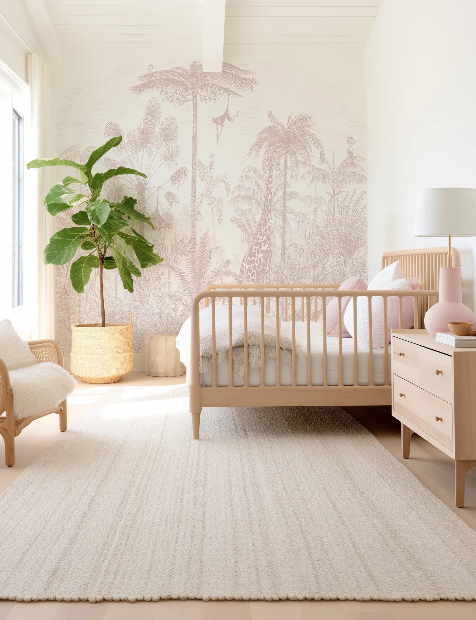
The bedroom is dusty rose's home. The calming, aggression-reducing physiological effect of pink is well documented, and dusty rose inherits that quality without the saccharine tone of brighter pinks. Enveloping a bedroom in dusty rose — wallpaper on all four walls, not an accent wall — creates the cocooning quality that designers currently call "moody minimalism." Pair with cream linen bedding, a single piece of art above the bed, walnut side tables, and a sage or oatmeal rug. Our bedroom wallpaper collection is where to start.
For a bedroom that needs to register as gender-neutral, layer charcoal or walnut rather than cream — the darker companion tone shifts the palette from feminine to designed. Our Vintage Jungle in Dusty Pink Wallpaper Mural is the single most popular wallpaper in our dusty rose range for shared master bedrooms, precisely because the botanical pattern reads as sophisticated rather than sweet.

Vintage Jungle in Dusty Pink Wallpaper Mural · Blushing Protea Art Print
The Powder Room — The Jewel Box
The powder room is dusty rose's second natural habitat. A small windowless room benefits enormously from a fully enveloping colour — it erases the awkward geometry and turns the space into something intentional. Four walls and ceiling in dusty rose wallpaper, a warm brass tap, a gilt mirror, a single scented candle. This is where you can be braver with pattern — Blush Peony Floral or English Rose are both maximalist enough to fill a small room without becoming overwhelming.
The Dining Room — The Unexpected Choice
Dining rooms have traditionally been painted moody — deep green, oxblood, navy. Dusty rose is the current contrarian pick. Softer than those heavy tones, still atmospheric under candlelight, and — because pink reduces aggression — genuinely conducive to long dinners. Pair with black timber dining chairs, linen napkins, and a single gold pendant. It photographs elegantly, which matters more for dining rooms than any other room; these are the spaces people share.
The Nursery — A Grown-Up Option
Most nursery pinks are sticky-sweet. Dusty rose is the sophisticated alternative — a nursery that the child will not outgrow at age five and that the parent genuinely enjoys being in. Every Olive et Oriel wallpaper is PVC-free, VOC-free, and fire-rated — so it is safe for a child's room. Pair with cream, oatmeal, pale oak timber, and rattan pieces. The nursery wallpaper range includes a curated selection of muted pinks — and because our wallpapers are custom-sized to your wall, you will not waste a roll.
The Home Office — Creative Energy Without Distraction
Dusty rose is emerging as one of the most-specified home office colours of 2026. The reasoning is practical: it is warm enough to be welcoming on a Monday morning, muted enough not to distract on a deadline, and photographs well on Zoom — a consideration that did not exist five years ago but now determines colour choices in real offices. A dusty rose feature wall behind the desk, walnut shelving, a single piece of bold art on an adjacent wall. Avoid beige — the contrast is what keeps the room alive.


Blush City Art Print · Palms on Pink Art Print
The Living Room — As an Accent
This is the one room where we advise restraint. Dusty rose as the dominant colour in a living room can read as overly soft for a space that needs to hold daily life — children, pets, dinner parties, the occasional argument. Instead, use it as an accent: a dusty rose velvet armchair, dusty rose cushions on a neutral sofa, a single dusty rose painting above the mantel. The rest of the room sits in cream, walnut, and charcoal — dusty rose becomes the moment rather than the stage. Browse our living room art for pieces that bring the palette in without committing a whole wall.
Art in Dusty Rose: Anchoring the Palette
Art is how you commit to dusty rose without committing a whole wall. A single well-chosen print above the bed or sofa tells the room what colour it is without the expense or permanence of wallpaper. For rentals, it is the entire strategy.


Bathing Roses II Art Print · Pink Tulip Illustration II Art Print · Heritage Rose Art Print
Three categories of dusty rose art work, and they work differently. Botanical illustrations — Pink Lisianthus II, Pink Tulip Illustration II, Heritage Rose — read as classical and bring a garden reference into the room. Soft abstracts like Pink Squares by Melissa Donoho and Blush City bring the colour without any figurative content, which suits modern rooms. And photographic pieces — our Blushing Protea and Pale Rose — bring a tactile, almost botanical-specimen quality that works especially well in bathrooms and dressing rooms.
One principle for hanging: frames matter as much as the image. For quiet-luxe rooms, slim gold or warm brass frames amplify the dusty rose without competing with it. For moody or charcoal-led schemes, matte black frames sharpen the palette. Avoid raw timber on dusty rose art — the tone clash feels accidental rather than considered. If you are unsure where to start, our wall art hanging guide covers spacing, height and composition for gallery walls and single pieces.

Blushing Ficus I Art Print · David Austin Roses Art Print
Materials: What Goes With Dusty Rose
- Timber: Light oak and white-washed timber are the first pick — the blonde warmth echoes dusty rose's warm undertone. Walnut works for contrast when you want a moodier scheme. Avoid orange-toned teak and cedar — the tone clash reads as 1970s rather than 2026.
- Stone: Pink-veined marbles like Rosa Portogallo or Breccia Capraia are the dream pairing. For budget schemes, white marble with grey veining works universally. Avoid green marble — it fights the grey undertone in dusty rose.
- Metals: Brushed brass, aged bronze and rose gold all amplify the warm read. Iron and matte black anchor the cooler, moodier read. Chrome is the only metal that should never meet dusty rose — the cool high-polish surface reads plastic next to a warm muted wall.
- Fabrics: Linen in cream or oatmeal is the workhorse. Velvet in burgundy, deep mauve or forest green adds the richness that quiet-luxe rooms need. Bouclé in ivory softens without adding colour. For rugs, natural jute and sisal ground the palette; for a more formal room, a vintage Persian or a muted Moroccan Beni Ourain works elegantly.
- Ceramics and glass: Matte unglazed terracotta, pale celadon, smoked amber glass. These are the finishing details that lift a dusty rose room from good to designer.

Tongue and Groove Wallpaper in Pretty Pink
Wallpaper or Paint: The Honest Answer
Dusty rose is one of the few colours where the wallpaper-vs-paint question has a clear answer. Paint gives you a single flat tone on a flat wall — and because dusty rose is muted, a single flat tone can read as flat and uninteresting. Wallpaper gives you pattern, texture and tonal variation built into the print, which is why a dusty rose wallpapered room almost always looks more designed than a dusty rose painted room.
The exception is if you are using paint as a ground for layered art — a gallery wall, framed prints stacked three deep, paintings. There, flatness is a feature. But for a bedroom headboard wall, a powder room, or any room where the wall is the focus, specify wallpaper. Our custom wallpaper is sized to your exact wall dimensions — so you order what you need, not a stock roll count that leaves you with offcuts. Start with our how to measure wallpaper guide, or request a fully custom dusty rose wallpaper made just for you if you want a design, scale or tone that is not in the core range.
One more point on paste-the-wall versus peel-and-stick. For homeowners, paste-the-wall is the premium install — it sits flatter, lasts longer, and reads as a permanent piece of the house. Our paste-the-wall installation guide walks through it. For renters, peel-and-stick is the whole point of the range — fully removable without damage, and available in every pattern. We ship peel-and-stick to 40+ countries with all import duties paid.


Modern Marble Wallpaper in Blush · Pink Marble Wallpaper
The 2026 Forecast: Where Dusty Rose Goes From Here
Colour trends move in families. The dusty rose family is shifting warmer. Where 2023's dusty rose leaned cool and greyed — almost ashen — 2026's dusty rose leans toward clay and terracotta. Call it "clay pink," "terracotta rose," or what Benjamin Moore is calling "Gracious Rose." It is the same palette with the thermostat turned up: more warmth, more saturation, more earth.
This matters for how you pair the colour going into 2026 and 2027. A clay-leaning dusty rose sits beside burnt umber, deep ochre, unglazed terracotta ceramics and mustard linen. A cooler dusty rose sits beside sage, dove grey, slate blue and aged silver. Both are current; the clay-leaning version is the one trending up. If you are specifying a wallpaper this year that you want to live with for five, lean slightly warmer than you would have last year. Our Aura in Pink Sands and Sweet Leaves in Dusty Pink are both on the warmer end of the range and will age elegantly into the coming clay-pink moment.

Flutter in Blush Wallpaper · Blushing Ficus I Art Print
Designer Tips Before You Commit
- Order the $4.99 sample (48cm × 40cm / 19in × 16in). Dusty rose shifts dramatically between warm and cool light. Afternoon sun pulls out the pink; morning light pulls out the grey. Tape the sample to the wall for a full 24 hours before you decide. Samples are wallpaper-only — not available on art prints.
- Never pair with bright cool white. Stark white makes dusty rose look washed-out and flat. Always choose warm white, ivory or cream trim and ceiling.
- Commit to the whole room. Accent walls are a 2015 move. Enveloping the room in dusty rose reads as a confident 2026 decision. If you are not ready, use art instead of wallpaper until you are.
- Layer one unexpected colour. Sage, charcoal, navy or deep mauve — pick one and carry it through textiles, art and a single furniture piece. The contrast is what keeps the room from reading as a wash.
- Mind the ceiling. A dusty rose room with a stark white ceiling reads as unfinished. Paint the ceiling a shade lighter than the walls — we call it "tonal drench" — or carry the wallpaper up.
- Worldwide delivery, all duties paid. Whether you are in Sydney, Melbourne, London, Auckland or New York, we ship with every import duty covered. No surprise fees at your door — a point our UK and US customers in particular appreciate.
Frequently Asked Questions
Is dusty rose too feminine for a shared bedroom?
No. Dusty rose reads as a warm neutral from across the room and only reveals its pink undertone on close inspection. That is exactly why interior designers recommend it for master bedrooms shared by partners with different colour preferences. Pair it with charcoal, sage, or walnut timber and the palette registers as sophisticated and grounded rather than sweet.
Will dusty rose work in a men's bedroom or a gender-neutral space?
Yes, and better than most pinks. The grey content in dusty rose removes the saccharine quality of blush and ballerina pink. A dusty rose feature wall paired with black metal, oak timber, and a charcoal rug reads as a considered palette rather than a feminine one. Many of our male customers choose dusty rose for home offices and bedrooms for this reason.
Does dusty rose date as quickly as millennial pink did?
It does not. Millennial pink was a specific saturated hue tied to a cultural moment between 2016 and 2019. Dusty rose is a broader family of muted pinks that has been documented in European interiors since the 1920s and in Scandinavian design since the 1950s. The grey undertone gives it permanence — it is closer to a warm neutral than a statement colour, and warm neutrals do not date.
What are the best rooms for dusty rose?
Bedrooms are the primary win. Powder rooms and bathrooms come second — small rooms benefit from the jewel-box effect of enveloping colour. Dining rooms work elegantly if you want a softer, more intimate atmosphere than a charcoal or deep green would provide. Home offices and nurseries are excellent. Living rooms work if dusty rose is an accent rather than the dominant tone.
Is dusty rose wallpaper or paint the better choice?
Wallpaper gives you depth that paint cannot. Dusty rose paint is flat — a single tone on a flat wall. Dusty rose wallpaper carries pattern, texture, and tonal variation within the print, which is why designers increasingly specify wallpaper over paint for rooms that need atmosphere. A painted wall in dusty rose can feel student-housing pink. A wallpapered wall in dusty rose reads as a designed space.
Should I use dusty rose on an accent wall or the whole room?
Enveloping the whole room is more contemporary. The accent wall as a concept is dated — current design language treats colour as a full commitment. If you love dusty rose, put it on all four walls and the ceiling. The room reads as an immersive considered space rather than a half-measure. If you are anxious about the commitment, order a $4.99 sample and live with it for a week first.
What furniture and textiles work with dusty rose?
Light oak and walnut timber are the first pick. Brushed brass, aged bronze, and rose gold hardware all complement the warm undertone. For textiles, linen in cream or oatmeal is the workhorse — velvet in burgundy or deep mauve adds richness, boucle in ivory softens, and natural jute or sisal rugs ground the palette. Avoid chrome and pure white — both fight dusty rose.
I rent. Can I still use dusty rose wallpaper?
Yes. Every Olive et Oriel wallpaper is available as peel-and-stick — fully removable without damage to painted walls. Sydney, Melbourne, Brisbane, London, New York, Auckland — renters in 40+ countries order our peel-and-stick wallpapers for exactly this reason. Read our peel-and-stick prep guide before installing.
Browse the Dusty Rose Range
Start with our pink wallpaper collection for the full range of dusty rose and blush patterns — everything from oversized peony murals to subtle textural abstracts. For art, our pink art print collection gathers every botanical, abstract and photographic piece in the palette. And if you want something bespoke — a custom tone, scale or design not in the range — request a fully custom wallpaper made just for you. We ship worldwide with all duties paid, four business days' production on custom orders, and $4.99 wallpaper samples before you commit. Read more palette and trend guides on On the Wall, or browse our bedroom wallpaper, nursery wallpaper and wall murals collections for more ways to bring dusty rose home.


