

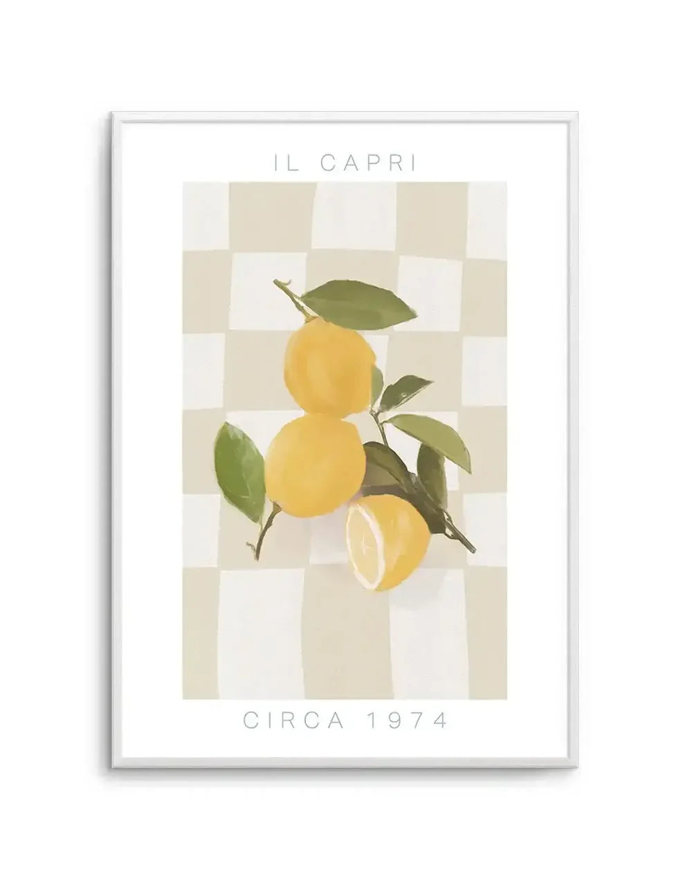
Kitchen wall art is the decorating decision most Australian homes never make, the kitchen gets the renovation budget, the appliance upgrades, the stone bench, and then the walls stay bare because nobody thinks of it as an art room. It is, and the homes that treat it as one feel different the moment you walk in. This is the complete guide: where art belongs in a kitchen, what survives there, and why the least formal room in the house is the most fun to buy for.
Everything here is printed at our West Gosford facilities on archival stock, the kitchen wall art collection exists precisely because the kitchen deserved better than novelty posters.


Il Capri Art Print · The Classic Margarita By Jenny Liz Rome Art Print · Summer Sessions Art Print
Why Kitchens Went Bare (and Why They Should Not)
The modern Australian kitchen is the most-occupied room in the house, the actual living room by hours logged, and the last to receive art. Partly it is surface anxiety, tiles and splashbacks feel undrillable; partly it is a hangover from when kitchens were service rooms rather than social ones. Both reasons are expired. Kitchens today have open wall above benches, servery nooks, shelving runs and breakfast corners, and every one of those surfaces changes character with one framed print on it. If the kitchen flows into a dining zone, the two rooms' art should be planned as one conversation, our dining room collection is the natural continuation of everything below.
The payoff is disproportionate because expectations are low. Art in a living room is expected; art in a kitchen is noticed. A single cocktail illustration above the coffee machine or a market-scene print by the pantry reads as a household with a sense of itself, and guests comment on kitchen art more than any other placement in the house, we hear it from customers constantly, usually with some version of "why didn't I think of that", which is the whole point: nobody thinks of it, so the households that do stand out immediately.
The kitchen is where the household actually lives. Its walls should know that.
The Placement Map: Where Art Lives Safely
Kitchens have a working zone and a living zone, and the map is simple: art belongs in the living zone. The cooking triangle, cooktop, sink, the bench between, generates heat, steam and airborne oil, and nothing you care about should hang inside it. Everything else is fair territory: the wall above the coffee station, the servery and breakfast bench backdrop, the pantry-side wall, the dining nook, and the tops of open shelving where a leaned frame sits among the crockery.
The leaned frame deserves special promotion in this room. No drilling into tile, instant seasonal rotation, and easy lift-down cleaning; an A4 or A3 from the print range leaned on a shelf is the lowest-commitment art placement in the house and one of the most charming. For hung pieces, standard picture hooks in plasterboard handle everything kitchen-sized, and the hanging guide covers the tile-adjacent tricks.


Whisky Sour By Jenny Liz Rome Art Print · Spaghetti by Britney Turner Art Print
What Kitchen Art Does Best: Appetite, Wit and Colour
Every room has a mood it does best, and the kitchen's is appetite. Food and drink illustration is the native language, pasta studies, citrus, the cocktail series school of charm, work that makes people feel like staying for another coffee. It is the one room where art is allowed to be funny, and the Jenny Liz Rome and Britney Turner illustration ranges we print live disproportionately in kitchens for exactly that reason.
Beyond the literal food-and-drink subjects, colour-forward work thrives here: kitchens are full of hard neutral surfaces, stone, steel, white joinery, and a saturated print supplies the warmth the materials withhold. Mediterranean scenes, market flowers from the flower market range, aperitivo culture, the whole sunlit-table genre belongs, and the kitchen canvas range carries it for the walls safely beyond the cooking zone. What rarely works is solemnity: moody formal abstraction in a breakfast nook reads like a dinner guest who will not relax.
Format Rules: The One Room That Prefers Glass
Kitchens flip the usual format logic. Everywhere else, canvas versus framed print is a style call; in the kitchen it is practical, glazed framed prints wipe clean, canvas weave holds whatever the air delivers, so framed wins in any placement within cooking distance. Matte fine art paper behind glazing is the specification for every piece in our kitchen and bar collection, and it is the right one.
Size runs smaller here than any other room because viewing distance is arm's length, not across-the-room. A3 and A2 framed carry open walls; A4 works leaned and in clusters; the 50x70 scale is reserved for the dining nook or a genuinely large servery wall. A trio of small framed prints stepping along a shelf run outperforms one large piece in most kitchens, rhythm suits a room you move through constantly, and the pairs and trios range arrives pre-matched for exactly this job.


Our Home · La Dolce Vita by Britney Turner Art Print
Kitchens That Host: The Bar Wall
The drinks corner has become a fixture of Australian kitchens and butler's pantries, and it is the single best small art moment in the modern home. One framed cocktail illustration above the bottles and glassware turns a shelf of spirits into a considered bar; a pair, negroni and margarita, say, turns it into a destination. This is also prime gift territory: bar-wall art from the cocktail range is the rare present that is personal, useful and impossible to get wrong for anyone who entertains.
For the full entertainer's kitchen, carry the same mood through to the adjacent dining zone, the dining room guide picks up where the servery ends, and a shared palette across kitchen and dining art makes an open-plan space read as one designed room rather than two rooms arguing.
Open-Plan Kitchens: Art as the Zoning Tool
Most new Australian homes run kitchen, dining and living as one volume, and art is the cheapest zoning tool the layout has. The principle: each zone gets its own art moment, but the moments share a thread, a palette note, a consistent frame finish, a mood that flexes rather than flips. The kitchen corner carries the wit, the dining wall carries the anchor, the living wall carries the scale, and a colour that appears in all three, a terracotta, an olive, a denim blue, stitches the run together so the eye reads intention from one end to the other.
The mistake in open plans is either extreme: identical art everywhere, which reads as a hotel corridor, or three unrelated schemes, which makes one room feel like three rentals. The thread method threads between. It also future-proofs: when the living room art eventually upgrades, the kitchen and dining pieces still agree with the newcomer as long as the thread survives, which is why we advise choosing the shared colour from the room's permanent materials, the timber, the stone, rather than from any single artwork passing through.
Renters, First Kitchens and the Weekend Upgrade
The rental kitchen is usually the most dated room in the lease and the least permitted to change, which makes it precisely where art earns hardest. Nothing in the placement map requires a drill: leaned frames on shelves and benches, removable hooks on the one open wall, and the whole scheme moves out in a box. A dated rental kitchen with two good prints in it stops apologising; the beige tiles stop being the story because something in the room finally has a point of view.
The same weekend-upgrade logic applies to first homes waiting on the real renovation. Art now, renovation later, is the right order more often than people think: the prints cost a fraction of a single appliance, they survive the eventual renovation and rehang into it, and they buy years of liking a kitchen you were merely tolerating. We have watched this sequence play out in customer photos for a decade, and the kitchens with art in them get renovated more calmly, the household already likes being in the room, so the renovation becomes an upgrade rather than a rescue.
Seasonal Rotation: The Kitchen's Secret Advantage
Because kitchen art runs small and much of it leans rather than hangs, this is the easiest room in the house to re-dress, and the one where rotation feels most natural. Citrus and spritz prints for summer, market flowers for spring, moodier still-life work for winter: two or three pieces per position, swapped when the season turns, keeps the busiest room in the house feeling current for the cost of one extra print per spot. Store the off-season pieces flat in a kitchen drawer with a sheet of baking paper between the frames; they are the only artworks in the house whose storage is two steps from their wall, and the swap takes less time than unloading the dishwasher.
Rotation also solves the commitment problem that stalls most kitchen art purchases. You are not choosing the print for this wall forever; you are choosing this season's shift. That lower stake is exactly why we suggest the kitchen as the starting room for households new to buying art, the prices are the lowest, the formats are the smallest, the room is the most forgiving, and the pleasure-per-dollar is the highest in the house. Start with one A3 above the coffee machine, from $9.95 at the smallest size, and let the habit grow from there, most of our repeat customers' first-ever order was something small for a kitchen.
Frequently Asked Questions
Where should art hang in a kitchen?
Away from the splashback and cooktop zone, where heat and oil live. The natural spots: the wall above a coffee station or servery bench, the pantry-adjacent wall, above open shelving as a leaned piece, and the dining nook if the kitchen has one. Every kitchen has at least one wall the cooking never touches.
Will steam and cooking damage framed prints?
Not in the placements above. A framed print two metres from a cooktop with a working rangehood lives as long as one in the hallway. The genuine no-go is directly beside or above the cooking zone, where airborne oil settles on everything, glazing included.
What style of art suits kitchens?
Wit and appetite: food and drink illustration, market and cafe scenes, colour-forward abstracts, vintage-leaning prints. The kitchen is the least formal room in the house, and art that takes itself slightly less seriously belongs there.
What size art works in a kitchen?
Smaller than the living room, larger than you think: A3 to A2 framed on open wall, A4 pieces leaned on shelves, and a 50x70 above a dining nook table. Kitchens are viewed close-up, so smaller detailed work earns its place.
Can I lean art on kitchen shelves instead of hanging?
It is one of the best kitchen moves: a framed A4 or A3 leaned among the crockery restyles in seconds, avoids drilling tiles, and keeps the art easy to lift down when the shelf needs cleaning. Rotate seasonally without a single hole.
Is kitchen art a good gift?
The best kind, because it is low-stakes and high-charm. A cocktail print for the entertainer or a pasta study for the cook lands better than most gifted art, precisely because kitchen walls invite personality over solemnity.
How do I clean art near a kitchen?
Glazed frames wipe clean with a dry or barely damp microfibre cloth. Choose framed prints over bare canvas for kitchens: glazing is wipeable, canvas weave is not, which is the one format rule this room has.
Start in the kitchen wall art collection, browse the bar and cocktail range, or pick a leaning-size piece from the art print range. Printed and framed in West Gosford, shipped ready to hang or lean, and guaranteed to be the least expensive thing in your kitchen renovation by several orders of magnitude.


