Striped wallpaper is one of the most technically demanding pattern types to use well in interior design — not because it is complex, but because the received wisdom about it is incomplete. Every guide tells you that vertical stripes make rooms feel taller and horizontal stripes make rooms feel wider. This is true. What none of them tell you is that these effects are contingent on a series of variables — the stripe width relative to the wall width, the contrast between stripe colours, the interaction with the floor material and direction, and the specific quality of natural light in the room — that determine whether the spatial illusion you intend is the one you achieve. Used correctly, striped wallpaper is among the most powerful spatial tools available. Used without understanding these variables, it can actively make a room feel smaller, colder, or more chaotic than it did before.
At Olive et Oriel, we manufacture striped wallpaper at our Central Coast of New South Wales facility, custom sized to the exact wall dimensions of each customer. Over more than a decade of supplying Australian homes and international clients in more than forty countries, we have seen every possible combination of stripe direction, width, colour relationship, and room type. The guidance that follows is drawn from that experience, with particular attention to the Australian residential context: our ceiling heights, our home typologies (Queenslander, federation cottage, contemporary apartment, coastal house), and the specific quality of Australian natural light, which interacts with stripe patterns differently from the temperate European conditions for which most stripe guides are written.


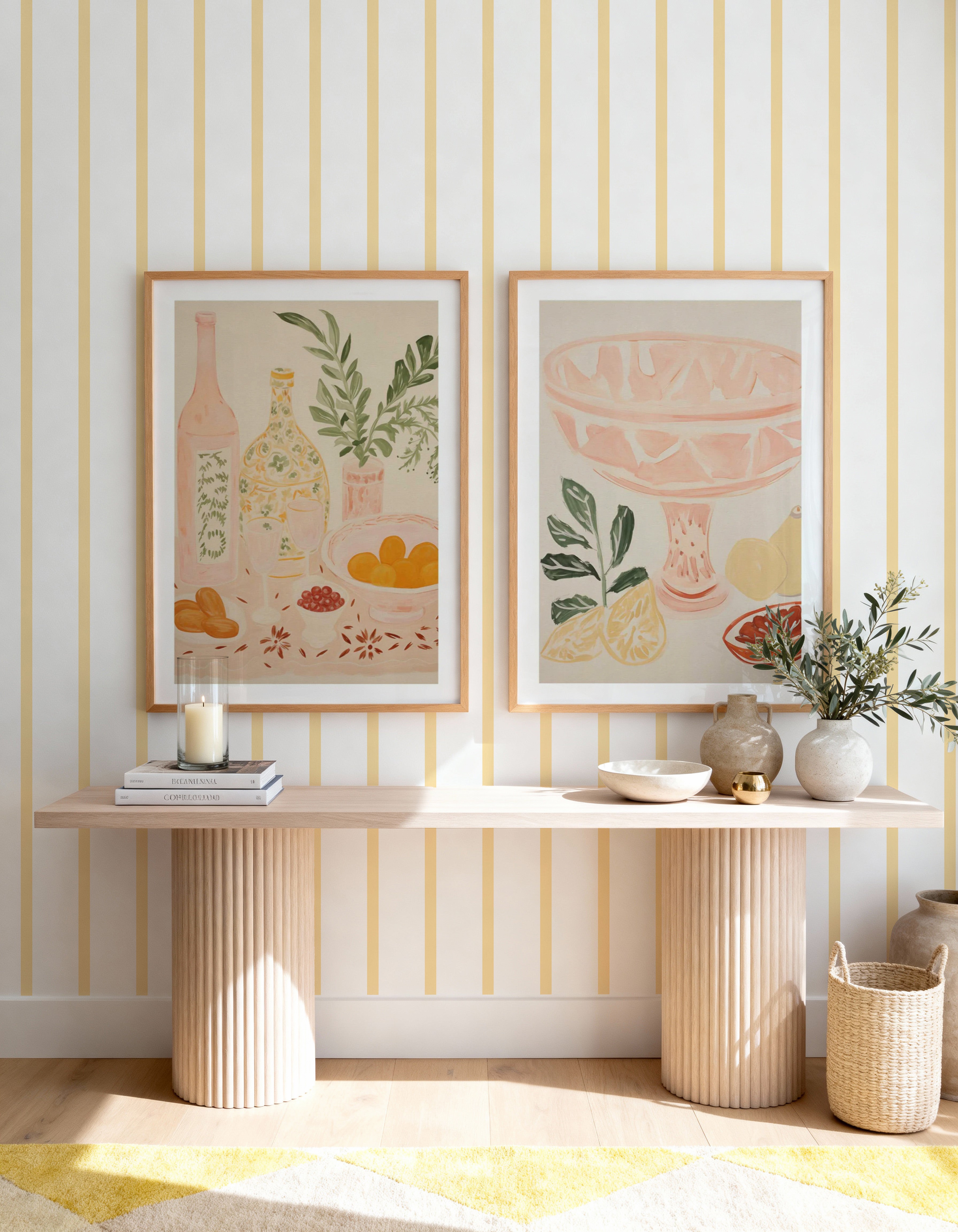
Stripe Wallpaper In Lemon · Linen Double Stripe in Soft Sage Green Wallpaper · French Linen Stripe in Beige Wallpaper
Before discussing direction and scale, the most important variable deserves to be stated clearly: stripe contrast. The visual effect of any stripe pattern is primarily determined not by the direction of the stripe or its width, but by the contrast between the two tones or colours that make up the stripe. A high-contrast stripe — black on white, navy on cream, dark forest green on pale linen — creates a strong, graphic, energetic spatial effect. A tonal stripe — two values of the same hue, or two adjacent neutrals — creates a quiet, atmospheric, enveloping effect. These are not different degrees of the same thing; they are qualitatively different design tools with qualitatively different appropriate applications.
In the Australian residential context, high-contrast stripes suit entrance halls, powder rooms, and dining rooms — spaces of brief, energised occupancy where visual impact is more important than sustained restfulness. Tonal stripes suit bedrooms, living rooms, and studies — spaces where the wallpaper is experienced over extended time and where a quieter, more atmospheric quality is the appropriate register. Most Australian homes benefit from tonal stripes rather than high-contrast stripes in the spaces where family life is actually lived, reserving the high-contrast options for the moments of transition and brief encounter.
The Mechanics of Spatial Illusion
Vertical stripes create the impression of height because the eye follows vertical lines upward. The brain extrapolates the direction of the line — upward — and registers the ceiling as further in that direction than it physically is. This effect is strongest when three conditions are met: the stripe extends unbroken from skirting board to ceiling cornice, the stripe contrast is moderate rather than extreme, and the stripe width is narrow relative to the wall width. A room that already has generous ceiling height — 2.7 metres or more, which is common in older Australian homes and new construction — does not always benefit from vertical stripes. Adding visual height to a room that already feels generous creates an environment that can feel cold and echoey rather than spacious. Vertical stripes are most valuable in rooms with ceiling heights between 2.4 and 2.6 metres, where they provide meaningful visual relief.
Horizontal stripes create the impression of width because the eye follows horizontal lines across the wall, registering the room as wider in the horizontal dimension. In Australian residential design, horizontal stripes are less commonly used than vertical, and for good reason: most Australian living rooms and bedrooms are already wider than they are tall (unlike the narrow, tall rooms of European period architecture), so adding horizontal visual expansion is less frequently the spatial problem that needs solving. Where horizontal stripes work best in Australian homes is in narrow corridors, in entrance halls with a pronounced horizontal dimension, and in rooms where the ceiling is so low that adding visual width is preferable to emphasising the ceiling further with a vertical stripe.
The interaction with floor material and direction is a variable that almost no stripe guide addresses. In Australian homes with timber floorboards — which run along the longest dimension of a room in the vast majority of installations — the direction of the floor grain creates a strong horizontal visual element that must be considered alongside the stripe direction. In a room where the floor runs horizontally (along the room's width), a vertical stripe on the walls creates a productive cross-directional tension that reads as designed rather than accidental. A horizontal stripe in the same room doubles the horizontal emphasis and can make the room feel low and wide rather than balanced. Understanding this interaction before selecting stripe direction is part of the research process that distinguishes considered design from guesswork.
Scale: The Most Misunderstood Variable
Stripe width relative to wall width determines how the pattern reads from the primary viewing position. A stripe that is 5cm wide on a 4-metre wall will create 40 visible stripe repetitions across that wall. At the primary viewing distance of 3 to 4 metres, this creates a tight, busy rhythm that can feel relentless rather than dynamic. The same stripe at 15cm width creates 13 repetitions — a rhythm that has more visual rest between elements and reads as more generous and considered.
The principle: stripe width should scale with wall width and room size. In a small bedroom feature wall of 3 metres, a stripe of 5 to 10cm creates an appropriate rhythm. In a large living room feature wall of 5 metres, a stripe of 15 to 25cm is more appropriate. Our custom sizing capability is particularly relevant for striped wallpaper: standard roll widths often produce stripe patterns where the stripe width was not calculated for the specific wall dimensions of the installation, creating partial stripes at the corners or edges. Our panels are produced to your exact wall dimensions, so every stripe is complete and the pattern resolves correctly at every edge.
"The stripe that looks right at 30cm viewing distance in a showroom sample is almost always too narrow at the 3-metre viewing distance from which most walls are actually experienced. Scale up from what feels right in the hand to what works in the room."


Petite Stripe In Mist Wallpaper · Arlo Stripe Wallpaper
Materials
- Substrate selection: Our Paste the Wall Smooth is the correct substrate for any striped wallpaper where the precision of the stripe line is a design priority. The smooth surface allows the printed stripe edge to remain sharp and uninterrupted across the full panel width. Our Paste the Wall Linen adds a surface texture that slightly softens the stripe — appropriate for tonal stripe applications where the texture itself is part of the atmospheric quality sought.
- Timber floor direction: Assess the direction of any timber floor in the room before selecting stripe direction. Floors running along the room's length (most common in Australian residential installation) create a horizontal visual element that should inform whether a vertical or horizontal stripe creates the spatial balance you are seeking.
- Ceiling height assessment: Measure the room's ceiling height before selecting vertical vs horizontal stripe direction. Rooms with ceiling heights below 2.5m benefit most from vertical stripes. Rooms with ceiling heights of 2.7m+ should consider whether additional height emphasis is actually what the room needs, or whether horizontal emphasis would create better balance.
- Colour undertone matching: Stripe colour choices must be assessed in the room's specific light. The warm Australian afternoon light that characterises north-facing rooms intensifies warm-toned stripes and can make a cream-and-white stripe read as yellow-and-white. The cool, diffused light of south-facing rooms can make warm-toned stripes look grey. Test the sample in the room at different times of day before committing.
Room by Room
- Bedroom: Tonal vertical stripe on the headboard wall. The visual height effect contributes to the restful quality of the bedroom without requiring the graphic energy of a high-contrast stripe. A linen-textured substrate with a tone-on-tone stripe is the most sophisticated application in this space.
- Entrance hall: High-contrast vertical stripe on all walls or on the primary long wall. The entrance hall is the room where the graphic energy of a high-contrast stripe reads most appropriately — it is a transitional space associated with arrival and departure rather than sustained occupation.
- Living room: Tonal stripe on a single feature wall — the wall most visible from the primary seating position. A wide, low-contrast tonal stripe in a warm neutral creates depth and atmosphere without competing with the room's other design elements.
- Dining room: Vertical stripe on the wall adjacent to the table. Creates the sense of occasion and formality that the dining room benefits from. High-contrast stripes are appropriate here in a way they are not in living rooms because dining room occupancy is brief and associated with social engagement rather than rest.
- Narrow hallway: Horizontal stripe on the end wall to create a visual terminus and sense of arrival at the far end of the corridor. On the long walls of a narrow hallway, vertical stripes can feel claustrophobic — the walls already feel close, and adding visual height emphasises the corridor's narrowness.
Designer Tips
- Order the $4.99 sample (48cm × 40cm) and hold it vertically against the wall at the primary viewing distance from the room. Assess the stripe width as it will appear at actual scale on the actual wall. The most common mistake in stripe selection is choosing a width that reads well in the hand but is too narrow at room scale. Order the sample, prop it against the wall, and step back 3 metres before making the final decision.
- Custom sizing is essential for striped wallpaper. Standard roll widths almost never divide evenly into the widths of real Australian walls, resulting in partial stripes at corners and edges that undermine the pattern's precision. Our panels are manufactured to your exact wall dimensions — every stripe is complete from edge to edge, floor to ceiling. No partial stripes, no awkward corner cuts. Production takes 4 business days at our Central Coast NSW facility. All import duties covered globally on wallpaper orders.
- In Australian homes with VJ board (vertical joint board) walls — common in Queenslanders and coastal properties — a vertical stripe wallpaper over VJ creates a striped-on-striped composition that requires careful consideration. The stripe spacing of the wallpaper pattern should be deliberately different from the VJ board spacing to create clear distinction between the pattern and the substrate texture beneath it.
Browse our full wallpaper collection, read our guide to making small rooms feel larger, or explore our complete guide to wallpaper for open-plan living.


