

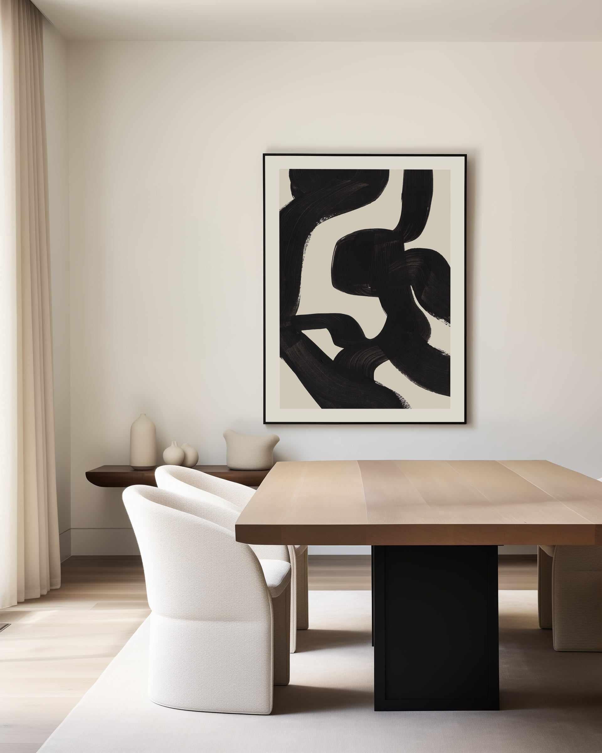
Neutral abstract wall art is the most specified art category in Australian interiors, by designers, by stagers, by anyone furnishing a premium space that has to please many eyes over many years. It is also the easiest category to buy badly, because at low quality, neutral just means faint. This guide covers what separates gallery-grade neutral abstraction from beige filler, and how to use the category's depth properly.
Our Modern Contemporary Art in Neutrals collection, 700-plus works, is the designer-favourite corner of our range and the one trade clients return to most; we design, print and frame it all at our West Gosford facilities. Consider this the collection's field manual.


Zebra · Greenwich No 1 · Greenwich No 2
What Makes Neutral Abstraction Work
Stripped of saturated colour, an abstract work succeeds on three things: tonal range, surface interest and compositional confidence. The tonal range must travel, bone through greige into umber or charcoal, because one-value works disappear into painted walls. Surface interest, wash, grain, gesture, plaster texture, replaces colour as the eye's reward. And composition shows immediately at low saturation: a weak neutral work looks like a swatch, a strong one looks inevitable. The full styling method lives in our earth-toned abstract guide; this piece is about using the category at specification depth.
Beige fails as a colour and succeeds as a range. Neutral art is bought by the octave, not the note.
The Five Registers Inside the Collection
- Bone and ivory tonal fields: the quietest register, texture-led, for bedrooms and calm living schemes, per the bedroom art rules.
- Greige and stone gesture: visible strokes in warm greys, the workhorse of living rooms and office fitouts alike.
- Clay, ochre and rust: earth-warm works that anchor timber-floored rooms; sibling palette to the brown abstract collection.
- Warm monochrome: charcoal-and-bone compositions bridging into our black and white guide's territory.
- Neutral landscape abstraction: felt horizons in sand and storm tones, the crossover register with Australian landscape photography that coastal and rural projects lean on.


Why Designers Default Here (and Should)
- Client-proof: neutral abstraction offends nobody and elevates everything, the correct risk profile for staging, display suites, hotels and shared spaces.
- Scheme-proof: it survives repaints, recoverings and rebrands; the artwork outlives the sofa it was chosen with.
- Series depth: the collection runs deep in related works, pairs, trios, extended families, which is what multi-room and multi-floor projects actually need; hang them per the gallery wall method.
- Scale honestly: most works print to order at any size in range, up to genuine extra large statements, in framed canvas or framed fine art prints.
- Trade mechanics: the whole collection sits inside the Designer Trade & Commercial Program, trade pricing, expedited dispatch, custom sizing as standard.
Styling Neutral Abstraction: the Three Moves
- Value spread: art decisively paler or deeper than the wall. Mid-on-mid is the whole reason people think neutral is boring.
- Texture conversation: pair a wash work with a gestural one across a room; sameness of mark flattens faster than sameness of colour.
- One anchoring dark: a work carrying the room's deepest tone (umber, charcoal) keys every paler element. Frame in solid timber, oak finish for warmth, black to formalise, white to float, and keep one finish per room.


Designer Tips
- Buy the pair, not the piece, two related neutral works, like Novetta I and Novetta II, give a wall rhythm no single work can; the pairs guide covers spacing.
- Audition under warm evening light; neutral works shift more between noon and lamplight than any saturated palette.
- In open plans, run one neutral family across zones and vary only scale, per the statement wall guide.
- Hang at the 145cm (57in) centre per the hanging guide; neutral work hung too high reads as wallpaper.
- Every piece is made to order at our facilities, archival pigment inks, hand trimming, solid timber frames, in a couple of business days, shipped to more than 40 countries with duties paid.
Frequently Asked Questions
What is neutral abstract wall art?
Abstract work composed in low-saturation, earth-derived palettes, bone, oat, greige, clay, stone, umber, warm charcoal, where texture, tone and gesture carry the composition. Done well it is the most durable art investment in decorating; done cheaply it is the faint beige rectangle the category is unfairly judged by.
Why do interior designers use so much neutral art?
Risk-adjusted performance: it flatters every scheme, survives redecorating cycles, photographs well, and works in series across many rooms. For staging, hospitality and workplace projects, where art must please many people it will never meet, neutral abstraction is the professional default for good reason.
How do I keep neutral art from looking bland?
Insist on tonal range (the work should travel from near-white to a genuine dark), real surface (wash, grain, gesture, texture) and confident composition. Then style with a value spread against the wall and one anchoring dark in the room. Blandness is a quality problem, not a palette problem.
What frame suits neutral abstract art?
Oak finish is the natural first choice, warm timber completing warm tones. White finish floats pale works on pale walls; black finish formalises warm-monochrome pieces. All our frames are solid timber, made in Australia, one finish per wall.
Does neutral art work in commercial projects?
It is the backbone of them, hotels, offices, healthcare and staging lean on neutral abstraction precisely because it sets a premium register without demanding opinions. Our commercial art guide covers the procurement side.
Canvas or framed print for neutral works?
Texture argues for canvas (no glass between the eye and the surface) on statement walls; framed prints carry fine tonal detail for pairs and gallery walls. Both are made to order in the full size range.
How large should a neutral abstract go?
One size larger than instinct: 60 to 75 percent of the furniture width, centre at 145cm. Because neutral work recedes politely, oversizing never overwhelms, and undersizing is the category's most common regret.
Browse Modern Contemporary Art in Neutrals, the wider abstract collection and extra large works, or apply for trade access. Designed and made on the Central Coast of NSW; delivered worldwide, duties paid.


