There is a moment in every room when you realise a single piece of art is not going to be enough. The wall is too wide, the furniture too long, the space too considered to anchor with one frame. This is when a pair of prints earns its place — not as a compromise, but as the more deliberate choice. Two pieces that belong together, that share a visual logic, that together do something neither could alone. This is a guide to choosing, pairing and hanging wall art pairs in a way that looks intentional rather than accidental.


Matching wall art pairs Australia · Art prints Australia · Framed canvas sets
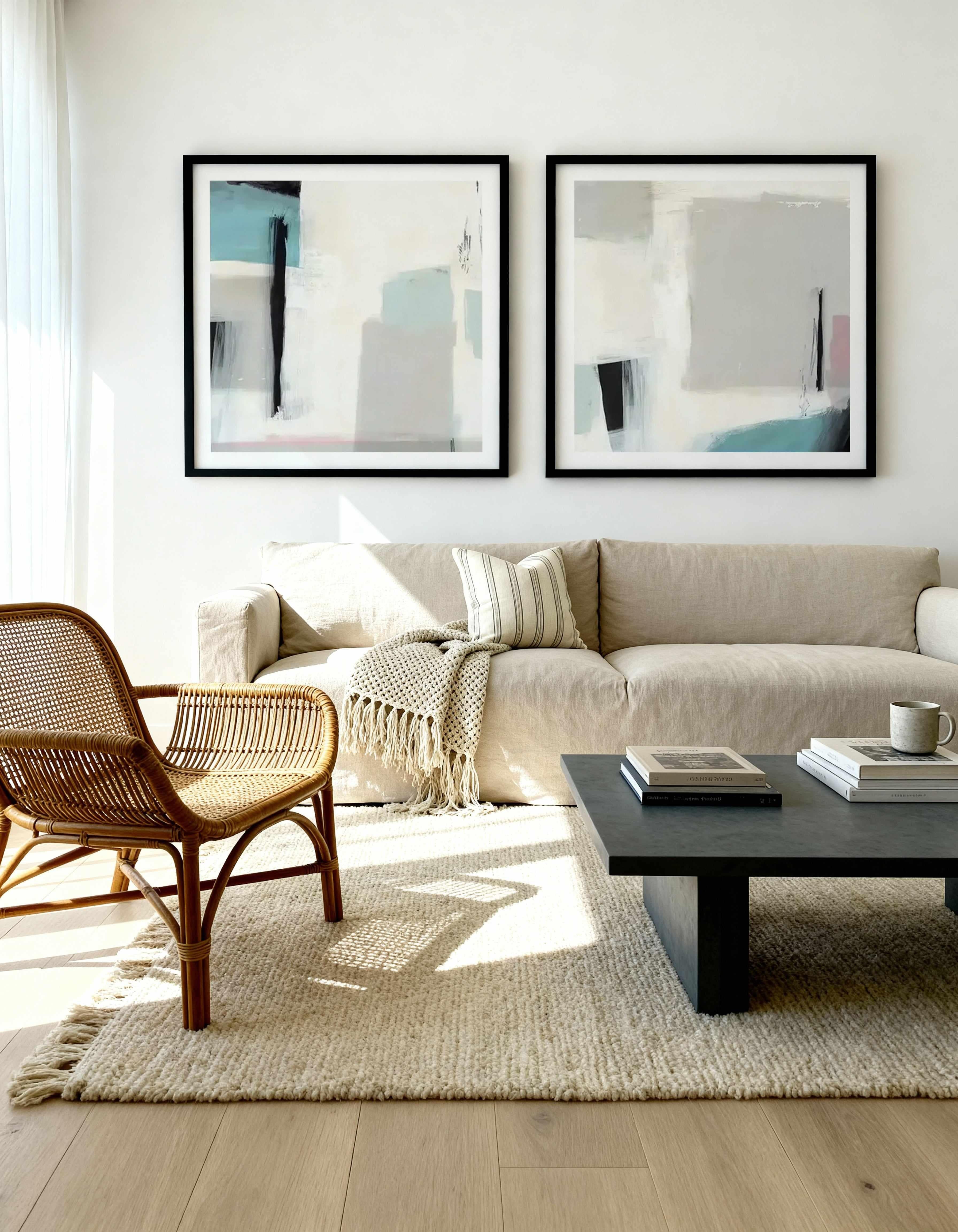
Why two pieces work better than one on a long wall
The brain processes visual symmetry faster than asymmetry. A single piece of art on a wide wall creates an immediate imbalance — the eye moves to the art and then to the empty space beside it, unable to resolve the composition. Two pieces, correctly spaced, complete the picture. The mind settles. The room feels resolved.
This is not a design theory. It is a neurological response. Interior designers use pairs not because they follow rules but because they understand that a room's visual weight needs to be distributed — and two matched pieces distribute it more naturally than one dominant piece flanked by absence. Above a 2m sofa, a correctly sized pair reads as a considered decision. The same wall with a single centred print reads as a starting point that never finished.
The practical rule: for walls between 120cm and 200cm wide, a pair generally outperforms a single statement piece. For walls above 200cm, a trio or a pair with significant scale is more appropriate. For walls under 100cm, a single piece is almost always the right call. Browse our matching wall art pairs — already curated so the visual logic is done for you.
Do matching wall art pairs have to match exactly?
No — and this is the most important thing to understand about pairing prints. The word "matching" is misleading. Pairs do not need to be identical, mirrored, or even from the same series. What they need is a shared visual language: something that connects them, makes them speak to each other, gives the eye a reason to move between them and back.
That connecting element can be any of the following:
Colour. The most reliable pairing method. Two prints that share a dominant tone — both leaning into the same warm terracotta, both working within the same soft blue-green range — will read as a pair even if the subjects are entirely different. The eye connects colour before it connects content.
Mood. Two pieces with the same emotional register belong together. A soft abstract and a muted botanical can pair perfectly if they both speak the same quiet language — restrained, considered, unhurried. The subjects are different. The feeling is identical.
Composition. Look at where the horizon sits in each piece, where the weight falls, where the negative space lives. Two prints with a similar compositional structure — both with weight at the bottom and space at the top, both with a central focal point — will feel paired even without shared colour or subject matter.
Theme. Two coastal prints, two botanicals, two abstract pieces from the same collection. Subject alignment is the most obvious pairing method and the easiest to execute — but it is not the only one, and often not the most interesting one.


Browse matching pairs · Abstract art pairs · Bedroom art pairs
How to choose the right size for matching wall art pairs
The size of each piece in a pair is determined by the wall, not by the art. Start with the wall dimensions, not the product page.
The reliable rule for pairs: the combined width of both prints — including the gap between them — should sit between 50% and 75% of the wall width. For a 180cm wall, that means a total span of 90–135cm across both pieces plus the gap. For a 240cm wall, 120–180cm. The gap between the two prints should be 5–10cm — tight enough to read as a deliberate pair, wide enough that each piece has breathing room.
Orientation matters too. Portrait-oriented pairs (tall prints) work best above furniture with vertical presence — a tall headboard, a fireplace, a console with height. Landscape-oriented pairs (wide prints) work better in wider, lower settings — above a long sofa, across a hallway wall. Mixing orientations in a pair can work, but it requires a very deliberate compositional reason — otherwise it reads as mismatched rather than considered.
Where to hang matching art pairs — room by room
Living room: above the sofa
The most common placement for a matching pair — and the one with the most specific rules. The combined span of the pair should be 60–75% of the sofa width. The bottom edge of the frames should sit 20–30cm above the sofa back. At this height, the art connects to the furniture below it rather than floating independently on the wall. Centre the pair to the sofa, not to the room — if the sofa is off-centre, the art follows the sofa. For further living room styling guidance, see Australian coastal luxe interiors and maximalist styling.
Bedroom: above the bed
Above the bed, a pair of prints works best when the combined span sits at 60–80% of the bedhead width. Hung at 20–25cm above the bedhead, with the visual centre of the pair at 145–150cm from the floor. In a bedroom, pairs should lean towards the calming end of the spectrum — soft tone, restrained composition, nothing that demands too much visual attention. The bed is already the dominant element in the room. The art supports it. For bedroom-specific guidance, see how to design a bedroom that feels genuinely expensive.
Hallway: creating rhythm on a long wall
A hallway pair creates rhythm and pulls the eye along the length of the wall. Portrait orientation usually works better here — tall, narrow prints feel proportional in a corridor setting. Consistent spacing is critical in a hallway: the gap between the pair and the gap between the pair and the end of the wall should feel intentional, not accidental. A pair hung too close to one end of the hallway will make the corridor feel unbalanced.
Dining room: across from the table
In a dining room, a pair works well on the wall opposite the table — the wall most people face during a meal. At this distance, medium-format prints (60–90cm each) with strong compositional interest reward extended looking. Choose pieces with enough visual content to sustain attention over a long dinner, but not so busy that they become distracting during conversation.

Shop all matching pairs · Living room art · Bedroom art
How to hang matching wall art pairs perfectly
The most common mistake when hanging a pair is treating each print as a separate hanging decision. They are not separate. The pair is a single visual unit, and it should be planned and hung as one.
The process: decide the total span of the pair first (combined width of both prints plus the gap). Find the centre point of that total span and mark it on the wall. From the centre mark, measure left and right to find where each frame's centre sits. Use a spirit level on both marks before making any holes. The pair should be level relative to each other — not relative to the floor, which may not be perfectly even. Hang at 145–150cm from floor to the vertical centre of the pair.
For heavier framed pieces, locate wall studs or use appropriate plugs. Every Olive et Oriel framed canvas arrives with fixings included and ready to hang. For detailed mural installation, see our complete Australian hanging guide.
Designer Tips
After years of working with pairs, a few principles hold across every room and every style:
Match the frame finish before matching the art. Two prints in the same frame will read as a pair even if the subjects are completely different. Two prints in different frames will struggle to read as a pair even if the subjects are identical. Frame consistency is the single fastest way to make a pair look deliberate.
Odd-number spacing is rarely right. If the gap between your pair and the furniture below feels wrong, it almost always means the art is too high. Lower it. Art that connects to the furniture below it feels placed with intention. Art that floats above furniture feels like it was hung without measuring.
Print orientation should follow wall orientation. Portrait prints for portrait walls (tall and narrow). Landscape prints for landscape walls (wide and low). Mixing orientations in a pair requires a deliberate compositional reason — otherwise it looks like an accident.
The curated option is underrated. Choosing two prints that already work together removes the most difficult part of the pairing process. Our matching wall art pairs are selected by our team for colour, mood, and composition — so the visual logic is already done. All you choose is the size and frame finish.
For more on sizing and hanging: the complete wall art sizing guide. For room-specific styling: affordable wall art Australia.
The Olive et Oriel matching pairs collection
Every pair in the Olive et Oriel collection is curated by our team — matched for colour, mood and compositional logic so the decision is already made. Each print is produced to your exact wall dimensions at our Central Coast NSW facilities on 230gsm fine art paper with archival inks. Frames in FSC certified solid timber with custom mouldings exclusive to Olive et Oriel, built using specialised Italian framing equipment. Made in Australia since 2015. Delivered ready to hang.
Find a comparable pair at a better price anywhere in Australia and we will beat it. Not by an inch, by a mile.
Browse: matching wall art pairs Australia — abstract pairs — coastal pairs — bedroom pairs — living room pairs — neutral pairs. For a quick reference, see our matching wall art pairs guide. If your wall needs three pieces rather than two, see our 3 piece wall art sets guide.


