

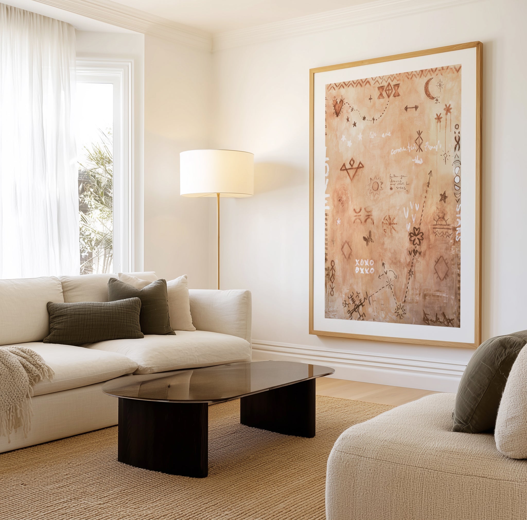
Neutral abstract art is the quiet achiever of decorating: oat, sand, clay, greige and stone compositions that add depth to a room without adding noise. It is the most requested art brief we receive, and the most misunderstood, because neutral done well is not the absence of colour. It is colour with the volume lowered until texture, tone and gesture do the talking.
This guide covers the earth-toned abstract spectrum, how to keep a neutral scheme from going flat, the rooms where tonal art outperforms everything else, and the framing that finishes it. Written from the workbench: we design, print and frame these works daily at our two production facilities in West Gosford, NSW.


Love is All Around II by Jackie Green · Not my First Rodeo by Jackie Green · Your Aura Will Take you Places by Jackie Green
Why Neutral Abstraction Works So Hard
Strip away saturated colour and the eye attends to everything else: the weight of a stroke, the grain of a wash, the balance of warm against cool within a narrow band. That is why a good neutral abstract reads as sophisticated at first glance, the viewer senses the discipline. It is also why cheap tonal art fails so visibly: with nothing to hide behind, weak composition and flat printing show from across the room.
Neutrals are also the register of calm the research actually supports. Brightness and saturation, not hue, are the reliable drivers of how restful a colour feels, and earth-toned abstraction keeps both in the restful zone while still giving the eye organised complexity to settle on. A blank wall is a room holding its breath; a tonal abstract is the quietest possible exhale.
Neutral is not beige. It is every colour, listened to at a whisper.
The Earth-Tone Spectrum
- Oat, bone and sand: the palest register, texture-led works that float on warm white walls. The backbone of our warm minimalism schemes.
- Greige and stone: grey warmed toward putty and mushroom; the register our mushroom greige guide maps in full.
- Clay, ochre and rust: the warm end, where neutral shakes hands with terracotta. One ochre-veined work carries a whole room's warmth; see the terracotta palette guide.
- Mocha and umber: brown's return to fashion is really a return to depth, deep coffee tones ground pale schemes. Our mocha mousse guide covers the pairing palettes.
- Charcoal-warmed monochrome: where neutral meets our black and white abstract guide, greys with brown undertones that read tonal rather than stark.


Abstract Still Life by Doris Schmitz · Abstract Brown by Sharyn Bursic
Keeping Neutral From Going Flat
The failure mode of neutral schemes is sameness: one value everywhere, no texture change, nothing for the eye to travel between. The fixes are mechanical:
- Spread the values. If walls and sofa sit mid-tone, the art must go decisively paler or deeper. Tone-on-tone only works when the artwork carries strong texture.
- Let the art hold the room's darkest dark. An umber or charcoal depth in the artwork gives every paler element something to stand against.
- Mix mark-making. Pair a soft wash work with a gestural or plaster-textured one; sameness of technique flattens faster than sameness of colour.
- Warm the metals and timber. Brass, oak and linen give tonal art its supporting cast; chrome and glass starve it.
Room by Room
- Living room: a large tonal work spanning two-thirds of the sofa width is the fastest quiet-luxury move in decorating; the full register lives in our quiet luxury guide.
- Bedroom: the natural home, low contrast, soft texture, nothing asking for attention at midnight.
- Dining room: clay and umber works glow under warm light and flatter every tableware palette you will ever own.
- Home office: tonal abstraction behind the desk reads composed on camera without becoming a talking point.
- Hallway: a run of related neutral works, one frame finish, gallery spacing, turns passage into procession.


Brown and Black 3 · Brown and Black 1
Framing and Format
Neutral art gives the frame nowhere to hide, so the joinery matters. Oak finish deepens the warmth and is our default for clay, sand and mocha works; white finish lets bone-pale pieces float; black finish sharpens greige and charcoal-warmed works into formality. Every frame is solid timber, cut and joined on Italian machinery by our own artisans in Australia, oak, white or black finish, made to order and despatched in a couple of business days.
Texture argues for canvas: a framed abstract canvas carries wash and grain without glass between you and the surface. Framed fine art prints, hand trimmed on heavyweight archival paper, suit pairs and layered gallery walls. Both live in the brown abstract collection and the wider abstract wall art range.
Designer Tips
- Buy neutral art after the room's biggest textures (sofa, rug) are settled, the artwork should bridge them, holding a little of each.
- Audition at night as well as day; earth tones shift warmer under lamplight, which is usually a gift, but check the room's bulbs first.
- A pair of related tonal works, like Blurred 10 and Abstract and Contemporary 5, gives a neutral wall rhythm that one piece cannot; hang per our pairs guide.
- With wallpaper, let one surface carry the texture and the other the tone; the $4.99 sample (48cm x 40cm / 19in x 16in) settles the pairing in your own light.
- We ship to more than 40 countries with all import duties paid; the price you see is the landed price.
Frequently Asked Questions
What is neutral abstract art?
Abstract work composed in low-saturation, earth-derived tones, oat, sand, greige, clay, mocha, stone, where texture and gesture carry the composition instead of saturated colour. It is defined by restraint of palette, not by any one style: gestural, textural and landscape-derived works can all be neutral.
Does neutral art work on white walls?
Yes, with one check: undertone agreement. Warm whites (cream-leaning) suit sand, clay and mocha works; cool bright whites suit greige and stone. A warm artwork on stark cool white can look yellowed, when in doubt, hold a sample of the wall colour beside the artwork on screen.
How do I stop a beige room looking boring?
Give it range and texture rather than colour. Art that spans from bone to umber supplies the value spread, plaster-textured or gestural surfaces supply the interest, and one black or deep brown accent in the room keys it all together. Boring beige is almost always a values problem, not a colour problem.
What frame suits earth-toned abstract art?
Oak finish is the natural first choice, its warmth continues the palette. White finish for the palest works, black finish where you want tonal art to read formal. Solid timber always; keep one finish per wall.
Is brown art back in style?
Deep browns, mocha, umber, coffee, have returned as the grounding note pale interiors were missing, and forecasters have kept them central through 2026. More useful than the trend cycle: brown-anchored abstraction has never dated in timber-floored Australian homes, because it agrees with what the architecture already owns.
Can neutral abstract art be the room's focal point?
Yes, through scale and texture rather than colour. An oversized tonal work with strong surface, a plaster-effect field, a deep ochre vein, holds a wall as firmly as any saturated statement, and holds it longer. Go one size larger than instinct suggests.
What colours accent a neutral art scheme?
Almost any single saturated colour works because the field is calm: olive, rust, ink blue and burgundy are the reliable friends. Choose one, repeat it twice in the room, and let the tonal artwork mediate.
Browse the brown and earth-toned abstract collection, the modern neutral abstracts, or the full abstract wall art range. Made in Australia, shipped worldwide, all duties paid.


