

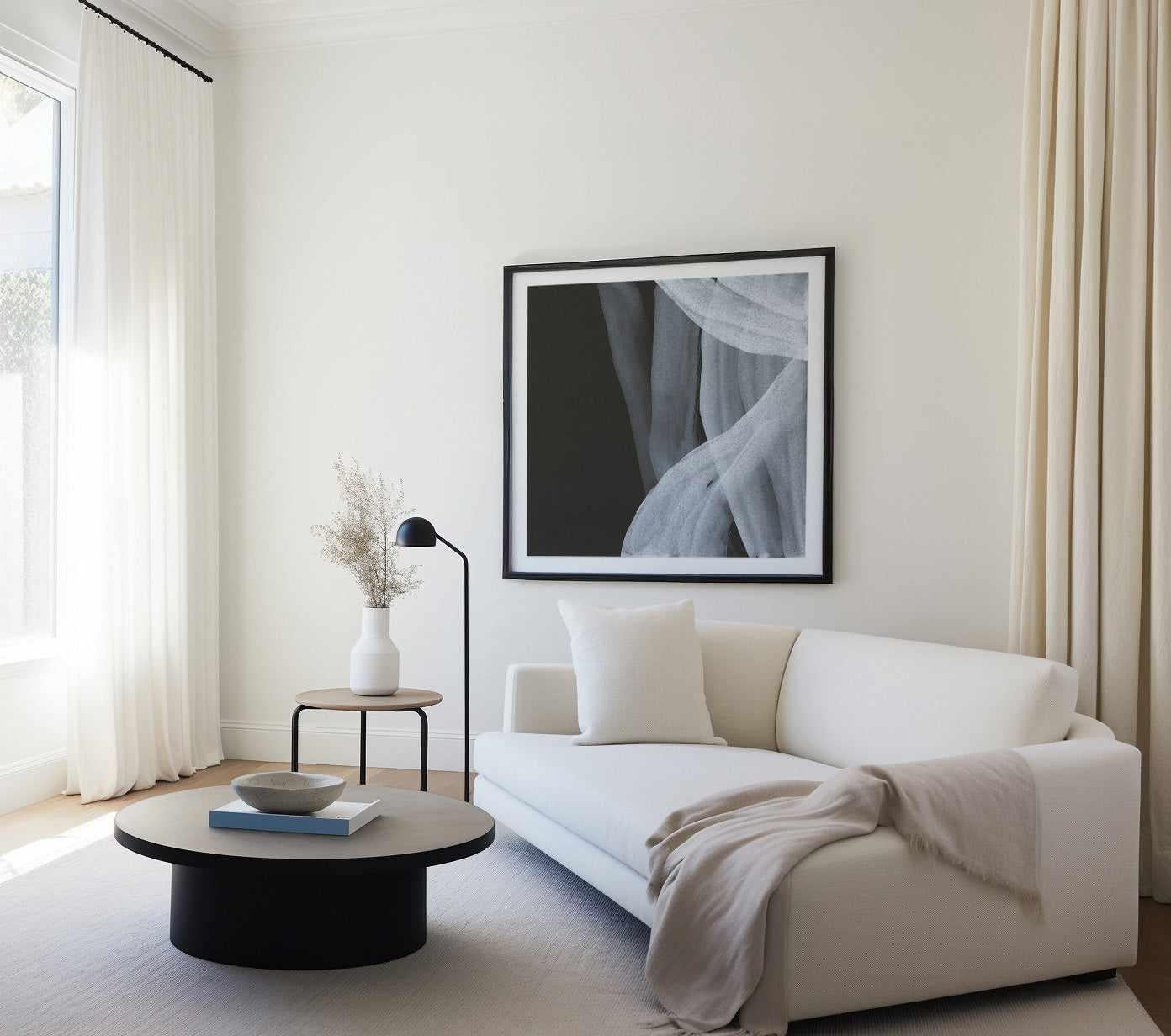
Black and white abstract art is the most disciplined choice in decorating, and the most forgiving. Strip colour away and everything that remains, gesture, tone, texture, composition, has to be right, which is exactly why monochrome abstraction never looks accidental on a wall. It agrees with every palette you will ever paint, every sofa you will ever buy, and every trend that will ever pass through your living room.
This guide covers the styles of black and white abstract work worth knowing, the rooms where monochrome earns its keep, how to frame it, and the styling moves that separate a gallery-calm wall from a flat one. It is written from more than a decade of designing, printing and framing monochrome works at our production facilities on the Central Coast of NSW.


Soft White III · Soft White IV · Stoned II
Why Monochrome Abstraction Works
Colour is the loudest voice in any room, and removing it changes how a work is read. Without hue, the eye attends to structure: the weight of a stroke, the greys between the extremes, the balance of dark mass against pale ground. That makes black and white abstraction feel considered even at a glance, the viewer senses the discipline before they analyse it.
There is also a practical superpower. Monochrome work is palette-proof. Repaint the room, recover the sofa, swap the rug, the art still belongs. For anyone who redecorates often, or for rental homes where the wall colour is not yours to choose, black and white abstraction is the single safest art investment you can make.
The perceptual evidence points the same way: brightness and contrast, more than any particular hue, drive how calm or energetic a space feels. A soft-grey tonal work whispers; a high-contrast ink gesture projects. You are choosing a volume level, and monochrome gives you the whole dial.
In black and white, nothing hides. Every stroke is a decision, and the wall reads that honesty instantly.
The Styles of Black and White Abstract Art
- Gestural ink and brushwork: sweeping, calligraphic strokes with the artist's speed still visible. The most dramatic monochrome style; one large piece carries a whole room.
- Tonal and textural: layered greys, plaster-like surfaces, smoke and stone effects. The gentlest style, and the backbone of quiet luxury schemes.
- Geometric monochrome: hard-edged blocks, arcs and grids in black, white and grey. Architectural, ordered, at home with mid-century and contemporary furniture.
- Minimal line work: a few unbroken lines describing a figure or form. Reads as refined and slightly intellectual; ideal for bedrooms and studies.
- Organic monochrome: nature-derived rhythms, ripples, strata, botanical shadows, abstracted past recognition. Bridges coastal and Japandi interiors effortfully well.
Works like Weaving I Gray Crop show how much warmth a supposedly cold palette can hold when texture leads. Browse the full black and white abstract painting collection to see each style side by side.


Room by Room
- Living room: monochrome above the sofa is the classic move, one oversized tonal work, or a high-contrast gesture if the room needs energy. Keep the piece at two-thirds of the sofa's width.
- Bedroom: choose soft-grey tonal or line work over stark contrast. The lower the contrast, the quieter the room feels at night.
- Dining room: high-contrast gestural work thrives here, it flatters candlelight and conversation both.
- Home office: geometric monochrome behind the desk reads composed on video calls and stays out of your thinking.
- Hallway or stairwell: a run of related monochrome prints, consistently framed, turns a corridor into a gallery. Our trio hanging guide covers spacing.
- Powder room: the small-space secret. Bold monochrome in a small dark room is pure hotel confidence.
Pairing Black and White With Colour Schemes
Monochrome art does not require a monochrome room. Against warm neutrals, oat, sand, honey, the greys in the artwork read almost mauve and the effect is deeply soft; see our warm minimalism styling guide for the full palette. Against saturated walls, sage, burgundy, cobalt, black and white art becomes the punctuation that stops the colour becoming wallpaper to the eye. Our burgundy palette guide and cobalt blue guide both lean on this move.
The one rule: repeat the artwork's darkest tone once more somewhere in the room, a lamp base, a picture light, a chair leg. That single echo makes the art look placed rather than parked.


Tumbling Down III · Under the Bridge II Dark
Framing Monochrome: the Decision That Makes or Breaks It
Black and white art is unusually sensitive to its frame because the frame joins the composition's tonal logic. A black finish frame extends the darks and gives the work authority, the gallery default for high-contrast pieces. A white finish frame merges with pale grounds and lets soft tonal work float. Oak finish is the warmth valve: it stops an all-monochrome wall reading cold, and it is our first recommendation in timber-floored Australian homes.
Every frame we make is solid timber with an oak, white or black finish, cut and joined on Italian machinery by our own artisans in Australia. For large statement monochrome, a framed abstract canvas needs no glass and carries texture superbly; for groupings, framed fine art prints keep the wall editorial. Hand trimmed, made to order, finished in a couple of business days, the fastest custom art turnaround in Australia.
A Brief History of Monochrome Abstraction
Reduction has been abstraction's sharpest edge from the beginning. Kazimir Malevich's Black Square of 1915 was the genre's most radical statement, a painting of nothing but painting, and Franz Kline built the abstract expressionist decade's most muscular works from housepaint blacks on white grounds. In the East, centuries of sumi-e ink tradition had already proven what the West was discovering: that a single confident dark stroke on pale ground can carry more feeling than a full palette.
Australian walls inherited both streams. The mid-century taste for Japanese-influenced restraint met the international appetite for gestural drama, and today's monochrome abstraction, tonal, textural, calligraphic, is the meeting point. When you hang a black and white gestural work in a light-filled Australian room, you are hanging a hundred years of that conversation.
Buying Well: What Quality Looks Like in Monochrome
Because monochrome hides nothing, production quality is visible from across the room. Three things to insist on. First, true blacks and clean whites, cheap printing turns blacks greenish or grey-brown, and the difference is obvious beside a window. We print with archival pigment inks on heavyweight fine art paper for exactly this reason. Second, hand finishing: machine-cut prints with drifting borders undermine the precision monochrome promises, so every print here is trimmed by hand. Third, honest framing, solid timber joined properly at the corners, not extruded foam pretending. There is an art surrounding the art, and in black and white you can see it from the doorway.
None of this slows delivery. Made to order at our facilities means a couple of business days from order to despatch, the fastest custom art turnaround in Australia, then tracked shipping to more than 40 countries with duties paid.


Under the Bridge IV Dark · Winter in Paris I
Designer Tips
- Vary the greys. An all-black-and-stark-white wall can read graphic-poster; works that travel through mid-greys hold depth. Mix one textural piece into any high-contrast grouping.
- Hang so the centre of the work or grouping sits 145cm (57in) from the floor, method in our how to hang wall art guide.
- Monochrome pairs love asymmetry: two related works hung with aligned tops, like Soft White III and Soft White IV, feel more collected than a mirror-matched pair. Full method in the pairs guide.
- Pairing with wallpaper: monochrome art sits happily on textured plains and even bold patterns if the wallpaper's tones stay in the same temperature family. Monochrome reads differently under warm and cool bulbs — to check it in your room's own light, order the artwork in its smallest size first — an A5 or A4 print (from $9.95) is made on the same 230gsm archival paper as the full-size piece, a true sample of colour and detail for your wall.
- We ship to more than 40 countries with all import duties paid, the price you see is the landed price, whether the wall is in Melbourne or Manchester.
Three Monochrome Recipes to Copy
- The tonal sanctuary: warm white walls, oak floor, linen sofa in oat, then one large soft-grey textural abstract in an oak finish frame. The room reads as a held breath. Add a single black object, lamp or side table, to key the artwork's darks into the space.
- The gallery corridor: three to five monochrome works of mixed styles, one gestural, one geometric, one line work, in identical black finish frames, hung in a strict horizontal line with equal spacing. Discipline in the hanging buys freedom in the art.
- The colour-block counterpoint: one deeply saturated wall, sage, burgundy, navy, carrying a single high-contrast black and white gesture in a white finish frame. The colour flatters the art; the art stops the colour becoming background.
Each recipe survives furniture changes, which is the quiet genius of monochrome: it commits to a standard, not a scheme.
Frequently Asked Questions
Does black and white art make a room feel cold?
Only if everything else in the room is also cold. Monochrome art takes its temperature from its surroundings: against timber, linen and warm white walls it reads sophisticated, not stark. If a scheme feels chilly, swap to an oak finish frame and choose a textural rather than high-contrast work, those two changes fix it in almost every case.
What size black and white abstract art should I choose?
The same rule as all statement art: roughly two-thirds the width of the furniture below it, or for an empty wall, around 60 to 75 percent of the wall's width including framing. Monochrome tolerates going large better than colour does, because contrast does the work saturation would, so when in doubt, size up.
Can I mix black and white art with colourful art?
Yes, and it is one of the strongest gallery-wall moves. Use monochrome works as the rhythm section, roughly every second or third piece, and the coloured works stop competing with each other. Keep frames consistent so the mix reads intentional.
Should I choose a black, white or oak frame for monochrome art?
Black finish for authority and high contrast, white finish for soft tonal pieces you want to float, oak finish to add warmth and connect the work to timber floors and furniture. Within one grouping, keep to a single frame finish.
Is black and white abstract art good for small rooms?
Excellent, especially in small rooms with limited natural light, where coloured art can turn muddy. Monochrome keeps its clarity in low light. In powder rooms and entries, one bold monochrome piece delivers more presence per square centimetre than any other art choice.
What is the difference between a black and white print and a photograph?
A monochrome abstract print reproduces a painted, drawn or digitally composed artwork; black and white photography captures the world through a lens. They style differently: abstraction sets mood without subject, while photography anchors a wall with a place or moment. Both belong in our black and white collection, and they mix well when the tonal range matches.
How do I keep a monochrome gallery wall from looking flat?
Vary three things: scale (one anchor piece at least twice the size of the rest), texture (mix gestural, tonal and line work), and depth of grey (not everything at maximum contrast). Keep one thing constant: the frame finish. That formula reads curated every time.
Start with the black and white abstract collection, widen to the full abstract wall art range, or explore the modern monochrome abstracts. Every work is made to order at our Central Coast facilities and delivered worldwide, duties paid.


