

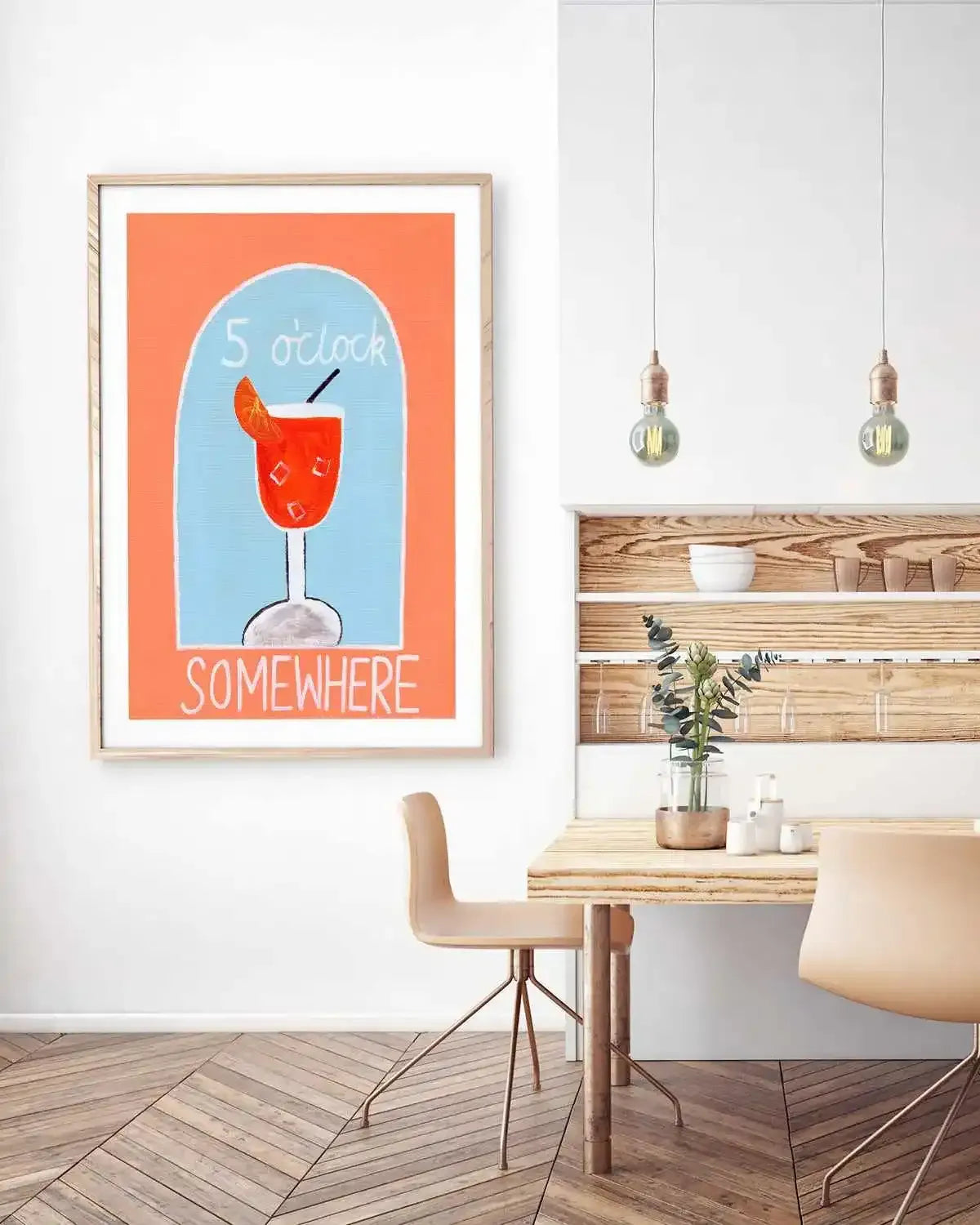
Dining rooms are where art earns its keep. Every other room asks art to decorate; the dining room asks it to host, to give people something to look at between courses, to set the register for every dinner party, and to carry the room in the long hours it sits empty and visible from the rest of the house. Framed pictures, paintings, canvas, this is the complete guide to choosing art for the dining room.
Everything here is printed and framed at our West Gosford facilities, solid timber frames, archival inks, made to order; the dining room wall art collection and dining canvas range are the shelves this guide shops from.


5 O'Clock by Britney Turner Art Print · Allora by Britney Turner Art Print · Aperol by Britney Turner Art Print
What Dining Room Art Has to Do
- Hold a long look: dinner guests sit facing your walls for two hours. Art with depth, layered abstraction, atmospheric landscape, photography with shadow, rewards the attention; thin decoration exhausts it.
- Flatter evening light: dining rooms live at night, under warm bulbs and candlelight. Deep tones, earth palettes and works with warm undertones bloom at 2700K; cool pastels go grey. Our wine palette guide is the register's home.
- Match the table's formality: a formal dining room takes framed prints behind glazing; a relaxed family eating zone takes canvas warmth, the split from our format guide.
- Own the sideboard wall: the wall above the buffet is the room's natural stage, one large horizontal work or a confident pair.
Living room art is met standing and passing. Dining room art is met sitting and staying, it has to be worth the conversation it interrupts.
The Directions That Work
- Confident abstraction: the dinner-party default, gestural, layered work from the abstract paintings collection gives the room energy without dictating its mood.
- Moody landscape and horizon: landscape paintings and dusk photography slow a room down with quiet authority, the long-lunch register.
- Black and white: monochrome art and photography formalise a dining space instantly, per the monochrome styling guide.
- Food-adjacent, done subtly: flower market scenes and still-life registers nod to the table without becoming a cafe mural, see flower market prints.
- The statement single: when ceilings allow, one extra large work across the main wall is the strongest dining room in the book, sized per our large art guide.


But First by Britney Turner Art Print · Ciao Bella I by Britney Turner Art Print
Sizing and Placement in the Dining Room
Above a sideboard: art at 60 to 75 percent of the sideboard's width, bottom edge 15 to 25cm above it. On a clear wall behind the table: centre the work on the table's axis at 145cm eye level (our height guide covers it), and size up, the table pushes viewers back, which shrinks art visually. Pairs hang with 5 to 8cm between frames; trios per the trio guide. One frame finish for the whole room, oak for warm schemes, black for formal ones, per the framed art guide.
Designer Tips
- Test candidates at night, under the actual dinner lighting, before committing; dining art bought in daylight is the room's most common mismatch.
- Echo one artwork tone in the tableware or linen and stop; the wall and the table should converse, not match.
- In open plans, let the dining art be the deepest-toned work in sight, it zones the eating space without a wall.
- Mirror on one wall, art on the others; mirrored dining rooms double candlelight but need art to have something worth doubling.
- Hosts who rearrange seasonally: two dining works rotated beats one compromise piece, made-to-order reprints make the second frame affordable.
Light, Candles and the Evening Room
The dining room is the only room in the house designed to be at its best after dark, and that inverts most art-buying instincts. A piece chosen under showroom daylight meets its real life under a dimmed pendant and candlelight, where warm palettes deepen into velvet and cool palettes can die into grey. This is why burgundy, ochre, olive and ink, the colours of our burgundy palette guide, over-perform in dining rooms relative to everywhere else: low warm light feeds them. If the room doubles as a daytime workspace or the table sees more homework than dinner parties, split the difference with a palette that holds in both lights, warm neutrals and blues with some depth to them, like the blue landscape range.
Glazing behaves differently after dark too. A glazed frame opposite a pendant will hand you the light fitting's reflection all dinner long, which is the practical argument for canvas on the wall that faces the table's light source; the dining canvas collection exists substantially for that wall. Keep the glazed pieces on the side walls where reflections rake away from seated eye level, and the room works at every hour without anyone knowing why.
The Sideboard Wall: The Dining Room's Natural Stage
Almost every Australian dining room has one wall that wants to carry the art, the sideboard wall, and it has its own arithmetic. Above a buffet or sideboard, artwork should span two-thirds to three-quarters of the furniture width and sit 15 to 25cm above its surface, low enough to converse with the furniture rather than float away from it. This band is naturally horizontal, which makes it the native home of the landscape format, the panoramic that fills the long low run in one horizon line, or the pair hung tight as one gesture from the pairs and trios collection. A tall portrait work above a long sideboard fights the wall's own geometry and loses every time.
Style the surface below as part of the composition, not separately: lamp or candlesticks at one end, something low and organic at the other, and the artwork bridging both. Leave breathing room, the sideboard vignette fails when every centimetre is styled, because the art needs quiet air around it to hold the wall. If the dining area is one zone of an open-plan run rather than a closed room, the sideboard wall matters even more, it is the visual cue that says "this part is the dining room", and a properly scaled work there zones the space more effectively than any rug. For those walls, err bigger; open-plan sightlines are long, and our extra large works earn their place from across a kitchen island.
Mood: What the Room Is Actually For
Strip away the styling advice and a dining room has one job: keeping people at the table after the plates are empty. The art should serve that. Conversational work earns its seat, pieces with a little wit, a place someone has been, an abstraction two guests will read two different ways; sterile perfection empties a room politely. It is why the Britney Turner aperitivo series became a dining-room staple of ours, it gives the table something to start on, and why black and white photography works so well for the moodier, more formal dining room, it deepens rather than chatters.
Trust the room's temperament. A big-window daytime family dining space wants energy, colour, the flower market prints school of joy. A closed evening room with dark walls wants fewer, deeper pieces and the confidence to leave a wall bare. Both are correct; the mistake is dressing one room in the other's clothes, and it is the most common dining-room misfire we see in customer photos, energy pinned to a wall that wanted gravity, or solemnity draped over a room whose whole personality is Saturday breakfast. Read the room you actually have, at the hour you actually use it, and buy for that room rather than the one in the magazine.
Formal, Casual and the Australian In-Between
Most Australian dining spaces now live somewhere between the formal dining room of the last generation and the kitchen-adjacent eating zone of this one, and the art can honour either lean. To formalise a casual space, go fewer and larger: one considered work from the abstract painting collection in a timber frame, hung with proper clearance, reads as intent. To relax a formal room, break symmetry, a pair hung slightly off-centre of the sideboard, or a modest gallery of works that share palette but not subject, and let one piece carry humour. The framing finish is the quiet formality dial: black frames sharpen a room toward evening and occasion, oak loosens it toward daylight and family, white recedes and lets colour do the talking.
Renters and frequent movers get a specific note here: the dining room is the best-value art room in a rental, because it is furniture-defined rather than architecture-defined. The same sideboard-plus-artwork pairing recreates the room identically at the next address, so investment pieces bought for this room travel with their context intact. Two removable hooks, honest weight ratings, and the height guide to place them, that is the entire installation, and the bond stays whole.
The Mistakes That Empty a Dining Wall
The recurring dining-room misfires, from a decade of customer photos, are worth naming so you can skip them. Hanging too high is epidemic in this room specifically, because people hang for standing height at a wall that is experienced seated; drop the centre to 140 to 145cm and the room recomposes itself around the table. The too-small single print above a long sideboard is the second, the wall reads as unfinished punctuation, when the fix is a wider format or a tight pair. Third is the reflective glazed piece opposite the pendant, which guests experience as a light bulb in a frame all evening. And fourth is theming, grapes, cutlery motifs, EAT signs, which decorates the function rather than the room; the strongest dining art has nothing to do with food and everything to do with keeping the conversation alive.
Every one of these is cheap to avoid and expensive to live with, and together they explain most of the difference between dining rooms that gather people and dining rooms that just seat them.
Frequently Asked Questions
What kind of art is best for a dining room?
Work with depth that flatters warm evening light: layered abstraction, moody landscapes, monochrome photography, in generous sizes. The test: would it hold your interest across a two-hour dinner?
What size art above a sideboard or buffet?
Sixty to 75 percent of the sideboard's width, hung 15 to 25cm above its top. One large horizontal work or a pair; small single frames above long furniture is the room's most common miss.
Framed prints or canvas for dining rooms?
Framed behind glazing for formal rooms, canvas for relaxed family spaces, and either at proper scale. Evening glare is minimal in most dining rooms, so the choice is register, not practicality.
Should dining room art match the living room?
Relate, not match: same frame finish family and one shared tone keeps an open plan coherent while each zone keeps its own voice, deeper and moodier at the table, lighter in the lounge.
What colours work in dining rooms?
Earth and evening tones, burgundy, umber, forest, navy, warm charcoal, with enough tonal range to read under candlelight. Save the bright pastels for rooms that live in daylight.
How many artworks does a dining room need?
Fewer than you think: one statement plus one supporting work suits most rooms. The table is the room's centrepiece; art frames the theatre rather than competing with it.
Can I get dining art sized to my exact wall?
Yes, every piece prints and frames to order at our NSW facilities, custom sizes included, ready to hang in a couple of business days, with international shipping available.
Start with the dining room collection, dining canvas art and extra large works. Everything is printed and framed at our West Gosford facilities and shipped ready to hang to more than 40 countries, and if you are weighing two directions for the same wall, send us the room photo, the team frames dining rooms every week and will give you the honest call.


