Mocha Mousse is Pantone's Colour of the Year for 2025 — a mid-tone brown with a soft chocolate-and-pink undertone that sits exactly where comfort meets quiet luxury. It reads like a latte in a ceramic cup, worn leather on a library chair, or the colour of the soil in a Hunter Valley vineyard at dusk. Brown has been dismissed for two decades as dated or safe. Pantone naming 17-1230 Mocha Mousse the colour of the year signals what Australian interior designers already knew: the cool-grey era is over, and warm, grounded, liveable rooms are back.
What makes mocha different from the browns we grew up on is its proportion of warmth. This is not the orange-brown of a 1970s rumpus room or the yellow-brown of a 1990s dining suite. Mocha Mousse is a balanced brown — cool enough to feel modern, warm enough to feel human. It behaves warmer under Australian light than in Northern European coverage because our sun is higher, which makes it an unusually strong match for coastal homes, sandstone terraces, and Queenslander weatherboard houses.
The right wall art holds a mocha palette together. Browse our affordable wall art collection — earthy, neutral and abstract prints on 230gsm fine art paper from $9.95, shipped globally with all import duties covered.


Vintage Oak Tree in Warm Brown Wallpaper Mural · Antique Tapestry Garden Wallpaper · Organic Layers Wallpaper Mural
Why Pantone Chose Mocha Mousse for 2025
Pantone's colour institute names a colour of the year based on what it reads as the prevailing cultural mood. For 2025, their research pointed to three forces converging: a desire for grounded comfort after years of instability, a hunger for quiet luxury as a reaction against maximalist colour fatigue, and a return to natural-world cues as homes increasingly become sanctuaries rather than showpieces. Mocha Mousse answers all three at once.
Laurie Pressman, Vice President of the Pantone Color Institute, described the choice as reflecting a longing for "sensorial and comforting warmth" — coffee, chocolate, timber, leather. It is a colour that rewards being in a room over a long evening, not one that wins in a photograph. That makes it suited to how Australians actually use their homes: lamp-lit evenings rather than bright overhead downlights.
Mocha Mousse vs Every Other Brown
The mistake most homeowners make is treating "brown" as one colour. It isn't. There are at least six distinct browns in common use, and each pairs with a different room. Understanding where Mocha Mousse sits in that taxonomy is the difference between a room that feels considered and one that feels like three mismatched browns shouting at each other.
- Mocha Mousse (Pantone 17-1230): Mid-tone with a soft pink-chocolate undertone. Reads warm without being orange, modern without being cold. The anchor colour.
- Chocolate: Darker, cooler, more saturated. Reads as heavier and more formal. Use in studies, libraries, and moody dining rooms — rarely in open-plan living.
- Tan: Lighter, drier, more yellow. Reads as outdoorsy and casual. Good for children's rooms and kitchens, less convincing as a luxury signal.
- Taupe: More grey, less saturated. Reads as safer and more corporate. Functional for rentals, less characterful than mocha.
- Warm greige: Beige with a hint of grey. Reads as neutral background rather than feature colour. Pairs with mocha as a complementary wall rather than competing with it.
- Espresso: Near-black with brown undertone. Reads as sophisticated anchor in otherwise light rooms. Use in joinery, not on large wall surfaces, or a room closes in.
Mocha Mousse sits in its own pocket — warm enough to feel like a hug, sophisticated enough to feel like a hotel lobby. Once you can name the difference between mocha and the five browns either side of it, every other design decision gets easier.
The Psychology of a Warm Brown Room
Colour psychology research consistently places brown-toned environments at the top of comfort ratings for extended occupancy. The reason is primal: brown is the colour of earth, wood, bread and shelter, the materials humans associate with safety. Cool colours like blue and grey calm the nervous system but do not signal warmth; warm reds and oranges create energy but fatigue quickly. Brown is the only hue that does both — it settles the body and warms the space without asking for attention.
Five Mocha Mousse Palettes That Work
1. Mocha and Cream — the elegant classic

The safest and most enduring pairing. Mocha at roughly 30 percent coverage (feature wall, sofa, rug), cream at 60 percent (remaining walls, bedding, curtains), with warm brass at 10 percent in hardware and lighting. This reads as a Parisian apartment or a five-star hotel lobby — quietly expensive, impossible to date. If you are nervous about commitment, start here and deepen later.
2. Mocha and Sage — the organic pairing

Brown and green are the two colours the human eye sees most of in nature, which is why they pair without effort. Mocha walls with sage linen upholstery reads as garden-adjacent, settled, and faintly botanical. The trick is restraint on the green — one sofa, one cushion, one plant in a terracotta pot. For a deep walk-through of the greens that sit well with warm browns, read our sage green colour palette guide.
3. Mocha and Terracotta — warm, layered, Mediterranean

Two earth colours stacked. Mocha on the walls, terracotta on accent pottery, throws and lamp bases. This is the palette of a Byron Bay farmhouse or a Mudgee winery — warm, relaxed, and generous. Works hardest in rooms with natural timber floors and linen everywhere. For the full terracotta playbook, see our warm terracotta colour palette trend piece.


Leafy Country Foliage in Light Brown Wallpaper · Arc Mural Beige Wallpaper
4. Mocha and Dusty Rose — feminine, moody, romantic

Chocolate and rose is the colour combination of a patisserie window, and it translates directly into the bedroom. Mocha behind the bedhead, dusty rose on the bedding, cream pillows for relief, and brass sconces for reading light. Reads as considered, indulgent, and grown-up without tipping into chintz. Our dusty rose colour palette piece goes deep on how to keep this pairing sophisticated.
5. Mocha with Charcoal and Gold — quiet luxury sophistication
The most formal of the five. Mocha walls, charcoal upholstery, unlacquered brass in frames and hardware. The palette for dining rooms, studies, and master bedrooms where the brief is "handsome" rather than "cosy". Cross-reference our charcoal warm-black colour palette for the companion anchor tones.

Chocolate Kisses Peel-and-Stick Wallpaper
Materials That Belong With Mocha
Every colour has a material family. Mocha's is the one most homeowners already have — warm natural materials that catch light on their surface rather than reflecting it flat. If you are sourcing furniture and finishes, let this list narrow your options.
- Linen: The most important fabric in a mocha room. Its dry, slightly textural handle balances the richness of the wall colour. Use in cushions, curtains and bedding.
- Velvet: The luxury counterweight. A mocha or chocolate velvet sofa reads as a deliberate design choice, not a dated carryover. Choose a dense, matte velvet rather than a shiny one.
- Travertine: The stone of the year. Creamy, honey-veined travertine in a coffee table or side table picks up mocha's pink undertone and amplifies the warm-luxe read.
- Brushed brass: The only metal that truly belongs. Polished chrome fights the warmth; matte black is acceptable as a secondary accent; brushed brass is the primary choice in taps, hardware, and light fittings.
- Natural timber: Walnut, oak and ash in honey or mid tones. Avoid grey-washed or whitewashed timbers — they fight the warmth. Avoid red-toned mahogany unless the whole room is committed to a traditional read.
- Boucle: The textural softener. A cream boucle armchair against a mocha wall is the most photographed pairing in interior design for a reason. It reads as softness and sophistication simultaneously.
Room by Room With Mocha Mousse
Bedroom — sanctuary
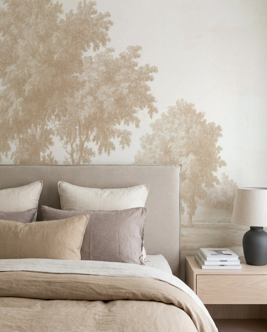
Mocha is a sleep-promoting colour. Warm, enclosed, and slightly absorptive of light, a mocha bedroom reads as a burrow in the best sense. Put the colour on the wall directly behind the bedhead — a wallpaper mural works harder than paint here because it adds texture and depth in the one direction of the room the occupant actually looks at (up, when lying down). Pair with cream bedding, a solid timber frame with oak finish on the side tables, and linen curtains in a slightly paler brown. The Stripe Wallpaper in Chocolate is a cleaner choice if you want the warmth without the pattern.
Living room — warm formal
In an open-plan living space, mocha is best as a feature wall rather than an all-walls treatment, unless the room is oversized and flooded with morning light. Behind the main sofa, a mocha wall becomes a visual anchor that makes the rest of the room feel organised around it. Pair a cream linen sofa, a walnut coffee table, a mocha-and-cream rug, and one piece of artwork large enough to pull focus. A solid timber frame with oak finish on the art print keeps the palette warm rather than breaking it with black.
Dining room — intimate
Dining rooms are the easiest room to commit to mocha. They are typically used at night, with candle or lamp light, which flatters warm walls. A mocha dining room with a heavy walnut or oak table, linen-upholstered chairs, and brass pendant lighting reads as a private dining room at a good restaurant. The trick is lighting — use lamps and candles at eye level, not bright overhead downlights that flatten the colour.


Stripe Wallpaper in Chocolate · Held Up Wallpaper
Study — focused warmth
The room mocha was made for. A study with mocha walls, a dark timber desk, leather chair, brass desk lamp and linen curtains reads as serious and focused. Brown walls reduce visual distraction and help concentration — the reason every serious library on earth is clad in dark wood. For a home office that doubles as a Zoom backdrop, mocha out-performs every other colour for video: warm enough to flatter skin tones, neutral enough not to pull attention.

Vintage Tapestry Panoramic Mural in Luxe Beige Wallpaper
How Mocha Reads Under Australian Light
This is where most international mocha coverage gets it wrong for local readers. European guides assume a cooler, lower sun angle that pulls mocha towards grey. In Australian light — particularly between latitudes 27°S and 38°S, covering most of our population — the sun is higher and the sky contributes more blue-reflected light, which actually warms mocha and pulls its pink-chocolate undertone forward.
The practical consequences:
- Coastal homes get the strongest result. Bright, reflective light off the water warms mocha walls without washing them out. Perfect for Sydney Harbour houses, Gold Coast apartments, and Perth beachside homes.
- North-facing rooms amplify the warmth. A north-facing living room with mocha walls will read as slightly pinker and richer than the swatch suggests. Paint a large A3 sample and live with it for a week before committing.
- South-facing rooms stay cooler. In a south-facing room with limited natural light, mocha can read as grey-brown rather than warm-brown. Either accept the cooler read, or pair it with generous warm lighting (2700K LEDs, not 4000K).
- Dark inland rooms need care. In a Canberra or Ballarat winter, a mocha room with small windows can tip into moody rather than cosy. If your room already feels closed in, use mocha on one wall only, not all four.
- Queensland humidity is a non-issue for quality wallpaper. Properly hung non-woven wallpaper handles tropical humidity if surfaces are sealed. This is where our vetted wallpaper installer directory earns its keep — installers who have handled coastal and tropical homes know the prep.
The Mocha and Warm Brown Wallpaper Range
Our brown wallpaper collection is the core of the mocha palette. A walk through the range, grouped by how they function in a room:
- Hero murals: Vintage Oak Tree in Warm Brown Wallpaper Mural is the flagship panoramic for a large feature wall — warm, detailed, and immediate. Its companion, Antique Tapestry Garden Wallpaper, takes the palette in a richer, more ornate direction, while Organic Layers Wallpaper Mural reads as quieter and more architectural.
- Softer patterns: Leafy Country Foliage in Light Brown Wallpaper is the everyday choice — light enough for bedrooms, grounded enough for living rooms. Arc Mural Beige Wallpaper offers a minimal arc-mural take that works in rooms with strong furniture.
- Contemporary takes: Chocolate Kisses Peel-and-Stick Wallpaper brings the mocha palette into a more playful, modern register — ideal for a guest bedroom or a kid's room that still reads grown-up. Stripe Wallpaper in Chocolate strips the palette back to its simplest form with tonal stripes.
- Textural options: Held Up Wallpaper layers movement and depth without adding pattern. Vintage Tapestry Panoramic Mural in Luxe Beige Wallpaper brings a panoramic luxe-beige alternative for rooms where mocha would read too heavy.

If none of these are the exact mocha you have in mind, our custom wallpaper service prints any pattern, at any scale, in any colour, to your exact wall dimensions. We print on the Central Coast of NSW and ship to 40+ countries with all import duties covered.
Is Mocha Mousse a One-Year Trend, or a Lasting Neutral?
Pantone colours of the year have two fates. Some are cultural markers that feel dated within 18 months (Living Coral 2019, Viva Magenta 2023). Others are broader neutral shifts that redirect interiors for a decade (Classic Blue 2020, Rose Quartz 2016).
Mocha Mousse is firmly in the second camp. Three pieces of evidence point to this being a lasting shift, not a seasonal one:
- It sits on top of a longer warm-brown cycle. Benjamin Moore, Sherwin Williams, and Dulux have all named warm browns or warm neutrals as colour of the year across 2024–2026. Pantone's choice confirms what the paint industry has been signalling for two years.
- Warm browns replace a 15-year cool-grey era. The shift away from cool greys started in 2022 with greige, moved to warm white and bone in 2023, and has now landed fully in the mocha-through-chocolate range. Trends that follow this kind of long arc rarely reverse within a year.
- It works with existing furniture. Unlike lavender or magenta, mocha integrates into rooms people already own. That is the hallmark of a neutral, not a fashion colour.
Our forecast: mocha and its warm-brown siblings will dominate residential interiors through 2028, with variations in saturation each year but the same underlying warm anchor. Buying into the palette now is buying into a neutral at the start of its cycle.
Frequently Asked Questions
Is mocha too dark for Australian light?
No, in most of Australia it is actively flattered by the local light. Northern, eastern and coastal homes with strong natural light will read mocha as warm and rich rather than heavy. The exceptions are small south-facing rooms and dark inland rooms in winter — in those cases, limit mocha to a single feature wall and pair it with warm 2700K lighting to prevent the room feeling closed in.
Which rooms suit mocha best?
Bedrooms, studies, dining rooms and living room feature walls. In that order. Bedrooms benefit most because the warmth is sleep-promoting; studies because brown aids focus; dining rooms because the colour is flattered by evening light; living rooms because a mocha feature wall anchors open-plan spaces. Bathrooms and kitchens work too, but require more planning around lighting and hardware.
How do I pair mocha with the furniture I already own?
Start by auditing your existing timbers and metals. If your furniture skews honey-oak, walnut, or mid-tone timber, mocha will integrate without any changes. If your furniture skews grey-washed or cool-toned, you will need to introduce warm textiles (linen, velvet, boucle in cream or caramel) to bridge the temperature gap. Mocha punishes mismatched cool-grey accessories; replace or relocate them before committing.
Should I use paint or wallpaper for mocha?
Wallpaper almost always outperforms paint for mocha. Paint in a mid-tone brown reads flat and plasticky — the colour needs texture to feel considered. A mocha-toned wallpaper with any pattern, even subtle, gives the wall the layered warmth the colour is known for. If budget forces paint, buy a premium paint with depth of pigment, and accept that one wall of wallpaper elsewhere will do more work than four walls of paint.
Are there peel-and-stick options in mocha tones?
Yes. Most of our brown and mocha-toned wallpapers are available in both traditional paste-the-wall and peel-and-stick formats. For renters, the peel-and-stick option is the obvious choice — fully removable, leaves no damage, and handles Australian humidity when the wall is properly prepped. Our preparing your walls for peel-and-stick guide walks through the prep that makes the difference between a wallpaper that holds for years and one that lifts after a summer.
What wall art complements a mocha room?
Earth-toned abstracts, landscape photography in warm light, botanical line drawings and figure studies all pair naturally. Avoid cool-grey black-and-white photography — the temperature clash is jarring. Frames matter as much as the art: a solid timber frame with oak finish warms the room further, a solid timber frame with white finish adds contrast, and a solid timber frame with black finish anchors a formal palette. See our wall art collection.
What flooring works with mocha walls?
Light-to-mid honey oak is the safest choice — it picks up the warmth without competing. Walnut works if the room has good natural light. Avoid grey-washed floors, dark espresso floors and cool-grey tiles. For a rental with cool floors, layer warm rugs (jute, wool in cream or caramel) to buffer the temperature gap.
Can I commission a custom mocha wallpaper?
Yes. Our custom wallpaper service prints any pattern at any scale in any colour. Common custom mocha briefs include colour-matching a specific Pantone chip, scaling an artwork to fill a panoramic wall, or recolouring an existing design into a mocha palette. Custom orders take 4 business days in production and ship globally with duties covered. Request a $4.99 sample (48cm x 40cm / 19in x 16in) to confirm the exact mocha tone before full production.
Browse our brown wallpaper collection, the full wallpaper range, earthy neutral wall art, or continue reading trend coverage on On the Wall.


