Forest green is the colour of depth in nature — the canopy overhead, the moss on stone, the dense shade where ferns grow without sunlight. It is the darkest green that still reads as green rather than black, and in interiors it creates a sense of enclosure and calm that lighter greens cannot achieve. Where sage whispers, forest green speaks with authority.
The resurgence of deep green in interiors tracks with the broader shift toward biophilic design — the theory that humans function better in environments that reference nature. Forest green on a wall does not just reference nature, it evokes it. The colour triggers the same psychological response as being surrounded by trees: reduced stress, slower breathing, a sense of shelter.


Colour Psychology
Green is the colour the human eye processes most efficiently — we evolved to distinguish between hundreds of shades of green because our survival in forest environments depended on it. This processing efficiency means green causes less visual fatigue than any other colour. A forest green room can be lived in all day without the eye tiring of it, which is a quality no other saturated colour possesses.
In a south-facing room with warm afternoon light, forest green glows with a golden undertone that makes the room feel like a conservatory. In a north-facing room with cool light, it reads as deeper and moodier — which can be dramatic or heavy depending on the supporting materials. Warm timber and brass are essential companions in north-facing rooms.
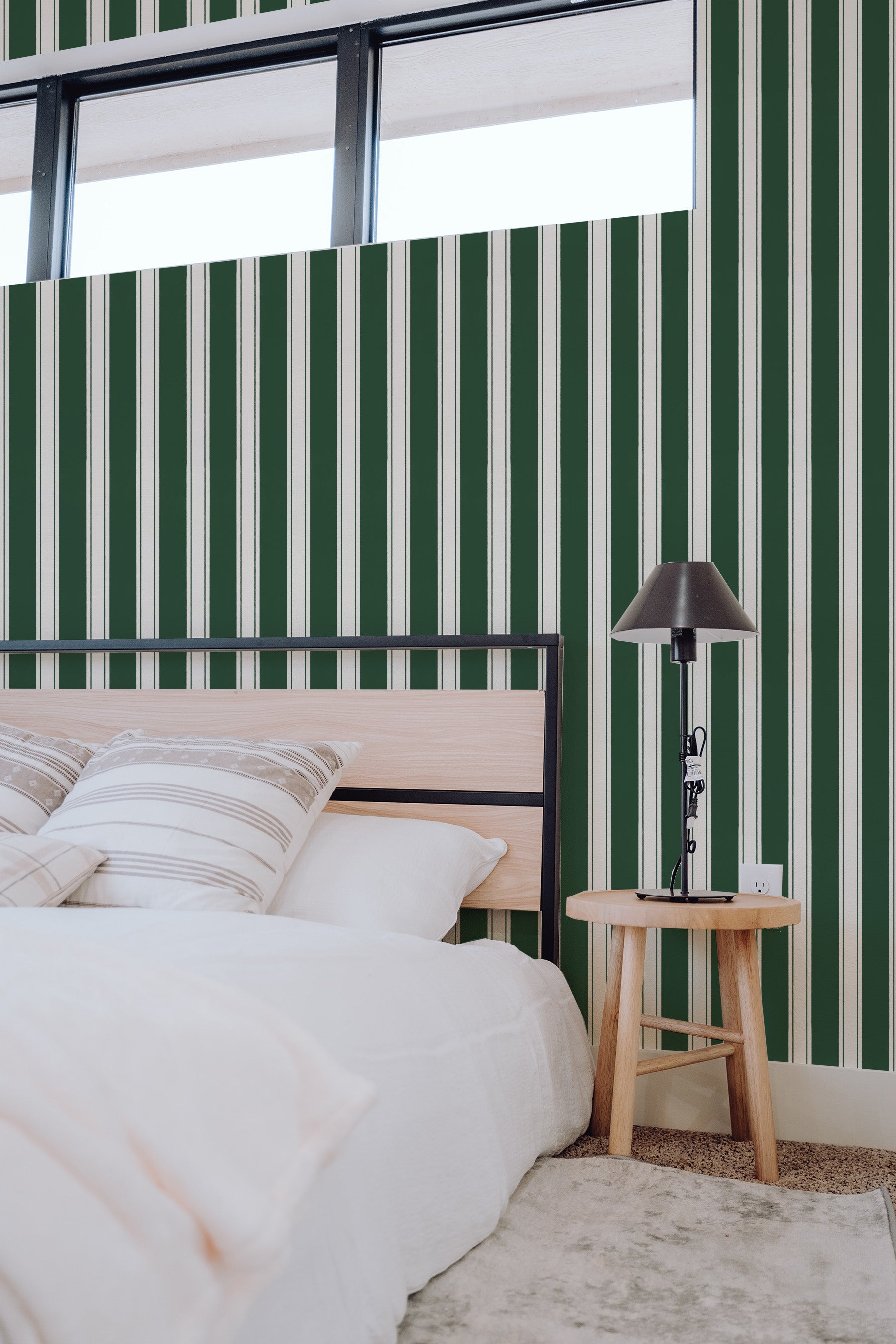
Four Colour Palettes
Forest Green and Cream

Palette 1: Forest Green and Cream. The safest entry. Forest green at 30% (wallpaper, cushions), cream and warm white at 60%, brass at 10%. This reads as botanical and fresh — a conservatory palette for any room in the house.
Forest Green and Brass

Palette 2: Forest Green and Brass. Deep green with warm metallic — the combination that makes green feel luxurious rather than botanical. A forest green wallpaper with brass sconces, gold-framed art, and a brass coffee table creates a room that feels like a private club in the best sense.
Forest Green and Blush

Palette 3: Forest Green and Blush. An unexpected pairing that works because both colours share grey content. The blush softens the green, the green grounds the blush. Together they feel botanical and feminine without being predictable.
Tonal Greens

Palette 4: Tonal Greens. A gradient from sage through fern, forest green, and pine — the full depth of green in a single room. Use the lightest sage on the ceiling, forest green on the feature wall, and pine as a single accent. The room feels like walking deeper into woodland.
Wallpaper and Art
Country Stripe Dark Green Wallpaper brings depth and warmth to any room. Country Blossom Dark Green Wallpaper offers a softer take on the palette. Heritage Leaves Emerald Green Wallpaper takes the colour in a more contemporary direction. Vintage Tapestry Botanica in Emerald Green Wallpaper provides the ideal complement.

Materials
- Timber: Walnut and dark oak. Forest green is one of the few colours where dark timber works — both are deep and warm, so they feel like part of the same ecosystem. Light oak creates more contrast if you want the room to feel lighter.
- Stone: White marble with green veining (Verde Guatemala) is the dream. Honed limestone or travertine for warmth.
- Metals: Brass exclusively. The warm gold against deep green is one of the most timeless material combinations in interior design — it references everything from Art Deco hotels to Victorian conservatories.
- Fabrics: Velvet in emerald for statement pieces. Linen in cream for balance. Wool in charcoal for grounding.
Room by Room
- Dining room: Forest green wallpaper on all four walls — this is one of the few colours that works as a surround in a dining room because the enclosure creates intimacy for evening meals.
- Bedroom: Feature wall behind the bed. Forest green promotes deep sleep — the association with shelter and enclosure is restful at a subconscious level.
- Study: Full wall coverage. Green improves concentration and reduces eye fatigue, making it the ideal colour for a room where you read and work.
- Bathroom: Our Paste the Wall Smooth is water and humidity resistant. Forest green in a bathroom feels like a rainforest retreat.
Designer Tips
- Order the $4.99 sample (48cm x 40cm). Forest green photographs lighter and more saturated than it reads in person. The true colour is deeper and more muted. The sample prevents disappointment.
- Warm the lighting. Forest green absorbs light. Use warm-toned bulbs (2700K) and multiple light sources — table lamps, sconces, candles. Cool white LEDs make green look grey.
- Plants amplify it. Real greenery against green wallpaper does not compete — it creates depth. The variation between the flat printed green and the three-dimensional living green makes both look more real.
Browse our green wallpaper collection, explore dark wallpaper, or read more on On the Wall.


