On the Wall

Hamptons Interior Design: The Complete Wallpaper and Wall Art Style Guide
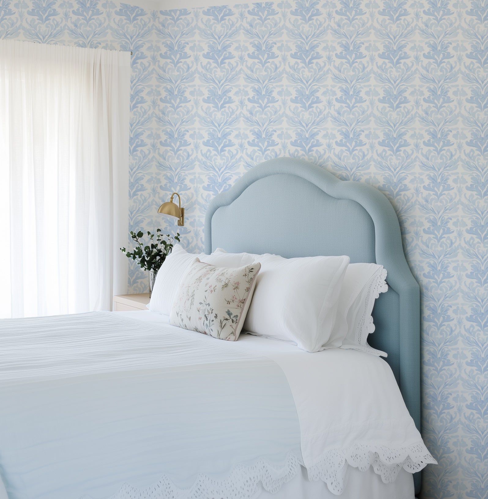
The definitive guide to Hamptons interior design — wallpaper palette, wall art, materials and room-by-room application for Australian coastal homes. Custom sized, all duties paid globally.
Learn more
Managing Humidity: The Best Wallpapers for Australian Bathrooms
Humidity is the primary reason homeowners hesitate before wallpapering a bathroom. The concern is legitimate — sustained moisture, steam cycles, and the temperature changes between a hot shower and the cooled bathroom afterwards create an environment that demands more of any wall covering than a standard interior. But the concern is frequently overstated. Bathrooms across Europe, the United Kingdom, and increasingly across Australia have been wallpapered for decades without incident, and the technical advances in wallpaper substrate manufacturing over the past ten years have made the application more reliable than at any point in the history of the medium. The key is understanding exactly what the environment demands and selecting both the product and the installation approach accordingly. At our Central Coast of New South Wales manufacturing facility, we produce wallpaper for bathroom applications to a specification that takes the high-humidity environment fully into account. The guidance in this article — on substrate selection, preparation, ventilation, and maintenance — is drawn directly from our production expertise and from the experience of thousands of installations in Australian bathrooms and wet areas over more than a decade. We ship globally to customers in comparable climates: coastal Queensland, tropical Singapore, humid Sydney summers, and the heated interiors of European winter homes where condensation is a constant challenge. Faux Grass Cloth in Charcoal Wallpaper · Peppy Plaid Dark Green Wallpaper · Country Stripe Eucalyptus Green Wallpaper The Science of Humidity and Wallpaper Water vapour becomes a problem for wallpaper at the adhesive layer — not at the printed surface. The mechanism is straightforward: when steam or warm humid air contacts a cool wall surface, it condenses. If that moisture penetrates to the adhesive layer — particularly with cheaper, non-moisture-resistant adhesives or paste — it begins to break down the bond between the wallpaper and the substrate. The result is gradual lifting at seams and edges, eventually progressing to bubbling and peeling. The substrate of the wallpaper itself also matters. Paper-backed products absorb moisture and swell, creating visible seam distortion. Non-woven substrates — what we use for our entire Paste the Wall Smooth range — do not absorb water in the same way. The non-woven fibres remain dimensionally stable through humidity cycles, which is why non-woven is the correct substrate for any bathroom application. It is also why our Paste the Wall Smooth is specifically recommended for bathrooms while our natural fibre range (grasscloth, sisal) is not. Where to Apply and Where Not to Apply Not all bathroom walls are equally suitable for wallpaper. Understanding the application zones prevents failures and sets appropriate expectations. Above the tile line — Recommended. The most reliable and most common bathroom wallpaper application. In bathrooms where tiles extend to approximately 1.5–2 metres on shower and bath walls, the wallpapered zone above is rarely subject to direct water contact. Steam reaches this zone but does not produce sustained condensation against a properly ventilated surface. This is the starting point for any first bathroom wallpaper project, and it is where 90% of successful bathroom wallpaper installations are located. Non-shower walls — Generally suitable. The wall behind the vanity, the wall opposite the shower, and the entry wall are subject only to ambient humidity rather than direct moisture. In a bathroom with functional mechanical ventilation, these walls perform comparably to any other interior room. The primary consideration is ensuring the ventilation system actively removes steam rather than simply circulating it. Inside the shower recess — Not recommended. Direct sustained water contact will eventually compromise any wallpaper installation regardless of substrate quality or adhesive choice. Tiled, sealed, or rendered surfaces are the correct specification inside the shower enclosure. Wallpaper should stop at the shower screen or curtain line without exception. Ventilation: The Non-Negotiable Prerequisite The single most important factor in the longevity of bathroom wallpaper is not the product — it is the ventilation system. A bathroom with inadequate mechanical ventilation will eventually compromise any wallpaper installation, regardless of how well it has been specified or installed. Before committing to a bathroom wallpaper project, verify the following: An exhaust fan rated for the bathroom's volume (cubic metres) must be present and operational. The fan must exhaust to the outside — not to a ceiling cavity or roof space. The fan should run during every shower and for at least 30 minutes afterwards. Windows should be used to supplement mechanical ventilation where possible. As a general rule: if a bathroom regularly shows condensation on mirrors and tiles after showering, its ventilation is insufficient for wallpaper application. The ventilation must be addressed before any wall covering is considered. Substrate and Adhesive Selection For all bathroom applications, specify our Paste the Wall Smooth range. This non-woven substrate is dimensionally stable through humidity cycles, wipeable, and compatible with moisture-resistant wallpaper adhesive. Apply the adhesive to the wall (not to the paper) in manageable sections — one panel width at a time. Use a moisture-resistant adhesive formulated specifically for non-woven wallpaper in high-humidity applications; standard PVA-based pastes are not appropriate. For peel and stick applications in bathrooms: this approach is suitable only in bathrooms with excellent ventilation where humidity levels consistently return to ambient between uses. In high-use bathrooms or those with inadequate ventilation, the self-adhesive backing may gradually release under sustained humidity exposure. Paste the Wall Smooth is the more reliable specification for any bathroom with challenging humidity conditions. Country Stripe Dark Green Wallpaper · Serenity Vista Wallpaper Materials Tiles: The tile selection beneath the wallpaper must complement the wallpaper's palette. Large-format tiles in white, stone, or neutral tones provide the calmest foundation. Avoid high-contrast grout colours which can visually compete with the wallpaper pattern above the tile line. Stone: If the bathroom includes a stone vanity top or floor, the wallpaper's secondary colours should relate to the stone's undertones — this creates a material coherence that reads as deliberately designed. Metals: Brushed brass and matte black are the most compatible hardware finishes for patterned bathroom wallpaper. Both have sufficient visual presence to read clearly against a patterned surface without competing with it. Substrate protection: In bathrooms with high splash exposure near the vanity, a clear matte sealant applied over the installed wallpaper provides additional moisture resistance without affecting the printed surface appearance. Room by Room Main bathroom: Wallpaper on the feature wall opposite the vanity or above a freestanding bath creates the most dramatic impact. Full-room treatment (all non-tiled surfaces) is appropriate in well-ventilated main bathrooms and creates a genuinely immersive environment. Ensuite: The ensuite's smaller scale means a bold pattern fills the room quickly and effectively. A single botanical or geometric print above the tile line transforms a generic wet room into something personal and considered. Powder room / WC: The ideal bathroom for wallpaper — no shower, no bath, minimal moisture exposure. A powder room can sustain bolder and more adventurous wallpaper choices than any other bathroom application. Full-room treatment with a dramatic pattern is not only possible but recommended. Guest bathroom: The guest bathroom is a hospitality statement. A well-chosen wallpaper creates an immediate impression that guests remember and photograph. Designer Tips Order the $4.99 sample (48cm x 40cm / 19in x 16in) and hold it against your bathroom's tiling and lighting before ordering. The filtered, often artificial light of an interior bathroom changes colours significantly compared to natural light. All our Paste the Wall Smooth wallpaper is custom sized to your exact wall dimensions — critical in bathrooms where the wall area above the tile line is often non-standard. Our measuring guide covers bathroom-specific measurement considerations. Production takes 4 business days at our Central Coast NSW facility. We ship to over 40 countries with all import duties covered on wallpaper orders. See our paste-the-wall installation guide for the full bathroom application process. If installing above existing tiles, clean the tile surface thoroughly and apply a bonding primer before hanging the wallpaper. The adhesive will not bond reliably to glazed or dirty tile surfaces without this preparation step. Explore our full wallpaper collection, browse our coastal bathroom wallpaper options, or read our guide to wallpaper types and substrates for detailed technical specifications.
Learn more
How to Wallpaper a VJ Panel Wall: The Expert Australian Guide
VJ board — vertical joint board, sometimes called V-groove lining — is one of the defining interior surfaces of Australian residential architecture. Found throughout Queenslanders, coastal homes, Federation cottages, and an increasing number of contemporary homes that reference this vernacular heritage, VJ walls bring a warmth and material authenticity that plasterboard cannot replicate. They are also, in terms of wallpaper application, one of the more technically demanding surfaces to work with — not impossibly so, but demanding enough that going in without understanding what you are dealing with reliably produces results that fall short of what is possible. The challenge is the grooves. Each VJ board is typically 100–150mm wide, and where boards meet, there is a distinctive V-shaped groove that creates a regularly spaced vertical relief across the wall surface. When you apply wallpaper directly over this surface without preparation, two things happen: the wallpaper bridges the grooves (creating a temporary flat appearance that bubbles and lifts as the adhesive dries), or it conforms to the grooves (creating a visible ribbed texture through the face of the paper that interrupts the wallpaper's pattern). Neither outcome is acceptable for a premium installation. Ethereal Horizons Wallpaper Mural · Citrus Tree Luxe in Sage Green Wallpaper · Avalon Palm Wallpaper in Grey At Olive et Oriel, we have manufactured wallpaper for VJ board applications across Queenslanders and coastal homes in Queensland, New South Wales, and Western Australia for more than a decade. The technical guidance that follows is drawn from that experience, from the expertise of our production team on the Central Coast of NSW, and from the installation feedback of the professional wallpaper hangers we work with across Australia. Understanding VJ Boards: What You're Working With VJ boards are typically produced from timber — originally hardwood or pine, now frequently MDF in contemporary applications — with a machined V-groove cut along each long edge where adjacent boards meet. The result is a regular pattern of shallow grooves at 100–150mm intervals running vertically from floor to ceiling. The depth of these grooves varies: in original timber VJ from a century ago, the groove can be quite deep and irregular; in contemporary MDF VJ, the groove is shallower and more consistent. The surface texture of VJ boards also varies significantly by age and condition. Original timber VJ in a century-old Queenslander may have been painted many times, creating a built-up surface with its own irregularities. Contemporary MDF VJ is smoother but still has the groove detail. Both require preparation before wallpaper application, but the approach differs somewhat based on the depth and character of the groove. Two Approaches: Fill or Embrace There are two philosophically distinct approaches to wallpapering over VJ boards, and the choice between them determines your preparation process. Approach 1: Fill the grooves. This is the approach to use when you want the wallpaper to appear as a completely flat, uninterrupted surface. Using a flexible filler compound (not a rigid plaster), fill each groove flush with the surrounding board surface. Allow to dry completely. Sand smooth. Prime with a wallpaper primer. The result is a surface that, while it still has the subtle variation of the VJ boards beneath, reads as essentially flat from the distance at which wallpaper is typically viewed. This approach is more time-consuming and requires care to avoid trapping air pockets in the filled grooves, but it produces the cleanest result for wallpaper with a tight, regular pattern or a photographic image where any surface texture would be distracting. Approach 2: Embrace the texture. This approach accepts that the VJ board texture will read subtly through the face of the wallpaper and uses that texture as a feature rather than fighting it. It works best with wallpapers that have an inherently textural quality — linen-effect or grasscloth-effect prints, abstract patterns, loose botanical repeats — where the subtle surface variation from the VJ boards adds to rather than detracts from the design. This approach requires significantly less preparation (primarily priming and sealing) and is entirely appropriate for the majority of wallpaper applications in a Queenslander or coastal home where the VJ board character is part of the architectural appeal. Preparation: The Critical Steps Regardless of which approach you choose, certain preparation steps are non-negotiable for a successful VJ board wallpaper installation: Clean the surface thoroughly. VJ boards in older homes often carry decades of paint buildup, dust, and grease in the grooves. Clean with a sugar soap solution and allow to dry completely before any further preparation. Check for loose or damaged boards. Any board that moves when pressed must be refixed before wallpapering. Apply construction adhesive and re-nail if necessary. Sand any paint ridges. Run a sanding block across the surface to knock back any paint buildup at board edges that would create high points through the wallpaper face. Seal knots in timber VJ. Raw timber knots in original VJ boards will bleed resin through wallpaper over time, causing discolouration. Seal every visible knot with shellac-based primer before applying wallpaper primer over the whole surface. Apply wallpaper primer. This seals the surface, controls absorption, and provides the tack necessary for the adhesive to bond properly to what is essentially a paint-covered surface. For peel and stick applications on VJ, the standard preparation also requires three coats of Viponds Self-Adhesive Prep Coat (available from specialist wallpaper suppliers, not hardware chains) applied over the primed surface. This dramatically improves adhesion and dramatically reduces the risk of lifting at the groove edges — which is the most common failure point for peel and stick on textured surfaces. Paste the Wall vs. Peel and Stick on VJ Both application methods can be used on VJ boards with appropriate preparation, but they have different strengths in this specific context. Paste the Wall Smooth generally produces the more reliable result on VJ boards. The paste has more time to bond into the board surface and groove edges before drying, and the weight of the non-woven substrate holds the paper in place during this process. Paste the Wall is the recommended method for any VJ application where a high-quality, long-lasting result is the priority. Peel and Stick is workable on VJ boards that have been properly prepared with Viponds prep coat, but it demands greater installation skill because the self-adhesive backing bonds immediately on contact. Repositioning is more difficult than with paste. The risk of air pockets at groove edges is higher. For a first-time VJ installation or a large wall area, Paste the Wall is the lower-risk choice. Avalon Palm Wallpaper in Ice Blue · Autumn Leaves Wallpaper in Soft Grey Materials Timber: The VJ board wall itself is the dominant timber element. Frame choices for any art or mirrors in the same room should relate to the board colour — white-painted VJ suits white or light oak frames; raw timber VJ suits natural oak or darker stained frames. Filler: Use a flexible, paintable filler compound for groove filling — not plaster or rigid filler, which will crack as the timber boards move seasonally. Primer: Wallpaper-specific primer, applied after cleaning and before any paste. Essential on previously painted VJ boards. Adhesive: Heavy-duty non-woven wallpaper adhesive applied to the wall. Follow the manufacturer's instructions for coverage rate — VJ boards absorb more adhesive than flat plasterboard and may require a slightly higher paste concentration. Room by Room Queenslander living room: The long VJ walls of a Queenslander living room are ideal for a single botanical or landscape pattern that creates an immersive atmosphere. Choose a pattern whose repeat works with the board width — a 150mm pattern repeat will align with the VJ groove spacing in a visually satisfying way. Queenslander bedroom: The headboard wall is the priority. Fill the grooves for the clearest presentation of a fine-detail pattern, or embrace them for a textured botanical that benefits from the added surface interest. Coastal bathroom with VJ: Many coastal homes have VJ in bathrooms, particularly in older beach houses. Above the tile line, with paste-the-wall application and appropriate preparation, this is entirely feasible and produces a result of extraordinary warmth. Verandah integration: Some enclosed Queenslander verandahs have VJ walls. A panoramic mural wallpaper on the VJ wall of an enclosed verandah creates an extraordinary indoor-outdoor connection. Designer Tips Order the $4.99 sample (48cm x 40cm / 19in x 16in) and apply it to a prepared section of your VJ wall to see exactly how the pattern will read over the board texture. Hold it at normal viewing distance — 2–3 metres — before making your final pattern decision. For the best result on deep-grooved original timber VJ, consider commissioning a professional wallpaper hanger with specific experience on VJ surfaces. The preparation alone typically takes a full day on a standard-sized Queenslander bedroom. See our global installer directory for vetted professionals in your area. Our wallpaper is custom sized to your exact wall dimensions — measured from finished skirting board to ceiling cornice, and from corner to corner. Never measure to the groove edges. See our measuring guide for Queenslander-specific measurement advice. Production takes 4 business days. Ships globally with all duties paid on wallpaper orders. Browse our full wallpaper range for VJ-appropriate designs, explore our coastal wallpaper collection for Queenslander and beach house applications, or read our paste-the-wall installation guide for the full technical process.
Learn more
The Ultimate Guide to Wall Art for Queenslanders & Coastal Homes
Styling a classic Queenslander or a modern Australian coastal home demands a more considered approach to wall art than most interior design resources acknowledge. These are not neutral white-box apartments where anything can be placed anywhere. Queenslanders have VJ board walls, soaring ceilings, deep verandahs that filter and warm the light, and a material vocabulary of timber, rattan, linen and corrugated iron that creates a specific environmental character. Modern coastal homes — particularly those in Queensland, the Northern Rivers, the Mornington Peninsula, and Western Australia's South West — share this relationship with natural light and organic materials, but express it with a contemporary restraint that demands art which earns its place on the wall rather than simply occupying it. The fundamental principle of art selection for these spaces is that scale governs everything. A Queenslander with three-metre ceilings and a long, light-filled hallway will reduce a standard 60×80cm art print to a postage stamp. These rooms require art that acknowledges the architecture — large-format prints, framed triptychs, or full-wall murals that hold their own against the physical presence of the space. The artists and subjects that work best in Australian coastal and Queenslander interiors share a common quality: they bring a sense of the outdoors inside, capturing light, water, sky, and the organic world without competing with the view through the window. Over more than a decade of manufacturing premium art prints and wallpaper at our Central Coast of New South Wales facility, we have supplied thousands of Queenslanders, beach houses, and coastal renovation projects across Australia, the United Kingdom, New Zealand, and the United States. The guidance in this article is drawn directly from that experience — from the design choices that consistently photograph beautifully and stand the test of daily living in salt-air, high-humidity coastal environments. Amalfi Seas I, II & III by Teigan Geercke | 3 Piece Wall Art Set · Horizon Mist Wallpaper Mural · Amalfi Coast Life I, II & III | 3 Piece Wall Art Set Understanding the Queenslander Aesthetic The Queenslander is one of Australia's most architecturally distinctive residential forms, developed through the second half of the nineteenth century as a direct response to the subtropical Queensland climate. Its defining features — elevation on timber stumps, VJ (vertical joint) board walls throughout, wide wraparound verandahs, louvred windows, and high ceilings — were all engineered to promote airflow and manage heat. The result is an interior environment unlike any other in Australian residential architecture: rooms that breathe, spaces where the boundary between inside and outside is perpetually negotiated, and a material palette dominated by natural timber in every direction. Art in a Queenslander must respect this material context. The warm, golden tones of aged timber — the VJ boards, the polished hardwood floors, the exposed rafters — create a background that is already visually rich. Art that introduces cooler tones (dusty blue, sage green, soft grey) provides the contrast that makes a Queenslander room feel designed rather than simply furnished. Art in warm tones (terracotta, rust, ochre) can work beautifully against the timber but requires careful handling to avoid the room feeling heavy. The light in a Queenslander is its most distinctive quality. Filtered through deep verandah eaves and louvred shutters, it arrives in the interior as a warm, diffused, directional glow rather than the flat, even light of a contemporary interior. This has profound implications for art selection. Prints that depend on sharp contrast for their impact can look harsh. Prints with soft tonal gradations — watercolour washes, photographic landscapes, tonal abstract works — catch this quality of light and deepen with it throughout the day. They look different at 7am, at midday, and at 5pm. This temporal quality is one of the things that makes great art for a Queenslander genuinely worth the investment. Coastal Homes: The Modern Expression Contemporary Australian coastal homes — whether newly built or sensitively renovated — operate from a different design brief than the Queenslander but share its fundamental orientation toward the natural environment. These are spaces designed around the view, the light, and the physical experience of being close to water. Interior finishes tend toward the pared-back: white or off-white walls, minimal mouldings, timber floors, and a restrained material palette that allows the exterior landscape to dominate. In this context, art selection is less about filling the architecture and more about curating a dialogue between the interior and the world beyond the window. The best art for a contemporary coastal home either extends the palette of the view (blue-green ocean, pale sky, bleached dune grass, dark coastal rock) or provides a deliberate counterpoint to it (a warm abstract, a burst of botanical colour, a figurative piece that introduces human scale to a landscape-dominated interior). Scale remains critical, but in a different way. Contemporary coastal homes often have larger windows and lower ceilings than Queenslanders, and the art must be sized relative to the wall it occupies — not simply to the room. A 120×90cm print on a narrow wall between two doorways will overpower the space. The same print on a clear three-metre expanse will look exactly right. Learning to assess wall area independently of room size is the single most important skill in art placement. "The best art for a coastal or Queenslander home doesn't compete with the architecture. It completes it — bringing the same quality of light, the same relationship to the natural world, the same sense of place." Riviera Parasols I, II & III | 3 Piece Wall Art Set · Bohemian Girl I, II & III | 3 Piece Wall Art Set Art by Subject: What Works Best Across both Queenslander and contemporary coastal environments, certain subjects consistently perform well and others consistently disappoint. Understanding why helps make selection decisions with confidence rather than intuition alone. Coastal photography. Aerial and close-up ocean photography — breaking waves, reef textures, beach panoramas, the intersection of sky and sea — is the most reliably successful category for both space types. The subject resonates with the environment; the tonal range (deep blue, foam white, wet sand, grey sky) sits naturally within coastal palettes; and the scale potential of large-format photography is well suited to the spatial requirements of both Queenslander and coastal home walls. Our Amalfi Seas, Antibes May 1972, and Amalfi Coast Life triptychs are the most frequently specified in this category. Australian botanical and landscape art. Original and reproduced works depicting the Australian coastal landscape — banksia, coastal ti-tree, paperbark, coastal headlands, ocean pools, surf breaks — connect directly to the cultural and environmental context of these homes. These subjects are particularly effective in Queenslanders, where the relationship between the interior and the subtropical garden is architecturally built in. Indigenous and Australian artist collections bring additional layers of meaning and provenance. Abstract works with coastal palettes. Soft abstract art in the blue-green-grey-white palette of the Australian coast works extraordinarily well in contemporary coastal homes, where it provides visual interest without the literal subject matter that some interiors resist. The key is tonal restraint — abstract works that introduce bright, saturated colour can easily overwhelm a carefully considered coastal palette. What to avoid. Generic fashion illustrations, city skyline photography, heavily graphic typographic prints, and any art whose palette introduces warm orange or red tones (unless this is a deliberate design choice in a specific room) will feel out of place in both context types. European interior photography — Parisian apartments, Scandinavian minimalist rooms — will compete with rather than complement the distinctly Australian quality of the architecture. Materials Timber: Frames in light oak finish or white finish sit naturally within both Queenslander and contemporary coastal interiors. Avoid dark stained timber frames in coastal homes — they read as heavy and urban in spaces that should feel light. In a Queenslander, natural timber frames with visible grain can work beautifully if they match the warmth of the existing floorboards and VJ boards. Stone: Coastal homes with stone floors or benchtops benefit from art whose palette draws from the stone's natural tones. Limestone, travertine, and white marble all have subtle warm undertones that art in the blue-grey range can balance. Metals: Brushed brass and aged bronze work well in Queenslanders, particularly in frame hardware and picture lights. Contemporary coastal homes tend toward brushed nickel and matte black. The frame hardware should match the room's existing metal finishes. Canvas vs. paper: Gallery-wrapped canvas prints have a textural quality that suits both environments, particularly in more casual rooms (living rooms, family rooms, outdoor entertaining areas). Fine art paper prints in solid timber frames have a more refined quality suited to formal rooms, studies, and master bedrooms. Room by Room Entry hall and staircase: In a Queenslander, the entry hall is often the longest wall in the house. A series of three to five consistently framed coastal photographs or botanical prints, hung at consistent height along the staircase, creates a gallery effect that is both personal and architecturally appropriate. Scale each print individually to its wall section rather than using identical sizes throughout — the variation feels more considered and less institutional. Living room: The primary art wall in a coastal living room should be the one that is seen on entry and from the main seating position. In a Queenslander, this is often the fireplace wall or the wall opposite the verandah doors. A single large-format print (100×150cm or larger) anchored in a solid frame reads with the confidence that these rooms require. Supplement with smaller works on adjacent walls at eye level, but let the primary piece dominate. Dining room: Coastal dining rooms benefit from art that creates intimacy at the scale of the table rather than the room. A triptych hung above the sideboard, or a pair of medium-format prints flanking a central mirror, draws attention to the wall at seated eye level and creates the sense of a defined dining environment within an open-plan space. Master bedroom: The headboard wall is the primary art placement in any bedroom, and in a Queenslander master it is often a VJ board wall that extends to the ceiling. A large-format print (80×120cm or similar) centred above the bedhead, or a pair of identical prints flanking the bed, frames the room's primary axis. The art should be soft in subject matter and restrained in palette — the bedroom is not the room for a bold statement piece. Verandah and outdoor areas: Covered verandahs in Queenslanders are genuinely inhabitable rooms, and art in these spaces — where it can be seen from both inside and outside the house — must be appropriate for high humidity and variable light. Weather-resistant wall murals in coastal subjects, mounted on the protected interior wall of the verandah, extend the interior art language into the outdoor living space in a way that few other interventions achieve. Bathroom: A single, well-chosen print in a bathroom — particularly in the tiled or painted area above the vanity or opposite the bath — transforms an otherwise purely functional space. Coastal photography and soft botanical prints work best. Ensure the print is protected from humidity in unventilated bathrooms; our fine art paper prints are protected under glass in sealed frames. Designer Tips Order the $4.99 sample before any large-format purchase and hold it against the specific wall at different times of day. The quality of light in a Queenslander — warm, directional, filtered — changes the appearance of art more than in any other type of Australian home. A print that looks one way on screen and another in flat showroom lighting may look completely different in your specific room. Custom sizing is essential for Queenslander entries and staircase walls, where standard print dimensions rarely align with the proportions of the space. Our prints are manufactured to your exact specified dimensions at our Central Coast facility, with 4 business days production time. All import duties are paid globally on art print orders to over 40 countries. In a Queenslander, always hang art on the VJ board walls rather than on partition or plasterboard walls where possible. The VJ board provides a more interesting textural background for framed art, and the warm timber tones create a natural relationship with the frame and the print that plasterboard cannot replicate. For coastal homes with an outlook to water, be cautious about placing art on the wall opposite the window. The strongest light in the room will hit that wall and can bleach or overpower the art. The walls adjacent to the window — where art is seen in reflected, gentler light — are usually the best placement choices. If your coastal or Queenslander home draws on the Hamptons aesthetic, our dedicated Hamptons style guide covers wallpaper, wall art, palette and room-by-room application in full. Browse our full coastal wall art collection, explore our complete wall art range for larger format options, or read our guide to how to hang wall art for professional placement advice specific to Australian homes.
Learn more
The Complete Guide to Wallpaper in Bathrooms and Wet Areas
Everything you need to know about using wallpaper in bathrooms and wet areas. Substrate selection, installation tips, and design ideas. Custom sized, ships globally.
Learn more
Wallpaper for Commercial Spaces: Restaurants, Hotels and Offices
How to use wallpaper in commercial interiors — restaurants, hotels, offices and retail. Durability, brand expression and installation. Commercial wallpaper from Australia.
Learn more
Statement Ceiling Wallpaper: The Fifth Wall, Reimagined
How to wallpaper a ceiling — techniques, patterns, and the rooms where it has the greatest impact. The complete designer guide. Custom sized, manufactured in Australia.
Learn more
How Wallpaper Makes Small Rooms Look Larger: The Designer's Playbook
How to use wallpaper to visually expand a small room. Vertical stripes, murals, tonal approaches and mirror effects. Expert design advice. Custom sized, ships globally.
Learn more
Textured Wallpaper: Adding Depth, Warmth and Character to Any Room
A definitive guide to textured wallpaper — grasscloth, linen, sisal, and embossed options. How to use them and what they offer over flat wallpaper. Manufactured in Australia.
Learn more


