

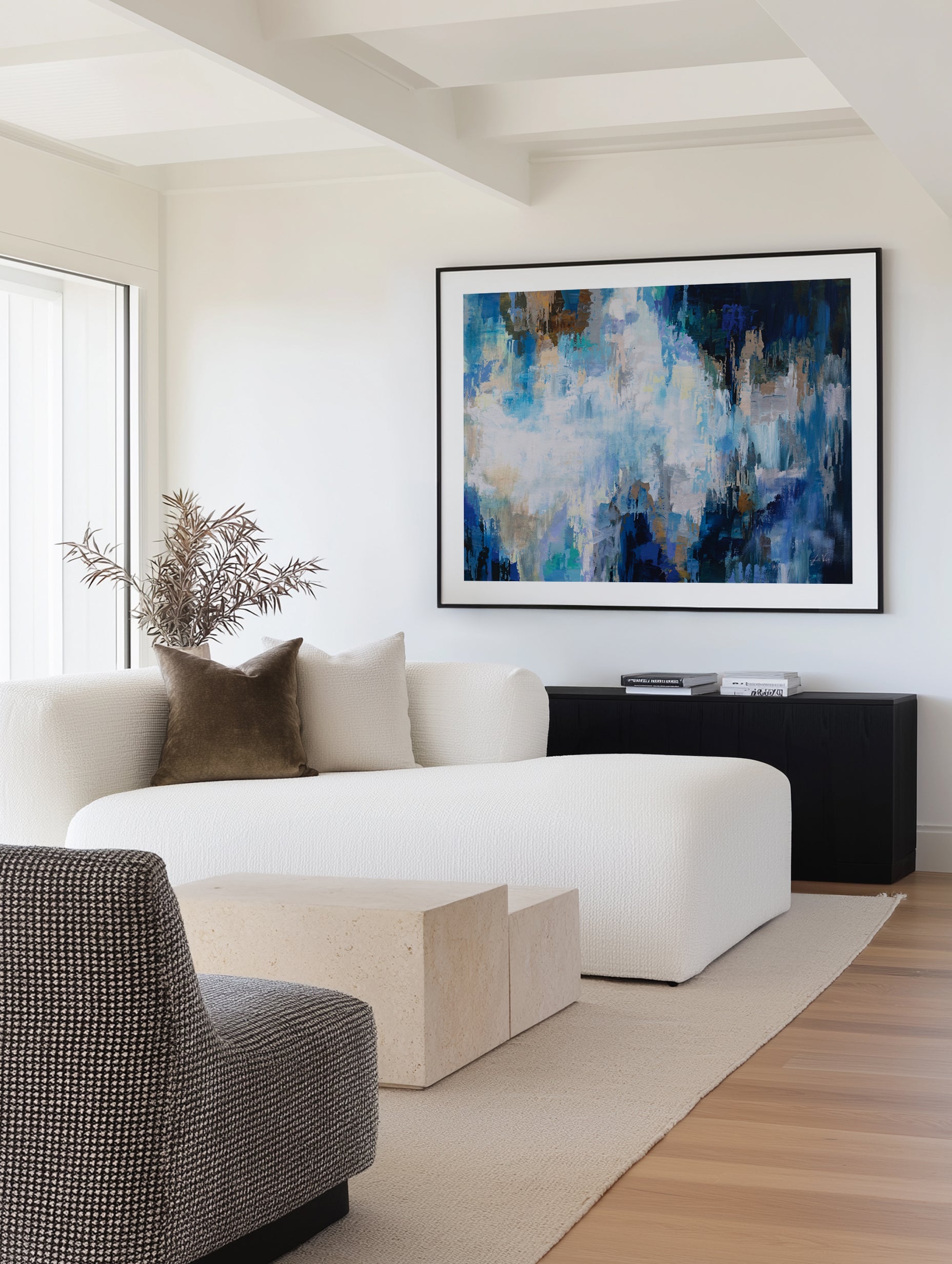
Blue is the colour humans trust most and tire of least, and in abstract art it does something no other hue manages: it reads as both a colour and a place. A field of layered blues suggests water, sky, distance, depth, without depicting any of them, which is why blue abstraction is the most requested colour family in Australian wall art and the easiest statement to live with for a decade.
This guide covers the blue abstract spectrum from ink-dark navy to washed aqua, which blues suit which rooms, the palettes that make blue sing rather than sulk, and how to frame it. We have designed, printed and framed thousands of blue works at our Central Coast facilities, for homes from Perth to Portland, and the patterns in what works are remarkably consistent.


Monets Dance I · Monets Dance II · Summer Feeling I
Why Blue Owns Abstract Art
Blue's advantage is perceptual, not fashionable. It is the colour of every horizon a human has ever relaxed toward, ocean, dusk, distance, and the association travels into abstraction intact. A blue colour field does not need to depict water for the body to respond as if near it. The evidence base is worth stating honestly: research on colour and emotion shows that brightness and saturation drive calm more reliably than hue itself, so a pale, low-saturation blue soothes while an electric cobalt energises. Blue abstraction offers the widest usable range of that dial in a single colour family.
For decorating, blue is also the great neutral-that-isn't. It cools timber without greying it, deepens white walls, and sits comfortably beside almost every accent Australians actually use, brass, linen, rattan, charcoal, eucalyptus green. When customers cannot name what a room is missing, the answer is very often depth, and blue abstraction is depth you can hang.
Blue never asks to be the story. It makes the room feel like it has a horizon.
The Blue Spectrum, Decoded
- Navy and ink: the formal end. Near-black blues ground high-ceilinged rooms and read as library-serious. Superb in studies and dining rooms; pair with brass or oak finish frames.
- Cobalt and royal blue: maximum voltage. One cobalt gesture can carry an entire white room; see our cobalt blue palette guide for the full scheme.
- Ocean and teal blues: the Australian favourite, saturated but weathered, reading coastal without a single beach cliché. The backbone of our blue abstract collection.
- Soft chalk and powder blues: the bedroom register. Low saturation, high brightness, the scientifically calm corner of the family.
- Aqua and sea-glass: lightest and most playful, at home in bathrooms, kids' spaces and summer-house schemes, browse the aqua abstract range.
Most successful blue works travel across several of these registers at once, a navy base breathing up into chalk highlights, which is what separates a blue artwork from a blue swatch.


Blue Abstraction, Room by Room
- Living room: ocean-register blues at scale. One large work spanning two-thirds of the sofa's width, hung with its centre 145cm (57in) from the floor. Blue tolerates scale generously, it recedes rather than shouts.
- Bedroom: the natural home of chalk and powder blues. Low-contrast, flowing compositions above the bedhead; save the cobalt for rooms you want to wake up, not wind down.
- Bathroom: aqua and sea-glass abstraction thrives here, echoing water without depicting it. Framed prints handle powder rooms and well-ventilated bathrooms comfortably.
- Home office: mid-blues aid sustained focus better than high-energy warm colours; a structured blue geometric behind the desk reads composed on camera.
- Dining room: ink and navy work after dark. Deep blue abstraction under warm lamplight is the cheapest sommelier trick in decorating.
- Entry: a confident blue pair sets the whole home's temperature at the door; our pairs guide covers the hang.
Palettes That Make Blue Sing
Blue abstraction fails only when a room gives it nothing warm to push against. The five pairings we specify most:
- Blue and oat/linen: the coastal-luxe default, deep blues against warm neutrals, oak floor, rattan texture. Our coastal luxe guide builds this scheme end to end.
- Blue and terracotta: complementary warmth; a blue work above a terracotta vase is an instant colour lesson. See the terracotta palette guide.
- Blue and white: crisp, Hamptons-adjacent, hard to date. Keep the blue saturated so the scheme reads deliberate rather than default.
- Blue and charcoal: tonal sophistication, navy abstraction on deep grey walls, best with a white finish frame creating the light break.
- Blue and brass/gold: the luxury pairing; warm metallics make ink blues feel lacquered. One brass picture light above a navy work earns its cost nightly.


My Body Moves · Embrace In Blue by Sella Molenaar
Framing Blue: Warmth Is the Decision
Blue art arrives cooler than any other colour family, so the frame carries the thermostat. Oak finish is our first recommendation for most blue abstraction, solid timber warmth against water-cool colour is the pairing that makes both sing. White finish suits chalky, light works where you want the art to float on pale walls. Black finish suits ink and navy pieces heading formal. Every frame is solid timber with an oak, white or black finish, cut and joined on Italian machinery by our own artisans here in Australia, and there is an art surrounding the art: the frame's craft is part of what you hang.
Format follows scale: blue framed canvas for statement walls (no glass, no reflections, painterly presence), framed fine art prints for pairs, trios and gallery walls. Made to order, hand trimmed, despatched in a couple of business days, the fastest custom art turnaround in Australia.
How Blue Abstract Art Is Actually Made
The register of a blue work is set in the making. Watercolour-style washes build luminosity by letting pale layers glow through darker ones, which is why washed ocean works feel lit from inside. Gestural acrylic and ink pieces bank their energy in the speed of the stroke, you can read the wrist movement a metre away. Digitally composed works layer scanned textures and painted marks, refined until the balance holds. Our range carries all three approaches, from named artists in our community alongside our in-house design team, because the connection matters more than the medium: an original composition, a name and an eye behind it, made for your wall.
Reproduction quality decides whether that making survives the journey to your room. Blues are the least forgiving family to print, cheap inks push navy toward purple and drain teal grey. We print with archival pigment inks on heavyweight fine art paper and stretch or hand trim every piece at our West Gosford facilities, so the blue that seduced you on screen is the blue on the wall.
Buying Blue: a 60-Second Decision Path
- Name the job. Calm (bedroom, retreat) points to chalk and powder blues; presence (living, dining) points to ocean and navy; energy (entry, kids' spaces) points to cobalt and aqua.
- Check the room's warmth budget. Timber floor, linen sofa, brass accents? Blue will thrive. All-white and grey? Add one warm element or choose a teal-leaning work.
- Size to the furniture. Two-thirds of the sofa or bedhead width; when torn between sizes, larger.
- Frame for temperature. Oak finish default, white for airy pieces, black for formal navy.
- Audition at night. Blue shifts more under lamplight than any other family; a work that holds at 7pm holds forever.


Tidal Retreat Crop · This Land II
Designer Tips
- Repeat the artwork's deepest blue once more in the room, cushion, vase, book spine. One echo makes it belong; three echoes make it a theme, stop at one or two.
- North-light rooms (cool light) suit warmer, teal-leaning blues; west-light rooms flatter chalky blues that hold their colour at golden hour. Audition in the room's own light before committing.
- Blue-on-blue layering works when saturation varies: pale walls, mid-blue textiles, deep blue art. Same saturation everywhere is what makes blue rooms feel flat.
- Pairing with wallpaper: a textured plain or subtle pattern in the same temperature family lets a blue work lead; order the $4.99 wallpaper sample (48cm x 40cm / 19in x 16in) and check the pair in situ.
- We ship worldwide to more than 40 countries with all import duties paid, the checkout price is the delivered price.
Frequently Asked Questions
What colours go with blue abstract art?
Warm neutrals (oat, linen, sand), terracotta and rust, crisp white, charcoal, and warm metallics like brass. The common thread is warmth: blue art needs at least one warm element nearby or the scheme drifts cold. Timber furniture usually supplies it automatically.
Is blue art good for bedrooms?
The best colour family for them, with one qualifier: choose low-saturation, high-brightness blues (chalk, powder, sea-glass) in flowing compositions. High-contrast cobalt energises, which is the opposite of the bedroom brief. Hang above the bedhead with the work's centre about 145cm from the floor, or rest a large framed piece on the bedhead ledge.
Does blue abstract art suit coastal style homes?
It defines them, precisely because it does the coastal work without the props. Weathered ocean blues in gestural or organic compositions give you the sea's register with no anchors, no shells, no typography. Pair with linen, rattan and pale timber, and read our coastal homes art guide for the wider method.
Can I hang blue art in a room with a lot of timber?
Blue is the best abstract family for timber-heavy rooms. Timber's orange-brown warmth and blue's coolness are near-complements, so each makes the other richer. Mid and deep blues work best; very pale blues can look washed out against dark timber.
What frame colour suits blue abstract art?
Oak finish for warmth (our default recommendation), white finish for pale airy works, black finish for navy and ink pieces in formal rooms. Keep one finish per grouping. All our frames are solid timber, made in Australia.
Should blue abstract art be canvas or print?
Canvas for large single statements and rooms with window reflections; framed fine art prints for groupings and layered editorial walls. Blue's depth carries in both, canvas carries texture, paper carries precision.
Is blue art too cold for south-facing rooms?
In the southern hemisphere, south-facing rooms receive the coolest light, so choose blues with warm undertones, teal, ocean, petrol, rather than icy chalk blues, and frame in oak finish. Add warm lamplight and the room reads moody rather than cold, which is the point.
Explore the blue abstract art collection, the wider abstract wall art range, or all blue wall art. Designed and made on the Central Coast of NSW, delivered to more than 40 countries with all duties paid.


