

Some rooms announce their budget. The better ones keep it to themselves. Quiet luxury, the look built on texture, restraint and deep neutral calm, has quietly become the most requested style in Australian interiors, and the fastest way to give a room that whispered-expensive feeling is on the wall. Not louder art. Better silence.
We print and frame neutral contemporary work every day at our West Gosford facilities, and the quiet pieces are the ones that keep going to the most considered homes. This guide covers what makes art read as quiet luxury, the palette and scale rules that hold the look together, and the pieces from our neutrals collection that do it best.

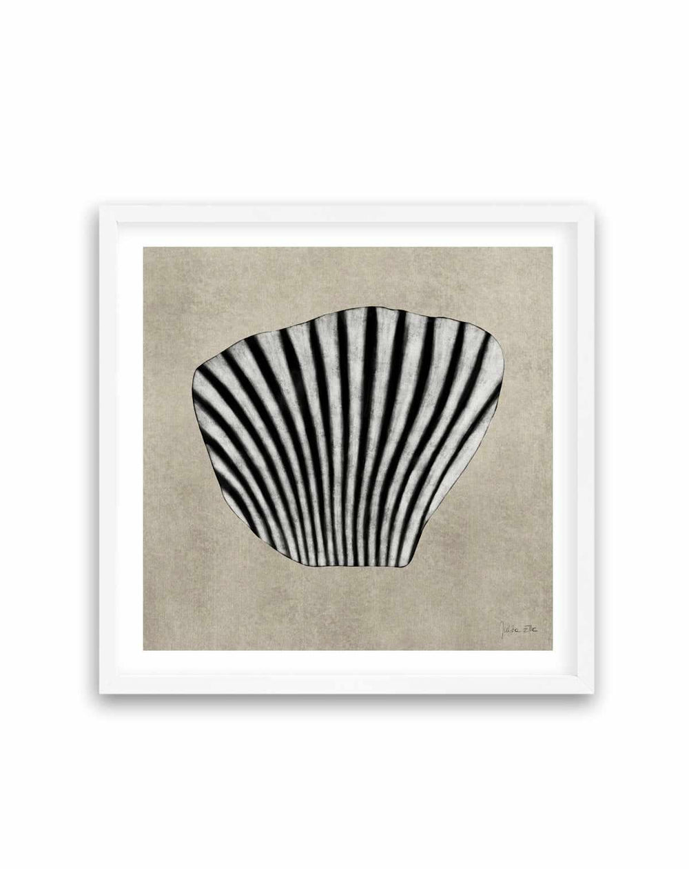
Sea Shells by Julita Elbe | Art Print
What Quiet Luxury Actually Means on a Wall
Strip away the fashion-press version and quiet luxury is three disciplines. Texture over image: the piece reads as a surface, plaster, sand, washed pigment, before it reads as a picture. Tone over contrast: colours sit near each other, ivory against oat against stone, so the eye glides rather than jumps. And space over abundance: one substantial work with room to breathe outranks a crowded wall every time. Sea Shells by Julita Elbe is a perfect study in all three, forms you feel more than see, in tones that could have been mixed from the beach itself.

Rituals - Earth by Design Fabrikken | Art Print
The result is a room that feels resolved. Guests rarely name the art as the reason, which is exactly the point, quiet luxury is felt as atmosphere, not spotted as decoration. Rituals, Earth by Design Fabrikken works this way, an earthen composition that behaves like a texture the room always had. If the wider aesthetic is new to you, our quiet luxury styling guide covers the whole room, this guide is for the walls.
Quiet luxury is felt as atmosphere, not spotted as decoration.
The Neutral Palette, Layer by Layer
Neutrals fail when they are flat and sing when they are layered, and the art is where the layering shows most. Build from warm whites and bone through oat, sand and greige, then anchor with one deeper note, clay, tobacco, soft charcoal. The Elaris pair, I and II, demonstrates the principle as a duo, two tonal compositions that hold hands across a wall without repeating each other. Hang them as a pair above a bed or sideboard and the wall does the layering for you.


Browse the full modern contemporary art in neutrals collection with the layering rule in mind, shortlist pieces whose tones neighbour each other, and the scheme assembles itself. Our neutral wall art guide and earth-toned abstract guide continue the palette thinking, and the mushroom greige palette guide names the exact tones this style leans on.
See It on Your Wall Before You Spend: The Free Mockup
Subtle art is the hardest kind to buy from a screen, because its whole language is texture and tone, exactly what phone displays flatten. So do not buy it from a screen. Send us a photo of your wall with rough measurements and our styling team will mock your shortlisted pieces onto the actual wall at true scale, free, usually within one business day. Noma on your own wall, in your own light, beside your own sofa, that render is the moment a quiet piece stops being a maybe.

Then stack the certainty: the product-page zoom shows the printed texture at full resolution, the newspaper-template trick confirms the footprint on the wall in thirty seconds, and standard sizes carry a 30-day exchange. Between the mockup, the zoom and the template, a considered purchase gets to be exactly that, considered, before a dollar moves.
Room by Room, Quietly
- Living room: One generous piece above the sofa, sized by the above-the-sofa formulas. Sand and Stone by Nicoll Suzanne carries the wall calmly at scale.
- Bedroom: Tonal work over the bedhead keeps the room's pulse low, the calm-first bedroom guide maps the approach.
- Entry: A single textured piece facing the door sets the whole home's tone in one glance, spacing advice in the hallway art guide.
- Dining room: Neutral depth flatters candlelight, and quiet work lets the table host, see dining room wall art.
- Home office: Tonal art reads composed on camera without becoming a talking point. Glimpse behind a desk is a masterclass in professional calm.

Sand and Stone by Nicoll Suzanne | Art Print
Scale and Framing: Where Quiet Gets Its Confidence
The paradox of this style is that quiet art needs confident scale. A small tonal print apologises, a large one presides, and the difference between the two is the entire look. Go one size beyond your first instinct, and give the piece more empty wall than feels efficient, the space around a quiet work is part of the work. Our complete sizing guide has the numbers per wall and room, and the large art buying guide settles the nerves that come with them.

Framing finishes the sentence. Oak is the quiet luxury signature, warm, textural, unshowy, while white dissolves into gallery calm and black adds the sharpest edge of formality. Every frame is built in-house at our Central Coast facilities around prints on 230gsm archival paper, made to order, dispatched within 24 hours of production and delivered Australia-wide with international shipping available. Hanging heights live in how to hang wall art.
Start Small, From $9.95, and Let It Earn the Wall
The lowest-risk entry into the look is also the most pleasant. Order a shortlisted piece in A5 or A4 first, from $9.95, printed on the same 230gsm archival paper with the same inks as our largest formats, so what arrives is the artwork itself in miniature, true tone, true texture. Prop it on the mantel or shelf where its bigger self would hang. Quiet work grows on you by design, and a week of walking past it will tell you more than a month of scrolling. When it keeps stopping you, order the statement size with complete certainty.

Rituals - Sand by Design Fabrikken | Art Print
Why This Look Lasts
Loud styles date because their reference points date. Quiet luxury is anchored to things that do not expire, stone, sand, linen, shadow, so a wall built on it in 2026 will still read as considered in 2036. That durability is also the budget argument: one well-chosen neutral piece outlives several trend purchases, and because the palette plays well across styles, the art survives your next sofa, your next rug, even your next house. It is the rare decorating spend that behaves like an investment in calm.
What we notice from the production floor backs it up, neutral contemporary pieces have the highest rate of companion orders in the catalogue, the second piece arriving weeks after the first as the scheme finds its rhythm. Quiet, it turns out, is habit-forming. And because every piece is printed and framed to order, dispatched within 24 hours of production, the short wait between ordering and unwrapping becomes part of the pleasure, the wall is already clearing in your head before the parcel is on the van.
The Blog-Reader's Question We Hear Most
The single most common question our team is asked about this style, in emails and in the free styling requests, is some version of: my room is already neutral, will neutral art just disappear? It is a fair worry and the answer is a firm no, provided the art brings what the walls cannot. A painted wall is one flat tone. A quiet luxury piece is twenty tones in conversation, plus texture, plus form, and against a flat neutral wall that difference reads clearly. The art does not disappear into a neutral room, it explains the room, suddenly the oat sofa and the travertine lamp look like decisions rather than defaults.
The practical test: hold the mockup render at arm's length and squint. If the artwork still reads as a distinct presence against the wall colour, the tones are far enough apart. If it truly vanishes, choose the piece one shade deeper, Rituals, Sand against a white wall, Rituals, Earth against a greige one. That one-shade adjustment is usually all the separation the look needs.
Designer Tips for the Whisper-Expensive Wall
- Use the free mockup on every shortlisted piece, subtle work must be judged in your light, not a screen's.
- Keep tones neighbourly, ivory beside oat beside stone, and save contrast for one deep note per room.
- Size up and leave breathing space, the wall around a quiet piece is part of the piece.
- Oak frames by default, black only where the room needs an edge.
- Pair the wall with texture at floor level, linen, wool, travertine, our warm minimalism guide completes the room.
Let the Room Lower Its Voice
Somewhere in your home is a wall working too hard or not at all, and one substantial neutral piece would settle the whole room around it. Shortlist from the neutrals collection, send us the wall photo for a free mockup, or let a $9.95 A5 audition on the shelf first. We have printed and framed for more than 350,000 homes since 2015, and the quietest pieces earn the most lasting Loox reviews, the word every one of them reaches for is calm. Keep reading with the gallery-quality canvas guide and the rest of On the Wall.
Frequently Asked Questions
What makes wall art quiet luxury?
Restraint, texture and depth. Quiet luxury pieces work in layered neutrals, stone, sand, bone, clay, soft charcoal, with organic forms and visible texture rather than bold statements. The piece looks and feels expensive because of its subtlety, not despite it. Nothing shouts, everything holds.
Which colours belong in a quiet luxury art scheme?
Warm neutrals lead: ivory, oat, travertine, greige, camel and stone, deepened with clay, tobacco and soft black. The rule is tonal harmony, colours sit close to each other rather than contrasting, which is what creates that calm, hotel-suite feeling.
Does quiet luxury art suit smaller homes and apartments?
Especially well. The style is about creating calm through cohesion, which small spaces reward. One large neutral piece in an apartment living room does more for the sense of quality than a dozen small decorative objects, and it costs less than most of them.
Should quiet luxury art be framed in oak, white or black?
Oak is the signature frame for this look, its natural grain adds warmth and texture without announcing itself. White disappears into gallery-calm. Black is the sharpest choice and suits pieces with deeper charcoal tones. All three are made in-house at our Central Coast facilities.
How large should the art be for this look?
Generous. Quiet luxury reads through scale and breathing space, one substantial piece with wall space around it, rather than several small works. Above a sofa, aim for around two-thirds of the sofa's width. When in doubt, size up, undersized art is the fastest way to undo the effect.
Can I preview quiet luxury pieces on my own wall?
Yes, free. Send a photo of your wall with rough measurements and our styling team will mock your shortlisted pieces onto your actual wall at true scale, usually within one business day. For subtle work, seeing it in your own light is the whole decision.
What styles pair well with quiet luxury art?
Japandi, warm minimalism, coastal luxe and contemporary interiors all share its DNA. The common threads are natural materials, tonal palettes and restraint, so the art folds into any of these rooms without effort.
How do I start a quiet luxury art collection affordably?
Start with an A5 or A4 print from $9.95, printed on the same 230gsm archival paper as the largest sizes, so the small print is the artwork itself, not a preview. Live with it, then scale your favourites up to statement sizes as the room evolves.


