

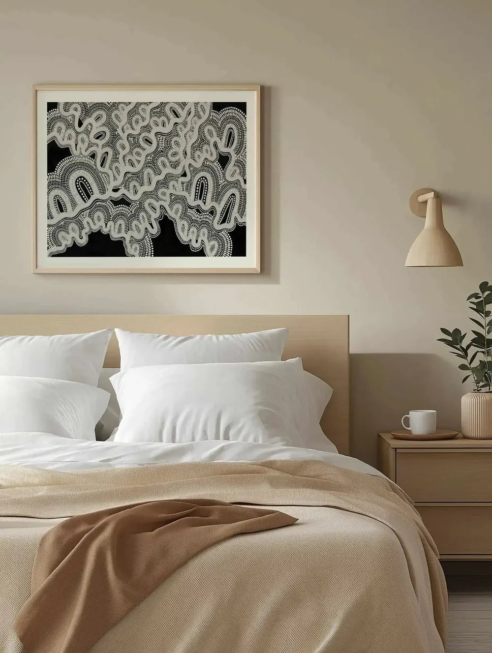
Black and white wall art is the most misunderstood choice in decorating, treated as the safe choice when it is actually the strongest one. Stripped of colour, an artwork has nowhere to hide: composition, light and subject carry everything. This is the complete guide to buying monochrome well, where it transforms a room, where it falls flat, and how the printing itself decides whether black and white looks gallery-grade or photocopied.
We print monochrome work daily at our West Gosford facilities, and it is the most technically demanding thing we do, deep blacks without bronzing, mid-greys without colour cast, on archival 230gsm stock. The black and white collection is built on getting that right.


Mother is Earth | Monotone by Leah Cummins Art Print · Systems | Black by Leah Cummins Art Print · Systems | Monotone by Leah Cummins Art Print
Why Monochrome Organises a Room
Colour asks questions; black and white answers them. In a room already carrying timber, textiles, books and life, a monochrome artwork acts as a visual full stop, the eye lands, rests, and understands the wall is handled. This is why designers deploy black and white in exactly the rooms amateurs think need more colour: the busy family living room, the eclectic study, the hallway of competing sightlines. The artwork does not add another voice to the argument; it chairs the meeting.
The flip side is honest too: in a room that is already quiet, pale walls, neutral sofa, minimal styling, hard monochrome can tip serenity into sterility. Those rooms want the soft end of the spectrum: misty greys, tonal charcoals like the Leah Cummins monotone series, or they want colour and should admit it. Black and white is a tool with a purpose, not a default.
Colour decorates a wall. Black and white governs it.
Photography, Abstraction and Line: Choosing Your Monochrome
Monochrome splits into three families with different jobs. Black and white photography carries place and memory, coastlines, architecture, figures, and rewards close viewing, which suits hallways, studies and any wall experienced at under two metres. Monochrome abstraction, gestural ink work, tonal fields, geometric studies, is composition distilled, and it holds a wall from across a room, which makes it the living room and statement-wall choice. Line work and figurative drawing sit between: intimate, literary, best in reading corners and bedrooms.
Mixing families on one wall works under one condition: identical framing. Same frame, same mat, same spacing, and a photograph can sit beside an ink abstract beside a line drawing, the monochrome does the unifying that colour-matched walls need palette discipline to achieve. It is the easiest sophisticated gallery wall in decorating, and our gallery wall method maps directly onto it.


Morning Villa by Mario Stefanelli Art Print · Serene by Mario Stefanelli Art Print
The Contrast Dial: Matching Energy to Room
Within black and white, contrast is the energy dial, and reading it correctly is most of the skill. High contrast, true blacks against clean whites, hard edges, is energising and formal; it suits entries, dining rooms that host, offices that need edge. Low contrast, the grey-led world of mist, smoke and stone, is restful; it belongs in bedrooms, calm living rooms and anywhere the brief is exhale rather than impress. Squint at any monochrome work and its energy reads instantly.
Australian light plays into this more than most buyers know. Hard coastal daylight amplifies contrast, a high-contrast work in a bright Queensland room can read almost aggressive by noon, while the same piece in a softly lit southern living room is perfectly judged. Rooms with strong direct light generally want the contrast pulled one notch softer than instinct suggests; the light supplies the drama the print holds back.
Framing Monochrome: Where the Room Enters
With colour removed from the artwork, the frame becomes the palette decision. Black timber framing doubles down, gallery-formal, sharpest against pale walls, the default for high-contrast photography. Oak brings warmth and is the secret of making monochrome live comfortably in relaxed Australian interiors; a grey-toned abstract in oak reads as considered rather than austere, which is why oak outsells black across our framed range even for monochrome work. White frames dissolve, leaving the image floating, right for soft photography in minimal rooms.
The rule that never misses: match the frame to the room's hardware, not to the artwork. Black window frames and matte black tapware call for black framing; blond timber floors and linen call for oak; if the room has no strong metal or timber voice, white lets the wall decide later. And on one wall, one finish, monochrome's unifying power evaporates the moment the frames start disagreeing.


Thirsty by Mario Stefanelli Art Print · In Balance by Mario Stefanelli Art Print
Rooms Where Monochrome Is the Answer
- The home office and video-call wall: monochrome reads as competence on camera and never fights the ring light; a tonal abstract behind the desk is the professional's default for a reason, and our video call wall guide builds the full backdrop.
- The hallway run: three or four black and white photographs, identical frames, even spacing, the highest sophistication-per-dollar move in decorating.
- Over-colourful rooms: kids' zones that leak into living space, maximalist book walls, collected interiors, one monochrome anchor gives the eye its resting place.
- The formal dining room: high-contrast work under warm evening light is the supper-club look: deep, flattering, conversation-starting; the dining room guide covers placement.
- Rentals: when you cannot control wall colour, monochrome art coordinates with whatever beige arrives, and moves to the next address without a palette renegotiation.
Print Quality: Why Monochrome Exposes Everything
A colour print can hide modest production behind saturation; black and white cannot. Cheap monochrome printing shows three failures within a year: blacks that bronze and go greenish at an angle, banding in smooth grey gradients, and paper that yellows and drags the whites with it. The fixes are unglamorous and non-negotiable, pigment inks rather than dye, archival acid-free stock, and printer profiles built for neutral greys, which is precisely the specification every print in our art print range runs on.
This is also the genre where paper texture earns its money. The 230gsm matte fine art stock we print on holds detail in shadows that gloss papers flare away, and its slight tooth gives large tonal fields a physical depth that flat poster paper cannot fake. If you have only seen black and white art as posters, the first archival print changes what black and white can mean, and the smallest size of any work, from $9.95, is the inexpensive way to see it before scaling up.
Monochrome at Scale: The Statement Wall
Black and white does something at large scale that colour cannot: it gets quieter as it gets bigger. A 120x150 colour abstract shouts; the same size in charcoal and mist simply presides. This makes monochrome the safest choice for the intimidating wall, the double-height void, the long living room run, the wall behind the dining table, because scale amplifies colour's risk but amplifies monochrome's authority. Our extra large works in monochrome consistently produce the most "it made the room" mail we receive.
Pairs deserve their moment here too. Two monochrome works from the same series, hung tight as one composition, solve the wide-wall problem with rhythm a single piece lacks, and the same-series rule keeps the greys genuinely matched, two different artists' blacks rarely agree as well as one artist's pair does. The pairs guide covers the spacing method; monochrome forgives everything about a pair except uneven framing.
Building Around Monochrome: The Styling Layer
A black and white wall gives the rest of the room unusual freedom, and the styling around it decides whether the effect lands as gallery or as showroom. The warm route is the Australian sweet spot: oak furniture, linen, wool, brass or aged bronze hardware, with the monochrome art supplying structure over the warmth, this is the combination that makes visitors ask who did the interior. The cool route, concrete, steel, black joinery, produces the serious loft look and wants high-contrast photography rather than soft abstraction, or the whole room goes flat.
One live plant near a monochrome wall does disproportionate work; the single note of living green against grey tones reads intentional in a way no cushion ever manages. And resist the urge to echo the artwork's monochrome in every textile, a room fully colour-drained needs the art to carry all its life, which is a heavier job than one wall should hold. The strongest schemes keep one or two quiet colour presences, dusty terracotta, olive, denim, so the black and white reads as a choice among riches rather than an absence.
The Monochrome Mistakes Worth Skipping
Monochrome has its own failure modes, all avoidable. The photocopied-quote wall is the obvious one, typography posters in black frames are the fastest way to make monochrome read as filler rather than art; if the wall wants words, it wants very few and very good ones, and it usually just wants an image instead. The contrast mismatch is subtler: hard graphic work in a soft bedroom, or misty greys trying to anchor a bold dining room: right idea, wrong dial position, and the room feels inexplicably off until the energy matches the function.
The third mistake is treating monochrome as colourless rather than as a palette. Blacks have temperature, warm charcoal versus blue-black, and greys carry casts that clash exactly the way colours do; a warm-toned photograph beside a cool-toned abstract disagrees visibly even in "black and white". Buying from one series, or one artist's hand, sidesteps the whole problem, which is one more argument for the pair-and-series approach over the single-pieces-from-everywhere gallery wall. When in doubt, the smallest print size settles temperature questions in person for less than a takeaway dinner.
Frequently Asked Questions
Where does black and white art work best?
Anywhere the room needs order: over-busy living rooms, hallways, home offices, and any space with strong existing colour. Monochrome is the one palette that cannot clash with anything, which is why designers reach for it when a room already has plenty going on.
Should I choose photography or abstract work in black and white?
Photography brings a place and a story; abstraction brings pure composition. Busy rooms usually want the calm of abstraction, minimal rooms can carry the detail of photography. Mixing both on one wall works when the framing is identical.
What frame colour suits black and white prints?
Black frames sharpen monochrome into gallery formality; oak warms it into a home; white disappears and lets the image float. The room's existing timber and metal decide, match the frame to the joinery, not to the artwork.
Does black and white art suit warm interiors?
Yes, and the pairing is underrated. Warm timber, linen and brass make monochrome read rich rather than stark, and a black and white print gives a warm room a spine it otherwise lacks. Choose works with soft grey mid-tones over hard pure contrast for these rooms.
How do I build a black and white gallery wall?
Identical frames, consistent spacing of five to eight centimetres, and one size rule broken deliberately, a single larger anchor among uniform smaller works. Monochrome forgives subject variety better than any palette, so the images can range widely while the wall stays coherent.
Can black and white prints go in a bedroom?
Choose the soft end of the spectrum: misty photography and gentle tonal abstraction rather than hard-contrast graphics. High contrast is energising, which is the opposite of the bedroom brief; grey-led monochrome with low contrast rests as well as any colour.
What sizes do black and white prints come in?
Everything from A5 to 120x150, framed in oak, black or white timber or unframed. The smallest size is the honest way to preview the paper and printing, from $9.95, before committing to a statement scale.
Start with the black and white collection, go deeper into monochrome photography and grey wall art, or pair works from the sets and pairs range. Printed and framed in West Gosford, shipped ready to hang worldwide, in the one palette guaranteed to still be right when every trend cycle has turned over twice.


