Botanical wallpaper is the most enduring pattern category in residential interior design — not because it is fashionable, though it recurs in every design cycle, but because it is fundamentally correct. Plants, leaves, flowers, and organic forms are the visual references the human eye finds most restful and most pleasurable. Every other pattern category requires the brain to process an invented visual language. Botanical patterns speak a language the eye already understands. This is why a well-chosen botanical wallpaper can make a room feel immediately more liveable and more calm — regardless of the room's other design decisions.


Miami Palms Wallpaper · Vintage Meadow Bloom Wallpaper · Vintage Autumn Floral Wallpaper
At Olive et Oriel, botanical and floral wallpapers are consistently our most purchased category across all Australian states and all room types. We manufacture at our Central Coast NSW facility, custom sized to each customer's exact wall dimensions. Over more than a decade, we have watched the category evolve from formal Victorian-influenced florals through large-scale tropical leaves to the current moment — a period characterised by considered naturalism: botanicals that are specific rather than generic, drawn with the precision of scientific illustration rather than the looseness of decorative motif.
What makes a botanical wallpaper work in a room is not simply the quality of the illustration, but the relationship between pattern scale, colour palette, and the room's existing design language. A large-scale tropical leaf in deep green reads as bold and graphic; the same leaf in dusty sage reads as quiet and atmospheric. The same pattern can function in very different rooms depending on colour choices and scale. Understanding these relationships is what allows botanical wallpaper to work in every room of the house rather than only in the obvious spaces.


Amber Meadow Bloom Wallpaper · Burgundy Wildflower Study Wallpaper
Pattern Scale and Room Proportion
Large-scale botanicals — leaves, fronds, or flowers extending 30cm or more — create immediate visual impact. At normal viewing distances of 3 metres or more, they read as bold, graphic statements. In large rooms with generous ceiling heights, they are commanding without being overwhelming. In small rooms, they work best on a single feature wall — one surface carrying the full weight of the pattern while the remaining three walls provide quiet contrast. The depth created by the feature wall treatment compensates for the visual energy of the pattern.
Small-scale botanicals — fine botanical illustrations, small repeat florals, detailed meadow prints — read as texture at viewing distance. They add visual complexity without asserting pattern in the way large-scale designs do. They are more versatile across room sizes and more tolerant of other pattern elements in the room. Cushion prints, rug patterns, and bedding can coexist with a fine small-scale botanical more easily than with a large tropical. In rooms with multiple existing pattern elements, small-scale botanical is consistently the most successful wallpaper choice.
Medium-scale botanicals — the most common category — require the most careful assessment. The $4.99 sample check is essential: prop the sample against the wall, step back to normal viewing distance, and assess whether the pattern reads as rich detail or visual busyness. The viewing-distance assessment is the only reliable test — samples at arm's length are consistently misleading about how a pattern will read on the wall. For large-scale tropical botanicals that function as a full feature wall, the design operates on the same principle as a mural — the composition must be considered at full scale and from the primary viewing position before ordering.
Colour in Botanical Wallpaper
Green is the defining colour, and the specific green matters enormously. Olive and eucalyptus tones read as distinctly Australian — they connect to the specific quality of light and landscape that characterises coastal and bush environments. They perform particularly well in north-facing rooms where Australian afternoon light adds warmth to the undertone. Sage green is quieter and more international — it works equally well in cool south-facing rooms and warm north-facing ones. Deep forest green reads as dramatic and enveloping, working in dining rooms, studies, and bedrooms where the enclosing quality of a rich colour is appropriate.
White and cream backgrounds open a botanical pattern up — the illustration floats on the background and the room reads lighter. Dark backgrounds — black, navy, deep charcoal — make the botanical illustration glow against the ground. Dark background botanicals work particularly well in dining rooms and powder rooms where the enveloping quality of a dark background creates atmosphere. The contrast between a richly illustrated botanical and a dark ground is one of the most dramatic and effective wallpaper applications available.
Australian natural light interacts with botanical palettes in specific ways. The intense warmth of north-facing afternoon light can shift cream backgrounds toward yellow and make soft greens appear more saturated. South-facing rooms with cool diffused light render botanical palettes more accurately to their colour card appearance. Order the sample and assess in your specific room at different times of day. This is not a precaution — it is the step that determines whether the wallpaper you install is the wallpaper you thought you were ordering.
"Botanical wallpaper works in any room because it speaks the visual language the eye is most fluent in. The design decisions — scale, colour, placement — determine the register, from quiet background texture to bold architectural statement."
Materials
- Paste the Wall Smooth: The best choice for botanical patterns with detailed illustration work. The smooth surface allows fine lines and colour gradients to render clearly. Any pattern where the quality of the print is central to the design should be on smooth substrate. Detailed scientific illustrations, fine watercolour-style florals, and precise botanical drawings all require smooth substrate to render at their best.
- Paste the Wall Linen: Adds a linen weave texture that slightly softens the botanical illustration — appropriate for patterns where the overall atmospheric quality is more important than precision of individual illustration details. Meadow prints and loose floral patterns suit linen substrate well. The texture adds warmth and a handcrafted quality to botanical designs.
- Peel and Stick: Available for all our botanical patterns. Equivalent print quality to Paste the Wall. The right choice for rental properties, feature wall applications, and any room where future flexibility is important. Production takes 4 business days at our Central Coast NSW facility. All our peel and stick products are recommended for use with Viponds Self Adhesive Prep Coat for optimal adhesion in Australian conditions.
Room by Room
- Living room: A large-scale botanical on the feature wall most visible from the primary seating position. Deep green tropical leaves or large florals on a white or cream ground. The remaining walls in a solid drawn from the botanical palette. Browse the full botanical collection for options across every colour family and scale.
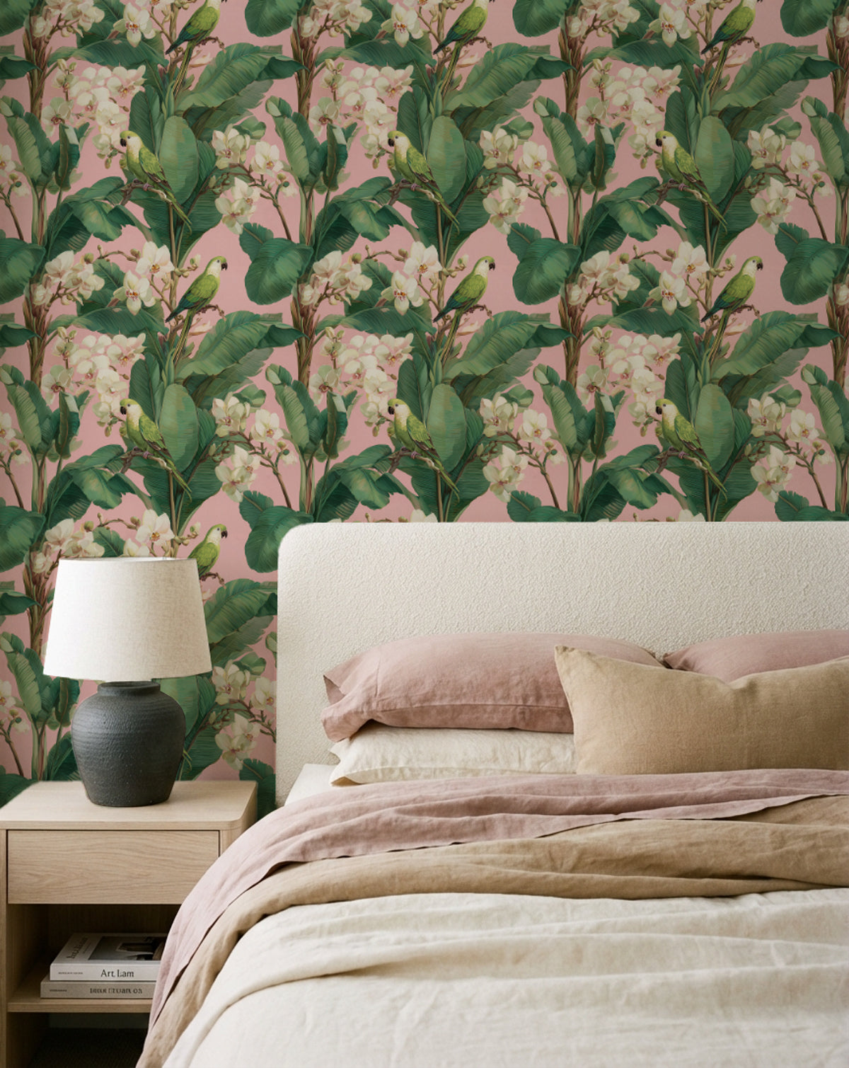
- Bedroom: A tonal botanical — sage, dusty rose, warm cream — on the headboard wall. The restful quality of botanical pattern is most appropriate in the bedroom. Avoid high-contrast dark-background botanicals in the bedroom; the visual energy suits rooms of brief occupancy more than spaces for sustained rest.
- Kitchen: A small-scale botanical — citrus prints, herb illustrations, meadow florals — on a splashback feature wall or the wall between bench and overhead cabinetry. The botanical reference connects naturally to the food preparation context. Kitchen wallpaper should be on smooth substrate for ease of wiping clean.
- Bathroom: Peel and Stick botanical on the wall behind the vanity. A tropical leaf or fine floral in the bathroom creates the sense of bringing the outside in — appropriate in a space associated with water and natural materials. Choose a pattern with adequate background colour so that the humidity-related darkening that can occur with very pale backgrounds is not visible.
- Dining room: A dark-background botanical creates atmosphere appropriate to the dining room. Seen across the table at every meal, it becomes a considered backdrop to every social occasion in the space. Deep green or navy with botanical illustration is the most enduring combination in this context, working across Australian interior styles from coastal to contemporary to heritage.
Designer Tips
- Order the $4.99 sample and assess it in the room at the primary viewing distance — 3 metres or more for living rooms and bedrooms. The scale at which botanical patterns read at room distance is consistently different from close range. Step back before committing. A pattern that looks detailed and intricate at arm's length may read as flat texture at 4 metres.
- Consider the room's existing organic elements — timber floors, rattan furniture, linen textiles — when selecting a botanical palette. Botanical wallpaper works with natural materials because it speaks the same visual language. The combination is mutually reinforcing: the wallpaper grounds the natural materials, the natural materials contextualise the botanical pattern. Where the room already has multiple natural material elements, choose a botanical with a clearly related colour palette to avoid visual competition.
- Custom manufactured to your exact wall dimensions at our Central Coast NSW facility. No standard roll pattern repeat calculations, no excess waste at edges. 4 business days production. All import duties covered globally on wallpaper orders to more than 40 countries.
Preparation: The Step Most Guides Skip
Wall preparation is the foundation of any wallpaper installation, and it is the step most guides address in a single sentence. In Australian conditions — where homes span from subtropical humidity in Queensland to the dry heat of inland regions and the variable temperate conditions of southern states — wall preparation requirements vary significantly. A wall in a Brisbane terrace house has different moisture characteristics from a wall in a Melbourne Victorian terrace or a Darwin apartment. Understanding the specific preparation your wall requires is not a minor formality; it is the difference between an installation that lasts a decade and one that begins to lift or bubble within months.
New plasterboard walls must be sealed with a wallpaper primer before any installation. Unprimed plasterboard is highly absorbent — it will draw adhesive out of the wallpaper paste too quickly, preventing full bond formation and making panel repositioning impossible once the panel contacts the surface. Even on previously painted walls, a primer coat creates a consistent adhesion surface that is more reliable than raw paint of variable age and formulation. Allow the primer to dry completely — in humid Australian conditions, a minimum of 24 hours, ideally 48 hours in subtropical environments or during summer months.
For peel and stick wallpaper specifically, Viponds Self Adhesive Prep Coat is the product recommended for Australian conditions. It is specifically engineered for self-adhesive films and reduces the bubbling, peeling, and premature wear that occur when peel and stick wallpaper is applied to surfaces with inconsistent porosity. The wall must cure for a minimum of 24 hours after prep coat application before any peel and stick installation begins. Three coats of Viponds prep coat are recommended on freshly painted walls — the paint must also have cured for a minimum of 30 days before prep coat application. Our full preparation guide is available on the product page for each substrate type.


