

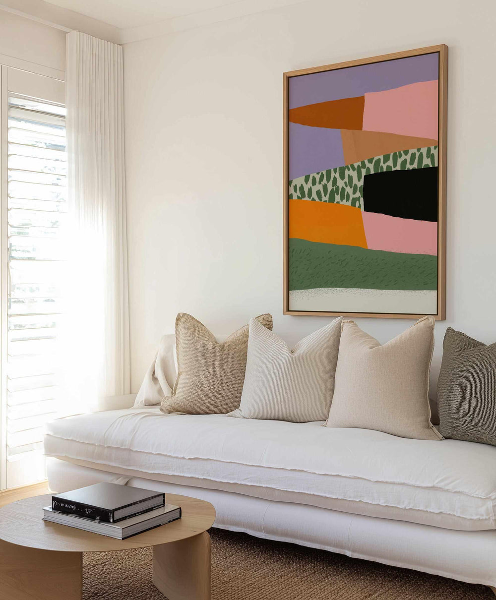
Somewhere along the way, Australian interiors got very good at beige. Warm, layered, lovely beige, and plenty of homes are one saturated artwork away from being twice as alive. Colourful wall art is the cheapest big move in decorating, no repaint, no new sofa, one confident piece, and the room changes its mind about itself.
We print and frame bold work daily at our West Gosford facilities, and we watch what happens in the reviews afterwards, colour buyers write the giddiest ones. This guide covers choosing saturated art you will still love in ten years, the palette tricks that make bold pieces look inevitable, and the free tools that take the risk out of the leap.


Layered Harmony by Little Dean | Framed Canvas Wall Art · Blah Blah by Jackie Green | Framed Canvas Wall Art · Space 06 By Treechild | Art Print
The Case for Colour
Colour psychology gets overcomplicated, so here is the working version, saturated colour raises a room's energy, and rooms have jobs that need energy. Kitchens host mornings, hallways host arrivals, living rooms host everyone, and a strong artwork feeds all of them. What holds people back is not taste, it is fear of commitment, and that fear deserves respect, a loud mistake is louder than a quiet one. The answer is not avoiding colour, it is buying it with better information, which is what the rest of this guide is for.
It helps to know that bold art is reversible in a way bold walls are not. A saturated feature wall is a repaint, a saturated artwork is a rehang, it can move rooms, seasons, even houses with you. For anyone weighing wall-versus-art as the colour delivery system, our colour drenching guide covers the committed end, and this guide covers the flexible one.
One confident piece, and the room changes its mind about itself.
Choosing Bold Work That Lasts
Scrolling the bright and colourful collection, apply one filter above all, composition over gimmick. A piece built on colour relationships, saturated abstracts, layered painterly work, bold botanical and figurative pieces, ages with you, while a piece built on a joke or a fad ages without you. Look for work that balances its own loudness, a quiet zone, a grounding dark, some breathing space, because that internal balance is what lets the piece live on a real wall through real years. The artists in our range are good at exactly this, a Katherine Spiller abstract shouts and whispers in the same frame.
Style neighbours are worth a look, the boho art prints carry colour in earthier keys, our blue wall art guide and pink wall art guide go deep on single families, and the abstract art guide explains why abstraction and colour are such natural partners.


Space 01 By Treechild | Framed Canvas Wall Art · Always Off Shore by Jackie Green
The Mockup Is the Courage: See It on Your Wall Free
Here is the tool that turns colour-cautious browsers into delighted owners, our free digital styling service. Send a photo of your wall and its rough measurements, name the bold pieces you are circling, and the team mocks each one onto your actual wall at true scale, usually within one business day. Fear of bold art is really fear of the unknown, and the mockup deletes the unknown, you see the exact piece at the exact size against your exact sofa before spending anything. It is the single most-used step among our bravest buyers, which tells you where their bravery comes from.
Stack the rest, product-page zoom for print-level detail, the newspaper-template test for footprint, and the 30-day exchange on standard sizes as the final net. Buying bold should feel like this, all the drama on the wall, none in the process.
Room by Room in Full Colour
- Living room: The hero wall belongs to your biggest, boldest piece, sized by the above-the-sofa formulas. Everything else in the room can relax once the wall is carrying the energy.
- Kitchen: Colour survives kitchens brilliantly, one saturated print near the bench outworks a splashback renovation, see the kitchen art guide.
- Hallway: Arrivals deserve a jolt of joy, and halls tolerate more saturation than rooms you sit in, spacing in the hallway art guide.
- Kids and teen rooms: The natural habitat, colour grows with children better than themes do, the teen bedroom guide handles the opinionated years.
- Home office: One energising piece in camera view beats a motivational poster in every possible way.


Transcendent by Katherine Spiller | Art Print · Balance by Katherine Spiller | Art Print
Making Bold Look Inevitable: The Echo Rule
The difference between a bold piece that looks curated and one that looks parachuted in is almost always a single echo. Find one colour the room already owns, the rust in a rug, the green of a plant, the blue of a spine on the shelf, and shortlist art that contains it somewhere, even as a minor note. That one point of agreement convinces the eye the piece belongs, and every other colour in the artwork is then read as intentional adventure rather than accident. It is the cheapest styling trick in this whole guide and it works every single time.
Frames finish the job by staying out of it. Oak and white give saturated work air, black suits dark-grounded pieces, and all our framing happens in-house at the Central Coast facilities on 230gsm archival paper with pigment inks, made to order, dispatched within 24 hours of production, delivered Australia-wide with international shipping available. Heights and hardware live in how to hang wall art.


For You and Me by Katherine Spiller | Art Print · Flowers by Katherine Spiller | Art Print
Start at $9.95 and Let the Colour Argue Its Own Case
Still hesitating between brave and beige? Put a $9.95 print in the room and let it campaign. Our A5 and A4 sizes print on the same 230gsm archival paper with the same inks as the largest formats, the small print is the artwork, true colour in your true light. Prop the contender on a shelf for a week. Colour is persuasive in person in a way screens never capture, and most weeks it wins, the full-size order arrives with the shortlist already settled and the wall already chosen. If it loses, you are nine dollars and one lovely shelf print down, which is the cheapest decorating lesson available anywhere.
What Colour Buyers Teach Us
The colour orders carry a pattern we have watched for years, they arrive in twos. The first order is cautious, one medium piece, often for a hallway, somewhere low-stakes. The second lands within months and it is the brave one, larger, louder, for the main room, because the first piece taught the house that colour was safe. The reviews tell the same story in reverse order of the receipts, the giddy write-up is nearly always about the second piece, and the sentence we see most is some version of, we should have gone bigger sooner. Take the shortcut, let the mockup and the $9.95 audition do the teaching, and start where the second order usually ends.
The other lesson is seasonal, colour orders spike at the end of winter, when the house has felt dim for months and something in everyone snaps. If you are reading this in August, that is not an accident, and the wall you are thinking about is the right wall.
Two Artists Who Paint the Argument: Belinda Stone and Jackie Green
If you want to see everything this guide preaches hanging in one frame, start with two of the most loved colourists in our range. Belinda Stone paints Australian places at full saturation, coastlines and hinterlands pushed into joyful, poster-bright palettes that still hold their quiet zones, her work shows exactly how bold colour and balance live together on one canvas.


Lagoon by Belinda Stone | Framed Canvas Wall Art · Havana Days by Belinda Stone | Framed Canvas Wall Art
Jackie Green works looser and cheekier, painterly abstracts and figures where the colour does the storytelling, and her pieces are a masterclass in the echo rule, there is always one tone in a Jackie Green that your room already owns. Both artists print on our 230gsm archival paper and frame in-house, and both reward the free mockup, send your wall photo and see either of them hanging in your room at true scale before you decide.


Sunny Boy by Jackie Green | Framed Canvas Wall Art · Your Destiny Is Golden by Jackie Green | Art Print
Gallery Walls: Colour in Numbers
Colour multiplies well when one rule holds, shared palette, varied volume. A gallery wall of bold pieces works when the colours rhyme across frames, three artworks sharing a family of pinks and greens read as a collection, while three unrelated loud pieces read as noise. Mix one or two quiet works, line drawings, muted photography, between the saturated ones and the whole arrangement gains rhythm, loud, soft, loud, the way good rooms breathe. Our picture wall guide covers the layout mechanics, and gallery walls with abstract art handles the composition method in depth.
Designer Tips for Buying Bold
- Use the free mockup on anything you are nervous about, the mockup is the courage.
- One hero per sightline, echo one existing room colour, and size properly large or deliberately small.
- Quiet frames only, oak, white or black, the artwork is the event.
- Bedrooms take their colour softer, save the electric pieces for living spaces.
- Neutral home? You hold the best gallery conditions in decorating, browse the neutral art guide to see what your walls pair with.
Choose Alive
Ten years from now nobody remembers the safe wall, and every guest remembers the brave one. Shortlist from the colourful art collection, send us your wall photo for a free mockup, or let a $9.95 print make the argument from the shelf. More than 350,000 homes have shopped with us since 2015, our Loox reviews overflow with the phrase pops of colour, and our framing benches are never happier than when the loud ones come through. Keep the momentum going with the colour psychology guide and the rest of On the Wall.
Frequently Asked Questions
How do I choose colourful art that will not date?
Buy colour in compositions, not gimmicks. A well-made abstract in saturated tones outlasts any motif-of-the-moment because its subject is the colour relationship itself. Check that the piece holds at least one quiet zone, negative space or a muted tone, strong work balances its own loudness, and balanced work survives taste changes.
How much colour is too much for one room?
One hero piece per sightline is the reliable ceiling. A bold artwork wants to be the loudest thing in its view, so if the room already carries strong pattern or saturated furniture, choose art that shares those tones rather than fighting them. Rooms with neutral bones can carry the most fearless pieces.
Which rooms suit colourful wall art best?
Living rooms, kitchens, hallways, kids rooms and home offices all reward colour. The gentle exception is the bedroom, where softer saturation protects the room's job of winding you down, keep the electric pieces for the spaces that keep you up.
How do I pick colours that work with my room?
Steal one colour the room already owns, a rug tone, a cushion, even a book spine, and let the artwork contain it somewhere. That single echo makes a bold piece look chosen for the room rather than dropped into it. The other tones can be as adventurous as you like.
Should colourful art have a white frame or a bold frame?
Frames should calm loud art, not amplify it. Oak and white frames give saturated work breathing room and suit most homes. Black frames sharpen pieces with dark grounds. Skip coloured frames on colourful art, the artwork is the event and the frame is the venue.
What size should a bold piece be?
Bold art works at two sizes, properly large or deliberately small. A statement piece above a sofa should follow the two-thirds-of-furniture-width rule, while small colourful prints work as accents on shelves and in gallery mixes. The awkward zone is the middle, a modest-sized loud piece reads as uncommitted.
Can I test a colourful piece before buying big?
Two free tools and one cheap one. The product-page zoom shows colour and detail at print resolution, our free digital styling service mocks the piece onto a photo of your actual wall at true scale within about a business day, and the A5 or A4 print from $9.95, made on the same archival paper as every larger size, lets you audition the palette in your real light.
Does colourful art suit a neutral home?
It is the fastest upgrade a neutral home can buy. Oat and grey rooms are the perfect gallery, one saturated artwork against them gets the full attention it deserves, and the room keeps its calm everywhere else. Most of the boldest pieces we ship are headed to the most neutral houses.


