

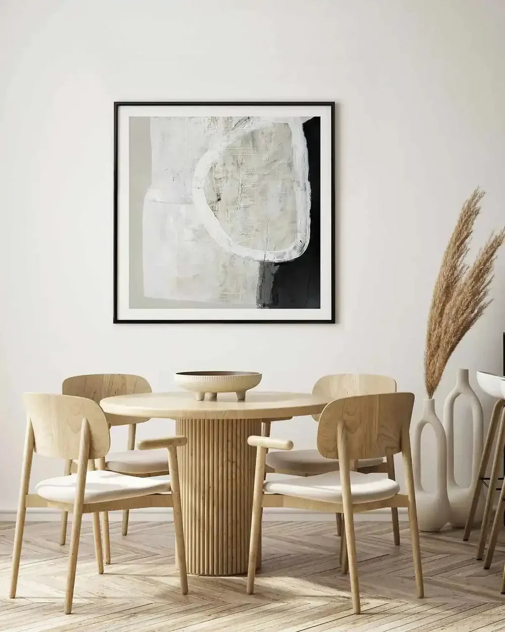
Grey wall art came through the great grey backlash in one piece, and for a good reason: the backlash was about flat grey walls, not about grey done thoughtfully. As a paint colour, builder's grey did flatten a decade of Australian living rooms. As an art palette though, grey is still what it's always been: the most quietly sophisticated neutral in the room, the shade that makes every other colour beside it look considered. We print and frame grey artwork at our West Gosford facilities, and in this guide we'll walk you through how to use the palette properly: warm grey versus cool, monochrome versus tonal, and the rooms where grey art isn't the safe pick but the smart one.
Here's the little shift that unlocks the whole category for you: grey art is contrast infrastructure. A charcoal abstract gives a pale room its gravity. A soft grey landscape gives a colourful room its rest. A black and white photograph gives any room a small moment of formality. Buy grey for what it does to your room's other decisions, and every piece you hang earns its wall twice over.


White Stone by Design Fabrikken Art Print · In the Haze IV Art Print · In the Haze III Art Print
The Grey Spectrum, from Warm to Cool
- Warm greys and greige: grey with a hint of brown underneath. It's the current Australian favourite, and it's completely at home beside oak, linen and every warm neutral you already own. The grey abstract collection leans warm for exactly that reason.
- Cool and steel greys: grey with blue undertones. Crisp, a little architectural, and at their best in modern rooms with black steel, concrete and lots of white.
- Charcoal and graphite: your anchors. Near-black depth that grounds pale schemes the way navy does, without committing to an actual colour.
- Soft dove and mist: the quiet wing. Barely-there greys for bedrooms and any room that wants atmosphere more than statement.
- Grey-blush and grey-blue pairings: the bridge palettes from the grey-blush collection. This is grey doing its best work, making a second colour look intentional rather than accidental.
Grey art is contrast infrastructure: buy it for what it does to the room's other decisions, and every piece earns its wall twice.
Grey, Room by Room
- Living room: this is the charcoal anchor's stage. One deep grey abstract above the sofa grounds a pale scheme beautifully, or a soft grey landscape rests a colourful one. Scale it by the standard 60 to 75 percent rule and round up: grey whispers, so it needs size to be heard.
- Bedroom: dove and mist country. Soft grey abstracts and misty landscapes from the bedroom collection lower the room's pulse without asking you to commit to a colour like blue or green.
- Home office: grey's professional wing. A graphite abstract or monochrome photograph behind the desk reads composed on every video call, and it never argues with the calendar, the client or the lighting.
- Hallway: black and white photography's natural home. Grey-scale work rewards the close viewing that corridors force on you, and a monochrome run reads instantly curated without needing anything else.
- Dining room: charcoal statements host beautifully here. Deep grey above the buffet gives dinner-party gravity, and candlelight has loved a dark ground since dining rooms were invented.
- Teen and study rooms: monochrome's growing-up territory. Grey-scale surf photography and graphic abstracts will survive every taste transition between twelve and twenty, which any parent will tell you is a genuinely long stretch.


In the Haze II Art Print · Ensemble by Katharina Daneke Art Print
The Undertone Rule That Rescues Every Grey Decision
Grey shifts undertone with light more than almost any other family in the box, second only to pink, and matching your artwork's lean to your room's lean is the entire craft of buying grey well. Here's the reading method: hold something white beside the grey, first on the product-page zoom, then on the $9.95 A5 sample print, and the lean will declare itself, either brown-warm or blue-cool. Then the matching method: warm rooms (timber floors, linen, brass tapware) take warm greys and greige; cool rooms (concrete, white walls, black steel) take steel and cool greys; and mixed rooms, which honestly describes most Australian homes, are exactly why greige exists in the first place. Finally, the verification method: the free mockup renders your shortlist onto a photo of your actual wall in your actual light, usually within a business day, and undertone mismatches announce themselves on screen before they can announce themselves on your wall for the next decade. Grey bought through this sequence is the safest purchase in the whole catalogue. Grey bought from a thumbnail is exactly how the backlash started, and we'd love to save you from that.
Monochrome: Grey's Photographic Wing
Black and white photography deserves its own moment in any grey guide, because it's the palette's most reliable statement form. A monochrome coastal aerial, a grey-scale landscape or an architectural study gives you grey's sophistication with the added interest of a real subject, and the rules of the format are well settled by now. You want strong internal contrast (true blacks, clean whites and the full tonal staircase in between), generous sizing, and frames that pick a side: black frames for graphic rigour, oak to warm the formality, or white to dissolve into a gallery-wall look. Print quality is the whole game in monochrome, because the tonal staircase between black and white is hundreds of steps long, and cheap printing collapses them all into mud. Our 230gsm archival paper and pigment-ink pipeline holds every one of those steps, which you can see at the product-page zoom and will keep seeing over ten years on the wall. The black and white photography collection is the deep end of this world, and our hallway guide covers its favourite venue in more detail.


Alpine II Square Art Print · Claymere I | Art Print · Cecilia II Art Print
Building a Room Around Grey Art
Grey's generosity in pairing is unmatched, because it's the palette that makes other colours look chosen. The combinations that reliably work: grey art with blush textiles (the softening classic straight from the grey-blush bridge), with mustard or ochre (the warmth injection), with sage (the current Australian handshake), with navy (structure meeting structure) and with pure white and timber (the Scandinavian baseline that never dates). The discipline mirrors every neutral scheme you've ever admired. You need three textures around the art as a minimum, so linen, timber, wool, boucle, because grey without texture is exactly where builder's-flat came from. And you need one deep anchor, either charcoal art or dark furniture, so the whole scheme has gravity to sit against. The art itself should be the largest, most textured object on the wall: a grey room with a small grey print is really just a beige room wearing a different name, and the fix is always more scale. When you're stuck between two sizes, go with the larger, without exception, in every case the category has ever produced.
Why Grey Buyers Choose the Manufacturer
Because undertone and tonal fidelity are production capabilities, not marketing ones. The warm grey that arrives cool, or the charcoal that arrives flat, is the marketplace's signature failure: invisible in the listing photo and permanent on your wall. Ours is printed colour-managed on calibrated equipment, with pigment inks on archival stock or gallery canvas, and solid timber frames in the three finishes grey schemes actually use, all made to order at our two large West Gosford facilities across ten years and more than 350,000 homes. The free mockup and $9.95 physical sample retire the undertone risk before anything prints. Custom sizes fit the grey to your wall when you're sitting between the standard sizes. Standard sizes dispatch within 24 hours. And the 30-day exchange policy on standard sizes stands behind all of it. The most sophisticated neutral in the box deserves the least approximate printing, and that arrangement is on offer here every day.
The full logic of the neutral scheme lives in our neutral art guide, monochrome's deep end sits in the black and white collection, and the sizing arithmetic you'll want beside all this lives in the complete sizing guide.
Grey Pairs and the Two-Tone Wall
Grey composes into multiples with a discipline all its own, and it's called tonal laddering. A pair or trio of grey works hangs best when each piece sits one clear step apart on the tonal staircase: a mist, a mid-grey and a charcoal, all aligned on one centre line, reading as a deliberate gradient rather than three greys that almost match. Our composed 3-piece sets resolve the laddering for you in advance, and single-run production keeps the steps honest, where marketplace assembly often lets them drift out of sequence. The two-tone wall is the simpler cousin of this idea: one grey anchor beside one piece in the room's accent colour, whether that's blush, sage or ochre, with the grey making the colour look chosen and the colour keeping the grey awake. Both formats follow the standard spacing rules, so 6 cm gaps between pieces, a shared centre line at 145 to 152 cm, and both preview exactly on the free mockup before a single hook goes in the wall.
Grey Art and the Rental Decade
Here's a closing practicality worth sitting with: grey is the renter's strategic palette. It survives every landlord's wall colour, agrees with every future address, and moves from the beige rental to the white apartment to the eventually-owned home without a single re-buy along the way. The archival version from our gallery-quality framed range will happily outlive four leases with its undertones intact. If you're a renter building a first collection, the grey anchor plus two colour satellites is the formula that adapts anywhere: the anchor holds, the satellites update as your taste and your addresses change, and the collection compounds instead of restarting from scratch every time you move. The bond-safe hanging mechanics live in our renter's art guide, and the palette logic lives right here: buy the grey once, buy it properly, and let the whole decade happen around it, address by address, with the collection quietly compounding the whole way.
The Grey Verification Sequence, Compressed
The whole guide really comes down to five moves you can verify as you go. First, read the room's lean from its largest materials, so warm or cool. Second, shortlist two or three greys in that lean, across at least two depths, one soft and one anchor. Third, zoom each one to print resolution and inspect the undertone against something white. Fourth, send us the wall photo with measurements for the free mockup, and for shade-critical rooms add the $9.95 A5 print on the same archival stock, then watch it across a full day of your room's real light. Fifth, order the proven piece one size larger than your instinct first suggested. Standard framed sizes dispatch within 24 hours, delivery reaches every Australian address and over 40 countries, and the 30-day exchange policy on standard sizes underwrites the rare miss. Grey rewards process more than any other palette in the catalogue, and the process is free right up until the final step.
Frequently Asked Questions
Is grey wall art still in style after the grey backlash?
The backlash was about flat grey walls, not grey art. As an art palette, grey is still the most sophisticated neutral available to you: charcoal anchors, warm greige, monochrome photography and grey-blush bridges are all thriving, because grey art creates contrast in a room rather than flattening it.
Warm grey or cool grey: how do I choose?
Match the room's lean. Timber, linen and brass rooms take warm greys and greige; concrete, white and black-steel rooms take cool and steel greys. Read the artwork's undertone at zoom, confirm it on your free wall mockup, and the $9.95 A5 sample settles the shade-critical calls physically in your own light.
What rooms suit grey artwork?
All of them, in different tones. Charcoal anchors work in living and dining rooms, dove and mist suit bedrooms, graphite belongs behind office desks, monochrome photography loves hallways, and grey-scale surf photography and graphics feel right at home in teen rooms. It's the palette that survives every phase of a household.
What colours pair well with grey art?
Almost everything, which is the whole point. Blush for softness, mustard for warmth, sage for the current Australian handshake, navy for structure and white with timber for the baseline that never dates. Grey's job is to make the second colour look chosen; pick your second colour and the pairing writes itself.
Why does grey art need to be large?
Because grey whispers. Without the volume that colour brings, it holds a wall through scale and texture instead. Undersized grey pieces vanish into the paint behind them; correctly sized ones organise the whole room. The 60 to 75 percent rules still apply, and the round-up clause is mandatory when you're on the fence.
What makes a good black and white photography print?
The tonal staircase. You want true blacks, clean whites and hundreds of honest steps between them, which is exactly where cheap printing collapses into mud. Zoom any piece to print resolution and inspect the mid-greys: on archival pigment printing the staircase is visible before you even buy.
Can I check that the grey suits my room before I buy?
Yes, and the full sequence is worth doing. Start with the product-page zoom for undertone, then the free mockup on your actual wall photo at true scale, then the A5 or A4 print from $9.95 on the same archival stock as a physical sample. Grey is undertone-critical, and the tools exist so your wall gets the exact grey you had in mind.
How quickly does grey wall art ship?
Standard framed sizes dispatch within 24 hours from our NSW Central Coast facilities, delivered Australia-wide with international shipping to over 40 countries, and the 30-day exchange policy on standard sizes sits underneath the whole thing.
Read the undertones in the grey abstract collection, go monochrome in the black and white photography range, and send us the wall photo when you're ready: the exact grey, proven in your light, before a single dollar moves.


