

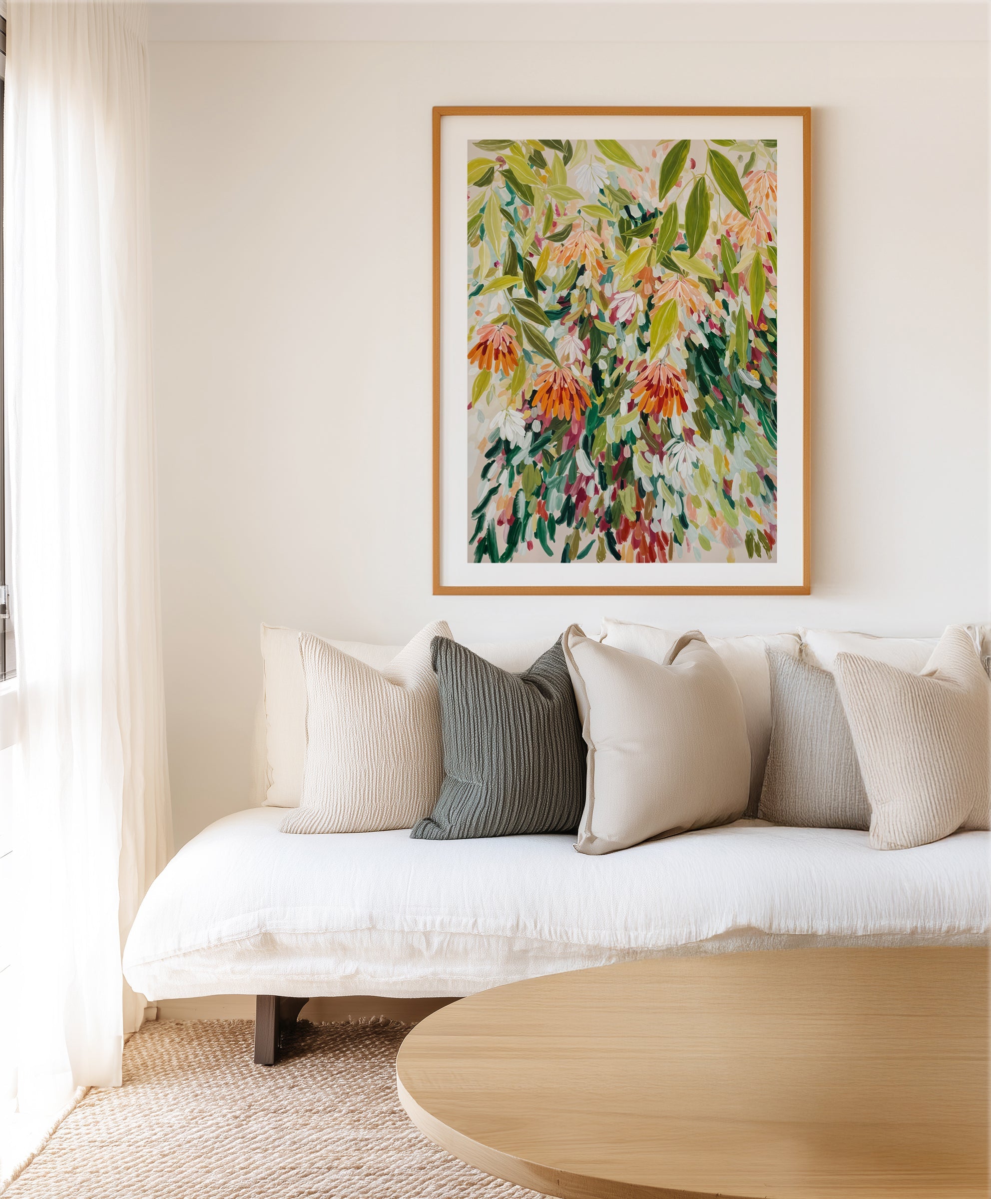
Green is the only colour the eye never has to work for, and in abstract art it carries that ease straight onto the wall. Where a botanical print shows you a leaf, green abstraction gives you the felt sense of foliage, moss, eucalyptus and rainforest shade with no literal subject to date or dominate the room. It is the colour family we reach for when a home needs to breathe.
This guide maps the green abstract spectrum from sage to emerald, the rooms and palettes where each register works, and the framing that keeps green feeling grounded rather than acidic. It draws on more than a decade of designing, printing and framing art at our two production facilities in West Gosford, NSW, for homes across Australia and more than 40 countries.


Abstract Floral Garden by Edie · Green Petite by Design Fabrikken · Organic Graphic No.2
Why Green Reads as Rest
The biophilia evidence is the strongest in all of design psychology: Roger Ulrich's landmark 1984 study in Science found hospital patients with a view of trees recovered faster and needed less pain relief than those facing a brick wall, and later research extends the effect, more modestly but reliably, to imagery of nature. Green abstraction sits in that lineage. It delivers nature's register, growth, shade, stillness, without asking the room to commit to a jungle.
Abstraction is the reason it works long-term. Literal palm and monstera prints anchor a room to a trend year; an abstracted field of layered greens stays a feeling rather than a motif. The saturation dial does the tuning: greyed sage whispers, olive and moss settle, emerald performs.
A green artwork is the window a wall wishes it had.
The Green Spectrum, Register by Register
- Sage and eucalypt: grey-softened greens, the most Australian register and the easiest to live with. At home in bedrooms and calm living schemes; our sage green palette guide builds five full schemes around it.
- Olive and moss: earthy, brown-warmed greens that pair with timber as if grown from it. The register for warm minimal and wabi-sabi rooms.
- Forest and pine: deep, serious greens for libraries, dining rooms and any space that earns its drama after dark.
- Emerald and jewel greens: saturated and confident, one emerald abstract against warm white is a complete decorating idea. See the jewel tones styling guide for the wider look.
- Sea and celadon greens: blue-leaning, coastal-adjacent, at ease in bathrooms and summer rooms alongside our aqua abstract range.


Green Abstraction, Room by Room
- Living room: olive and sage work at scale spanning two-thirds of the sofa width, centre at 145cm (57in). Green recedes graciously, so oversizing never overwhelms.
- Bedroom: the natural habitat. Low-saturation sage and celadon in flowing compositions read as deep rest; keep contrast gentle.
- Home office: the restoration colour. A green abstract in sightline of the desk gives the eye somewhere to recover between screens.
- Dining room: forest greens under warm lamplight turn dinner into an occasion; pair with an oak finish frame and brass light.
- Bathroom: celadon and sea greens echo water and foliage at once; framed prints suit powder rooms and ventilated bathrooms.
- Entry and hallway: a green pair or trio sets a calm tone at the door, our trio guide covers spacing.
Palettes That Let Green Lead
- Green and warm white: the default that never fails; the artwork supplies all the colour the room needs.
- Green and oat/linen: softer again, sage abstraction over a linen sofa is the calmest corner of Australian design. Our warm minimalism guide maps the neutrals.
- Green and terracotta: foliage and clay, nature's own pairing; see the terracotta palette guide.
- Green and charcoal: forest green on deep grey reads as considered luxury; keep the frame black finish.
- Green and blush: a whisper of pink beside sage keeps a feminine scheme grounded rather than sweet.


Olive Haze II · Quiet Birch Forest I Art Print
Framing Green
Green art is timber's oldest friend, and oak finish is the near-universal answer, the warm grain completes the natural register the colour begins. White finish suits pale sage and celadon works floating on light walls. Black finish belongs with forest and emerald pieces heading formal. Every frame we make is solid timber with an oak, white or black finish, cut and joined on Italian machinery by our own artisans here in Australia, and despatched in a couple of business days, the fastest custom art turnaround in the country.
Format follows scale as always: framed canvas for single statement greens (no glass, no reflections), framed fine art prints for pairs and groupings. Browse the green abstract painting collection and the wider green abstract wall art range to see both formats.
Designer Tips
- Match the green to the light: cool south-facing rooms flatter warm olive and moss; bright north rooms can carry greyed sage without it disappearing.
- One live plant near a green abstract multiplies both, the artwork makes the plant look curated, the plant makes the art look inevitable.
- Repeat the artwork's deepest green once at floor level, a cushion, a ceramic, a throw, and stop there.
- Pairing with wallpaper: keep the paper textural (grasscloth-look, linen weave) when the art carries the colour; order the $4.99 sample (48cm x 40cm / 19in x 16in) and audition both in the room's own light.
- Every order ships to more than 40 countries with all import duties paid, the checkout price is the delivered price.
Frequently Asked Questions
What colours go with green abstract art?
Warm neutrals (oat, linen, warm white), terracotta and clay tones, charcoal, blush, and timber in every finish. Green is a near-neutral itself, so it tolerates more company than most colour families; the only reliable clash is a competing saturated colour fighting for the same wall.
Is green art good for bedrooms?
Among the best choices. Choose the low-saturation registers, sage, eucalypt, celadon, in soft, flowing compositions, and keep contrast low. The biophilic association with foliage and shade supports exactly the wind-down register a bedroom needs.
Which green suits a dark room?
Counter-intuitively, go deeper rather than paler. Pale sage turns grey in low light, while olive, moss and forest greens hold their character and make the darkness feel intentional, the moody-library effect. Add warm lamplight and an oak finish frame.
Does green abstract art suit coastal homes?
Yes, through the sea-green and celadon registers, which read as water-adjacent without a single literal wave. Pair with linen, rattan and pale timber; our coastal luxe guide shows the full scheme.
What frame colour works with green art?
Oak finish first, timber and green complete each other. White finish for pale works on light walls, black finish for deep formal greens. All our frames are solid timber, made in Australia, in oak, white or black finish.
Can I hang green art in a room with green walls?
Yes, if the values differ decisively. Sage walls take forest or emerald art; deep green walls take pale, high-key abstraction. Matching mid-green art on mid-green walls is the one version that flattens, separate the values and the room layers instead.
Is green abstract art on trend for 2026?
Green has been climbing for five years and 2026 forecasts keep it central, but the honest answer is that the sage-olive-forest family has stopped behaving like a trend at all: it has settled in as a new neutral. Buy the register that suits the room's light and purpose, not the forecast.
Begin with the green abstract collection, widen to all abstract wall art, or keep reading on On the Wall. Designed and made on the Central Coast of NSW, delivered worldwide, duties paid.


