

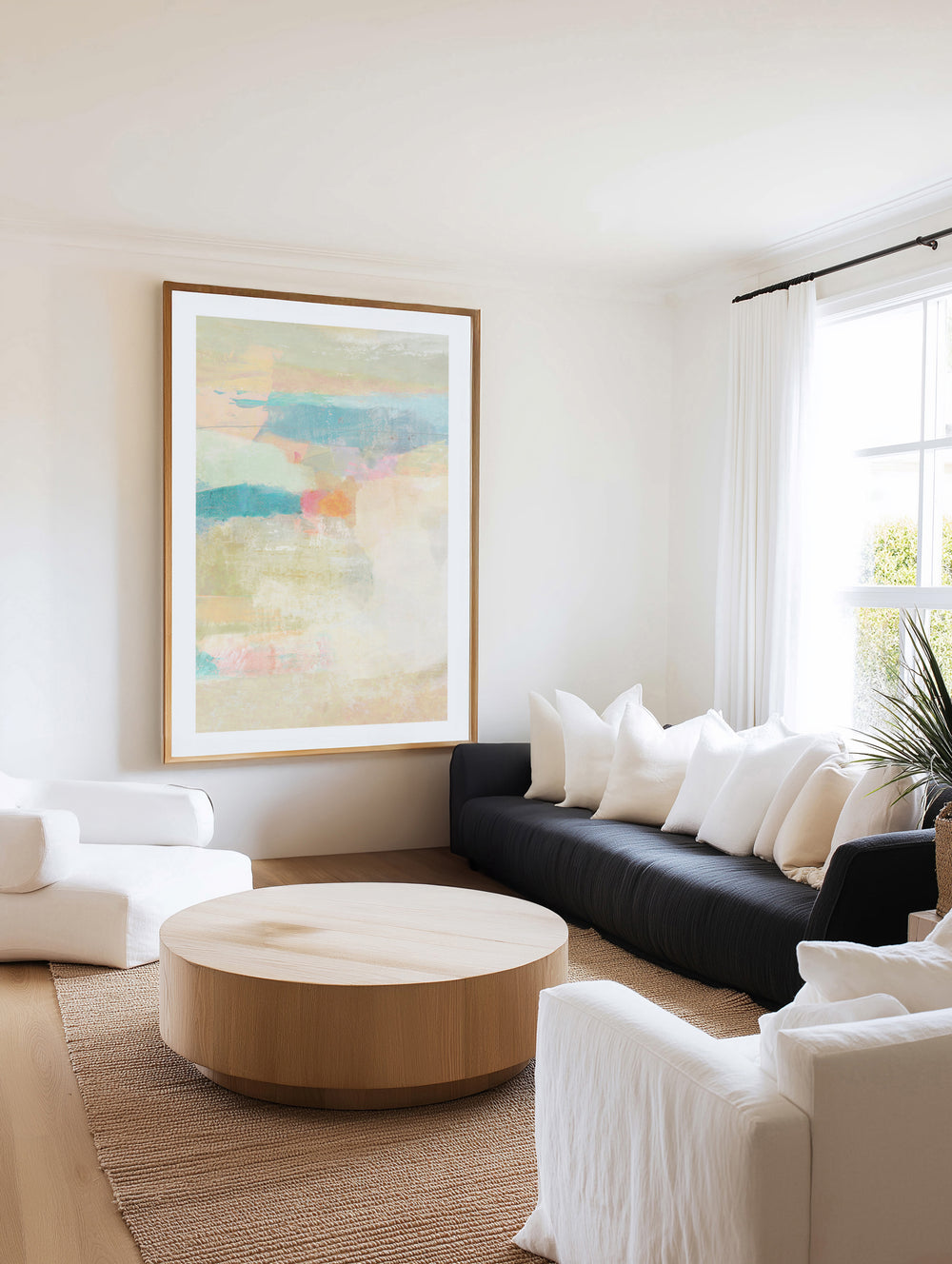
Neutral wall art is the trickiest category to buy well, and the easiest to buy badly. Beige-on-beige prints from marketplace sellers have taught a whole generation of decorators that neutral means forgettable, and that couldn't be further from what a well-made neutral artwork actually does to a room. The neutrals we print and frame at our West Gosford facilities, warm whites, oat, sand, taupe, mushroom greige, stone and clay, are the working palette behind almost every considered Australian interior of the past five years. This guide is here to help you choose neutrals on purpose, rather than by default, so the piece you hang finishes the room instead of fading into it.
Here's the first thing worth knowing: neutral art isn't the absence of colour, it's the management of warmth. Every neutral leans somewhere. Some lean pink (the blush-beiges), some lean yellow (sand, oat), some lean green (the sage-greiges) and some lean grey (stone, cement). Learning to read that lean, and then matching it to your room's light and materials, is the whole craft. Get that right and a neutral piece will look considered forever. Get it wrong and the whole room feels a little off in a way you can't quite name.


Orange Sweep 1 by Suzanne Nicoll | Art Print · Orange Sweep 2 by Suzanne Nicoll | Art Print · Palm Trees by Dani Heyward | Art Print
Your Neutral Palette, Properly Mapped
- Warm white and ivory: the quietest art on the wall, where texture and composition carry everything. Best in rooms with strong architecture or bold furniture that wants no competition on the walls.
- Oat and sand: the Australian coastal neutrals. Sun-warmed, linen-adjacent, and completely at ease with timber, cane and rattan.
- Taupe and mushroom greige: the sophisticated middle, grey enough to feel calm, warm enough to feel human. It's the designer default at the moment, and for good reason.
- Stone and cement: the cool end of the spectrum. Minimalist and architectural, best in rooms that carry warmth elsewhere, timber floors, a tan leather chair, brass tapware.
- Clay and warm charcoal: the anchors. Deep neutrals that give a pale scheme its gravity. One warm charcoal abstract will ground a room the way navy does, but without asking you to commit to a colour.
Neutral art isn't the absence of colour. It's the management of warmth, and warmth is the whole game in Australian light.
Why a Neutral Room Still Needs Art
The most common mistake in a calm scheme is deciding it needs no art at all. A bare wall in a neutral room doesn't read as minimalism, it reads as unfinished, because your eye still needs somewhere to rest and an empty wall refuses to give it one. Neutral artwork gives your eye that resting point without breaking the room's calm. Texture, composition and scale quietly do the work that colour would do in a bolder scheme. It's exactly why our neutral art collection and the contemporary neutrals range have two of the strongest reorder rates in our catalogue. The first piece finishes the room, and the next room in the house quietly asks for the same treatment.
Room by Room in Neutral
- Living rooms: scale is everything here. Neutral art has to be generous to hold a wall, because it whispers rather than shouts. A 100 x 130 cm or 120 x 150 cm piece from the extra large range above the sofa is the move you're looking for. Small neutral pieces simply vanish above a big couch.
- Bedrooms: the natural home of neutral art. Oat and taupe abstracts above the bed lower the pulse of the whole room. Layer tonal bedding underneath and the scheme almost finishes itself.
- Dining rooms: warm charcoal or clay above a buffet gives dinner-party gravity without the theatre of a bold colour. Guests feel it before they can explain it.
- Hallways: textured neutrals reward the close viewing that hallways force on you. Paper grain, brush texture and detail all earn their keep when you're standing an arm's length away.
- Open plans: neutrals are the connective tissue. One palette family flowing across the living and dining walls makes a big space feel composed rather than zoned. Pairs and triptychs from the 3-piece sets are ideal for handling that width.


Firmament by Marie-Pierre Goudreault | Art Print · Mother & Child by Meredith Howse | Art Print
Texture Is Your Real Currency
Strip colour back and texture becomes the artwork's whole voice. This is where print quality stops being invisible. The 230gsm archival fine art paper we print on has a cotton-feel surface that carries brushwork, grain and wash detail the way thin poster stock physically can't, and framed canvas adds a literal surface texture that shifts with the light through your day. When you're on the product page, zoom right in to print resolution and study that texture, because in a neutral piece, that's what you're actually buying. Then let the mockup show you how it will land on your wall. Send us a photo of your wall with measurements and our team will render your shortlist at true scale, free of charge, usually within a business day. Neutral-on-neutral schemes live or die on undertone matching, and seeing the exact piece against your exact wall colour is the only honest test there is.
Building Your Scheme Around the Art
- Match the lean, not the shade: a warm-leaning room (timber, linen, brass) wants warm-leaning art (oat, clay, blush-beige). A cool room (concrete, black steel, white walls) takes stone and greige. Mixing warm and cool leans is what makes neutral rooms feel inexplicably off.
- Three textures minimum: art, textile, and one natural material. That's the neutral room formula. Your art can carry the boldest texture in the room because it carries no colour risk.
- Contrast through depth: if everything's sitting at a similar mid-tone, add one warm charcoal or clay piece. Neutral schemes need a bass note, and that's how you give them one.
- Frames as part of the palette: oak frames warm the scheme, white frames dissolve into it, and black frames give you a graphic edge. Our solid timber frames are part of the artwork's neutral maths, and we'll happily render all three options in your mockup so you can see the difference on your actual wall.


Quai de Brume by Marie-Pierre Goudreault | Art Print · Calm Botanical Leaf by Casa Cartissi | Art Print · Soft Blue Fan Leaf by Casa Cartissi | Art Print
The Certain Path to the Right Neutral
Undertones are the whole risk in this category, so we've built a simple sequence to take that risk off the table. Start by shortlisting a few pieces from the neutral collection. Zoom to print resolution on each one and read its lean. Send us a photo of your wall and we'll do a free mockup so you can compare your shortlist on your actual wall, in your actual light. If you'd like to hold the material first, an A5 or A4 print from $9.95 comes off the same archival stock with the same inks, so it's a genuine sample of both surface and undertone. Then order the size the wall actually needs, which in neutrals is almost always one size larger than your instinct says. Standard framed sizes dispatch within 24 hours from the Central Coast, the 30-day exchange policy on standard sizes stands behind everything, and if the whole scheme needs a second set of eyes, our free styling service will happily compose the wall from a room photo. Art, sizes, frames, the lot.
Why Neutral Buyers Choose Us
In a category where texture and undertone are the entire purchase, the manufacturer wins on every axis that matters. You get archival 230gsm paper and pigment inks that render texture honestly, colour-managed printing so the greige you approved is the greige that arrives, and solid timber framing in the three finishes neutral schemes actually use. You'll get custom sizing for the walls that fall between sizes, 24-hour dispatch on standard sizes, free mockups before any money moves, and the reassurance of more than 350,000 homes served since 2015. Marketplace neutral art is beige noise printed on paper that flattens everything distinctive about the category. Ours is the reason the category exists in the first place. Buy the difference, and your wall will show it every day.
If you want to go deeper on palette theory, our terracotta guide and the dusty rose trend piece are both there for you. Sizing formulas for every wall live in the complete sizing guide, and the practical mechanics of hanging are covered in our hanging guide.
Neutral Art in the Open-Plan Australian Home
The open plan is where neutral art does its most valuable work, and where the buying rules shift slightly. A combined living, dining and kitchen space reads as one visual field, which means every artwork in it is seen alongside every other. Palette coherence matters more than any single piece. Here's the method that works: choose one neutral family for the whole space, then vary depth rather than hue across the walls. An oat statement in the living zone, a warm-charcoal anchor by the dining table, a textured study near the kitchen. Your eye reads the space as one composed room rather than three decorated corners. This is where the free mockup earns its keep twice over. Send us photos of each wall and our team will render the whole scheme at scale across all of them. One palette, three walls, zero guesswork, before you order a single piece. The 3-piece sets were composed with exactly these sight lines in mind.
When the Room Isn't Neutral Yet
Plenty of neutral-art buyers are somewhere mid-renovation. Walls still builder's white, furniture inherited, the palette more aspiration than reality. Buy the art first anyway, and buy it slightly warm. Warm neutrals (oat, taupe, clay) flatter unfinished rooms and survive every future direction the room might take, whereas cool stone-greys demand a finished scheme to sit inside. The artwork becomes the room's first real commitment, and rooms built outward from a beautiful piece of art are, in our decade of customer photos, consistently the most coherent ones we see. It's the cheapest interior design consultant there is: one good neutral piece, sized correctly, telling every subsequent purchase what to be.
The Finishing Sequence for a Room That's Almost There
For the room that's nearly done, walls painted, sofa in place, but something still missing, here's the finishing sequence our stylists use. Photograph the room from its main doorway. Identify the largest empty wall plane, because that's where the artwork wants to live, and its size comes from the 60 to 75 or 50 to 65 percent rules in the sizing guide. Read the room's lean, warm or cool, from its largest materials. Shortlist three pieces in that lean from the neutral collection, send us the photo and shortlist for a free mockup, and order the one that makes the whole photograph look finished. The whole sequence takes two evenings and one business day, costs nothing until the final step, and ends the months of almost-done that neutral rooms are famous for. The missing thing was never a fourth cushion. It was scale and texture on the biggest wall in the room.
Frequently Asked Questions
What is neutral wall art?
It's artwork whose palette sits in the warm-white to charcoal spectrum: oat, sand, taupe, greige, stone and clay, where texture and composition do the work that colour does elsewhere. Done well, it finishes calm rooms without breaking their calm. Done cheaply, it disappears, which is why material quality decides everything in this category.
How do I choose the right neutral art for my room?
Start by reading the undertones. Warm rooms (timber, linen, brass) want warm-leaning neutrals, and cool rooms (concrete, steel, crisp white) take stone and greige. Then size generously, because neutral art needs to be larger than colourful art to hold the same wall. Confirm the undertone match with a free mockup on your wall photo before you order, and you'll get it right the first time.
Isn't neutral art a bit boring?
Cheap neutral art is, because thin paper stock flattens the texture that is the whole category. Well-made neutral art carries brushwork, grain and surface depth that reward daily viewing, printed on 230gsm archival paper or textured canvas. Zoom any piece on the product page to print resolution and you'll see the difference clearly before you buy.
What size should my neutral artwork be?
One size larger than you first think. Neutrals whisper, so they need presence: 60 to 75 percent of your furniture width, 50 to 65 percent of your open wall width, and when you're torn between two sizes, take the larger one. Undersized neutral art is the most common regret in the category. Oversized neutral art has never once been returned to us as too big.
What frame suits neutral art best?
Oak to warm the scheme, white to dissolve into it, black for a graphic edge. The frame is part of the palette in a neutral room, and our mockup service will render your shortlist in different frames on your actual wall photo to help you settle it.
Can I check the undertone before I buy?
Three ways, and between them undertone risk is off the table before anything prints. Zoom to print resolution on the product page, get the free wall-photo mockup at true scale, and if you'd like something physical, order an A5 or A4 print from $9.95 on the same archival paper for a real undertone sample in your hand.
How fast does neutral wall art ship?
Standard framed sizes dispatch within 24 hours from our West Gosford facilities, printed to order, framed in solid timber, and delivered Australia-wide with international shipping to over 40 countries.
What goes with neutral wall art?
Everything, which is rather the point, but it truly shines with layered texture: linen, boucle, timber, stone, rattan. Add one deep anchor (warm charcoal or clay) so the scheme has some gravity, and let the art be the largest, most textured object on the wall.
Begin with the neutral wall art collection, deepen it through contemporary neutrals, and send us the wall photo when you're ready. Undertones are our department, and we'd love to help you get yours exactly right.


