The entry is the handshake of a home. Ten seconds, maybe fifteen — the distance from the front door to the threshold of the first real room — and in that short walk guests form an opinion about everything that follows. It is the smallest space most of us own, and the one that shapes perception most.
Most homeowners under-decorate their entries. A hook, a runner, a single picture if they are lucky. But the entry is design gold precisely because it is small. Patterns that would overwhelm a lounge read as intentional in a narrow hallway. Colours that feel heavy across four walls feel considered in a short corridor. The entry is the one room in the home where wallpaper is most forgiving and most rewarded.
This is the complete guide to first-impression interiors — the wallpaper on the long wall, the art above the console, the mirror across from it, the pendant overhead and the objects on the table beneath. All the pieces, working as one composition.


Chrysanthemum Flower Grey Wallpaper · Japandi Garden Panoramic Painted Mural Wallpaper · Olive Veil in Sage Green Wallpaper
Why Entries Are Design Gold
The open-plan lounge is where wallpaper ambition goes to die. Four metres of pattern behind a sofa, another four beside the dining table, a run around to the kitchen — and suddenly what looked confident in a sample becomes visual noise. Pattern needs edges. It needs a frame. The entry provides both.
A typical Australian entry wall is somewhere between two and four metres wide. Ceilings run 2.4m in a post-war home, 2.7m in a contemporary build, up to 3.3m in a restored Queenslander or Federation. Compared with the rest of the house, that is almost nothing — and that scarcity is the reason wallpaper succeeds here. You see the pattern in its entirety from a single vantage point. The eye does not have to travel. It simply arrives.
There is also a psychological gear-change that happens at the threshold. Guests shift from outdoor mode to indoor mode, from their phone to your home. They are paying attention. They notice the picture rail, the way the light falls on the wall, whether the pendant is centred. An entry that has been thought about reads as a home where the rest has also been thought about.
Pattern needs edges. The entry provides them. Every other wall in the house is a canvas; the entry is a frame.
For a closer look at selecting the wallpaper itself, our Entrance Hall Wallpaper: How to Make a First Impression That Lasts guide focuses specifically on pattern choice for narrow walls. This post widens the frame to cover the complete entry — wallpaper plus every other element that decides whether the handshake feels composed or accidental.
Four Entry Moods
Before you choose a paper, choose a feeling. Every entry project we advise on starts with the same question: what do you want a guest to feel in the first ten seconds? Soft and formal? Minimalist and calm? Nature-led and grounded? Coastal and classic? Below are four Australian entries built around four different answers, each photographed in the same narrow-hallway format so you can compare the moods side by side.
1. Chrysanthemum Grey — Soft Feminine Formal
The Chrysanthemum Flower Grey Wallpaper delivers what most contemporary entries are missing — softness without sweetness. The tonal grey base reads as neutral from a distance but reveals a drawn, almost etched chrysanthemum on approach. It is the pattern equivalent of a well-tailored linen shirt: considered, quiet, obviously thought about.
Pair it with a mid-tone timber console (oak or a warm walnut, never raw pine), a round antique-brass mirror, and a single statement piece of wall art with either deep charcoal or oxblood in it. The grey absorbs dark accents without clashing, which is why it is our most-recommended paper for formal entries in heritage homes. A hurricane lamp or candelabra on the console pushes it toward dinner-party territory; a simple bowl for keys keeps it everyday.
This paper is also a quiet workhorse in bedroom installations, but where a bedroom gives you four walls to spread pattern across, an entry only asks for one — which is why it reads as intentional here rather than overwhelming.
2. Japandi Garden — Minimalist Calm
Japandi — the quiet bridge between Japanese restraint and Scandinavian warmth — is the mood almost everyone asks for when they say they want something “modern but not cold.” The Japandi Garden Panoramic Painted Mural Wallpaper does the whole job in a single panoramic print: an ink-wash garden that reads as art rather than repeat pattern, sized once for the wall and hung as a single continuous image.
For this mood the mistake is over-styling. The mural is the piece of art. The console should be oak or ash, no drawer pulls if possible, or the simplest flat brass. One ceramic vessel, ideally hand-thrown with a visible glaze drip, no second object. No framed print. No gallery wall. The wall is the gallery.
Lighting should also be single-object: a Noguchi-style pendant, a paper lantern, or a brass wall sconce — one source, warm temperature (2700K), dimmable. For a broader look at mural installations, our wall mural collection shows more single-panorama options.
3. Olive Veil Sage — Nature-Led Calm
If Japandi is the restrained garden, Olive Veil in Sage Green Wallpaper is the garden you actually walk through on the way home. The paper is a veiled repeat of olive branches on a sage ground, saturated enough to register as colour from the outside door, soft enough that it does not shout once you are past the threshold. It is our most-requested wallpaper for entries in Byron Bay hinterland, the Sunshine Coast, and anywhere with leafy outlooks that benefit from being echoed indoors.
Against this paper, timber reads warmer. Brass reads richer. White trim reads crisp rather than cold. The entry becomes the transition piece between outside and inside — an echo of the garden that steps you softly into the more neutral rooms beyond.
We recommend pairing Olive Veil with botanical or landscape art rather than abstract. A framed pressed leaf, a moody still life, or a photographic landscape in natural tones. The conversation between wallpaper and art should rhyme, not compete. Our botanical wall art collection is a good first port of call.
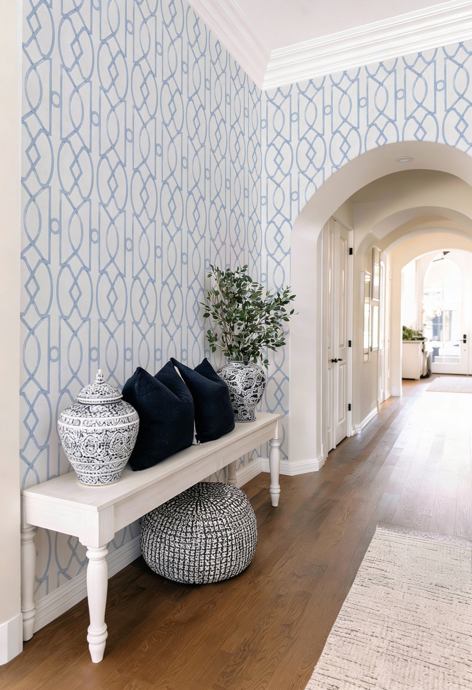
4. Trellis Luxe Heritage Blue — Coastal Heritage

The coastal Hamptons look is the most durable decorating style in Australia — it has survived every trend cycle since the nineties and shows no sign of fading. Trellis Luxe in Heritage Blue Wallpaper is the best paper we stock for the style: a classic lattice trellis in a deep heritage blue, with enough structure to pair with wainscoting or VJ panel (a classic Australian decorating combination) and enough colour to feel confident without going navy-heavy.
Pair with white wainscoting to the dado rail, the paper above. Console should be white-painted timber with panel-front drawers. Brass hardware — polished, not brushed — keeps the Hamptons reference honest. For art, look for framed botanical prints, a pair of coastal oils, or a single large-scale seascape. The coastal framed wall art collection has the strongest pairings.
This mood also works elegantly in Queenslanders and Federation homes where the bones are already in place — high ceilings, timber floors, decorative cornicing. The paper is doing 40% of the job; the house is already doing the other 60%.


Palmeras by Julie Celina · Riva Boat, Lake Como
The Art Pairing
Art in an entry follows different rules than art elsewhere. The wall is narrower, the viewing distance is shorter, and anything you hang competes directly with the wallpaper behind it. Three rules cover most decisions.
Scale is vertical, not horizontal. An entry wall, especially above a console, wants a vertical or square-format piece. A horizontal print splits the visual field and pulls the eye sideways — exactly the wrong direction for a corridor. Vertical artwork reinforces the upward read of a hallway. If you must use a horizontal piece, hang a pair stacked vertically rather than one lonely landscape.
Complement, do not compete. If the wallpaper is busy (a repeat pattern, a botanical, a trellis), the art should be calmer — a moody still life, a single-subject portrait, or abstract with open negative space. If the wallpaper is quiet (a tonal texture, a soft wash), the art can do more work. The rule is simple: one of the two must be the hero. Never both.
Height is measured from the console, not the floor. Hang art so the centre of the piece sits 15-20cm (6-8 inches) above the top of the console. That places the visual centre at roughly 155-160cm from the floor — standing eye-level for most adults. Hanging too high is the single most common mistake we see in Australian entries. If in doubt, lower. Our how to hang wall art guide covers the maths in more detail.
One of the two must be the hero. Never both. The wallpaper and the art are in conversation, not in competition.
The Mirror Question
Almost every entry we design features a mirror, and almost every client asks the same question: where should it go? The honest answer is that it depends on three things: sightlines, light, and scale.
Sightlines first. Walk through your front door and stop at the threshold. What do you see directly in front of you? If the answer is a blank wall, that is where the mirror belongs — it will reflect the door behind you and double the apparent depth of the entry. If the answer is a window, do not mirror it; reflecting a bright window at eye level creates glare. If the answer is a staircase, a mirror at the landing height adds drama without creating visual confusion.
Light second. Mirrors earn their keep by moving light. Position the mirror to catch either the front door’s glazing or a secondary light source — a pendant, a wall sconce, a lamp on the console. In a dim entry (most Australian entries are dim) the mirror is doing as much work as the light fitting. A round mirror opposite a pendant doubles the fixture visually.
Scale third. The mirror should be roughly two-thirds the width of whatever is below it. A 90cm console wants a 55-65cm mirror. A 120cm console wants a 75-85cm mirror. Anything larger looks posted on; anything smaller looks apologetic. Round mirrors are the most forgiving shape in a narrow entry because they do not pick up the geometry of rectangular wallpaper repeats.
On feng shui: a mirror facing the front door is said to push chi back out of the home. We are not going to tell you whether to believe in that. What we can tell you from experience is that a mirror directly facing the door also creates a startling reflection as you enter — you see yourself arriving, which is visually jarring. Either way, set the mirror at an angle to the door rather than head-on.
Lighting: What Each Source Does to Wallpaper
Wallpaper colour is three different things under three different light sources. The same paper that looks dusty-rose at 3pm looks burgundy by lamp at 8pm. Plan for the hour the entry gets used most — which, for most households, is evening.
- Pendant light: Centres the eye, creates a single pool of illumination on the console below. Works best with muted or tonal wallpapers. Warm pendants (2700K) push warm-toned wallpapers toward honey; cool pendants (3000K+) flatten warm papers and neutralise them. Always dimmable.
- Wall sconce: Washes the wall rather than spot-lighting it. The most generous light source for textured or patterned wallpaper because it reveals the repeat and the finish without flattening it. A pair of sconces flanking a mirror doubles both function and theatre. Hard-wired is best; battery-powered sconces exist for rentals (see Renter-Friendly below).
- Table lamp: The lowest, warmest, most intimate light. Works elegantly on the console at night. A small ceramic lamp with a linen shade creates a soft glow that makes even the simplest paper look considered. Two table lamps in a narrow entry (console-end and opposite surface) creates symmetry without additional wiring.
For a broader discussion of how light shapes colour perception, we cover colour psychology in our Dusty Rose Colour Palette guide.
The Console Table
The console is the stage. The wallpaper is the backdrop, the art is the poster, the mirror is the audience — but the console is where the performance happens. Style it wrong and the whole entry falls apart.
When to style bare. If the wallpaper is bold, the art is large, and the mirror is round — let the console breathe. One object maximum. A single hand-thrown bowl for keys, or a low stack of two books. Empty space is legitimate design.
When to style full. If the wallpaper is tonal and the mirror is small, the console can take more weight. Layer a tall object (lamp or vase), a mid-height object (hardcover book stack), and a low object (bowl or tray). Three heights, three textures, one story.
Three objects every entry console needs. A bowl or tray for keys (ceramic, brass, or timber — never plastic). A small vessel for greenery or dried stems (changes seasonally). A lamp or candle (creates evening light). That is the working minimum. Everything beyond is styling.
For pairings between wall pieces and console styling, our Perfect Pairs collection shows wallpaper-and-art combinations already matched by our design team.
Small vs Long Hallways
The rules change at six metres. Below that length, treat the hallway as a single composition — one wallpaper, one mirror, one console, one light. Above it, think of it as a sequence.
Short entries (under 3m): Every element is visible at once. Vertical rhythm wins — a tall narrow mirror, vertical art, a pendant dropping from a high ceiling. A small pattern repeats reads better than a large one, which is why chinoiserie and trellis patterns work so well in compressed spaces.
Medium hallways (3-6m): You can introduce a second focal point. Console at the near end, a bench or plant at the far end. The wallpaper carries through the full length; the eye registers two stopping points; the journey feels composed rather than processional.
Long hallways (6m+): Dizziness is the risk. A high-repeat pattern (small florals, tight geometrics) will create visual vibration along a long wall and give guests a headache. Either use a large-scale pattern (trellis, toile, mural) that reads as a single image, or switch to a single-colour wall with framed art along its length. The long corridor in a Queenslander or Federation home is almost always better served by a quiet wall and a gallery of small framed pieces.
Our full wallpaper collection is filtered by scale; for long hallways, sort by large-scale murals first.
Period Home Entries vs Modern Entries
Australian housing is a pattern book of four or five distinct periods, and the entry is where each period shows its hand most clearly. Match the paper to the bones of the house.
- Queenslander: High ceilings (often 3.3m+), timber floors, decorative VJ panelling to the dado rail. These homes love botanical, trellis, and heritage colours above the dado. The paper goes on the top two-thirds of the wall only; the VJ panel handles the bottom third. Heritage Blue, Sage Green and Soft Grey all work in this context.
- Federation (1890-1915): Stained-glass front doors, pressed-metal ceilings, rich cornicing. These entries carry dark, saturated paper well — a formal chrysanthemum, a moody navy trellis, a deep olive botanical. The house has the scale to hold the weight.
- Californian bungalow (1915-1940): Lower ceilings, timber-framed doors, plaster walls. Keep pattern smaller and tones softer. Japandi-style panoramic murals and soft tonal papers work where heritage blues can feel heavy.
- Mid-century and post-war: Flat ceilings, ranch-slider doors, minimal cornicing. Modern geometrics, large-scale murals, and nature-led papers (olive, eucalyptus, palm) read as a deliberate contemporary choice rather than a period costume.
- Contemporary new builds: 2.7m ceilings, open plans, few walls of any kind. The entry is often just the back of a kitchen island or a half-wall. Treat wallpaper here as a feature — one statement wall, nothing else competing.
Renter-Friendly Options
Renters have always been told the entry is off-limits — no paint, no drilling, nothing permanent. That is no longer true. Three techniques let you design a first-impression entry without losing your bond.
Peel-and-stick wallpaper. Every paper in our peel-and-stick collection is the same design as our paste-the-wall papers, printed on an adhesive-backed substrate that removes cleanly from smooth painted plaster. Chrysanthemum Grey, Olive Veil Sage, the full Trellis Luxe range and the Japandi Garden mural are all available in peel-and-stick. Installation is a weekend job, removal is a ten-minute job. Read our peel-and-stick wall preparation guide before you order.
Freestanding console. Skip the wall-mounted console and choose a freestanding piece — a timber sideboard, a vintage demilune, even a low bench. No drilling, no anchors. Weight it down with books and lamps so it does not shift.
Picture rail hanging. Most Australian rentals built before 1960 still have a picture rail at the top of the wall — a thin timber moulding 20-30cm below the cornice. It was designed for exactly this: hanging art without nails. S-hooks and picture wire let you suspend framed pieces at any height, rearrange seasonally, and leave no marks. If your rental lacks a picture rail, ask your landlord about adding one — most agree, since it is considered an improvement rather than damage.
For a broader discussion of rental-friendly decorating, see our Renter-Friendly Wallpaper Guide.
The Custom Angle
For homeowners who want an entry that cannot be walked into anywhere else in the world, custom wallpaper turns a single photograph into the print on your wall. A black-and-white image of the harbour you grew up near. A watercolour of the street you got engaged on. A botanical sketch of the tree outside your window. Printed to the exact dimensions of your entry wall and delivered in pre-trimmed drops ready to hang.
We have produced entry murals from client photographs of Lake Como, Byron lighthouse, Hyams Beach and a grandmother’s garden in the Blue Mountains. The entry is the best room in the house for a custom mural — it is the first thing guests see, and the image you have chosen carries story into the conversation before anyone has sat down.
Our custom wallpaper service handles everything from artwork preparation to printing to sizing. Minimum quantities are smaller than most suppliers (an entry wall is usually 4-6 square metres, well within our custom range), and we ship globally with all import duties covered.

Designer Tips
- Order the $4.99 sample (48cm x 40cm / 19in x 16in) before committing. Entries are the most light-variable rooms in the home — north-facing vs south-facing changes every paper’s colour by 10-15%. Tape the sample to the actual wall and watch it at three different times of day before ordering.
- Measure twice, order once. Entries have quirks — a light switch in the middle of a run, a door architrave that eats 5cm, a picture rail that shortens the wall. Follow our how to measure guide before ordering.
- Book the installer before the paper arrives. Good wallpaper installers in Australia are booked out 4-6 weeks ahead. The wallpaper installer directory lists vetted installers by state.
- Warm temperature lighting. 2700K or lower. Cool white light (4000K+) flattens wallpaper colour and makes even a well-chosen paper look sterile at night.
- All wallpaper is custom-sized to your wall. We manufacture in 4 business days from our Central Coast NSW facility, and we ship globally with all import duties covered — no surprise fees at the border.
Frequently Asked Questions
Is wallpaper better than paint for an entry?
For most entries, yes. Paint needs scale and natural light to feel considered; wallpaper creates its own interest at any scale and in any light. A narrow 3m entry in a dim hallway is the single best case for wallpaper over paint in the entire home. The only exception is entries with significant natural architecture — exposed stone, original timber panelling, or statement joinery — where paint stays out of the way and lets the bones speak.
Can I use a busy pattern in a narrow hallway?
Yes, with one caveat: the pattern should either be small-scale (trellis, chinoiserie, small florals) or a single large mural that reads as one image. A medium-scale repeat is the worst choice in a narrow hallway because the pattern reads as visual noise at viewing distance. Our Trellis Luxe range and Japandi Garden mural are both proven in narrow entries.
How high should I hang art above a console?
15-20cm (6-8 inches) from the top of the console to the bottom of the frame. The centre of the artwork should sit at approximately 155-160cm from the floor — standing eye-level. Hanging too high is the most common mistake; if in doubt, lower. Our hanging guide covers scale, spacing and grouping.
What size mirror works in an entry?
Roughly two-thirds the width of whatever sits below it. A 90cm console wants a 55-65cm mirror; a 120cm console wants a 75-85cm mirror. Round mirrors are the most forgiving shape in narrow entries because they do not pick up the geometry of rectangular wallpaper repeats.
Does wallpaper survive in humid Australian entries (QLD, NT, coastal)?
Yes, when the substrate is right. Our papers use a PVC-free, breathable non-woven base that handles humidity far better than older paper-backed wallpapers. Avoid installing directly against an external door that frequently rains in; otherwise, Queensland, Darwin, and coastal installations are routine for us. Air-conditioned homes have no issues. For front-door walls that take weather directly, choose our peel-and-stick range for easier replacement if needed.
Is peel-and-stick wallpaper good enough for a real entry?
It is the same design, the same pattern library, the same Australian manufacturing — just printed on an adhesive backing. The finish is matte, the colours are identical to our paste-the-wall range, and the substrate is removable without damaging smooth painted plaster. The only functional difference is cost and installation method. For renters and for homeowners who want the option to change pattern without redecoration, peel-and-stick is a first-tier choice, not a compromise.
How much wallpaper do I need for a typical entry?
Most Australian entries use between 4 and 8 square metres of wallpaper. A single feature wall (2.4m high x 3m wide) is 7.2 sqm. A wainscoting arrangement (papering only the top half above a dado rail) halves that. Our measurement guide has exact calculations; when in doubt, order one extra drop — the cost of an additional drop is always less than the freight cost of a re-order.
What lighting works best with patterned wallpaper?
Warm temperature (2700K), dimmable, and layered. A single pendant or ceiling light flattens patterned paper; a pendant plus a table lamp plus a candle creates depth. Wall sconces flanking a mirror are the single best fitting for patterned entries because they wash the wall rather than spot-lighting it. Avoid cool white LEDs — they turn warm papers grey and saturate cool papers unnaturally.
The Final Word
An entry that has been thought about reads as a home where the rest has also been thought about. The wallpaper on the wall, the art above the console, the mirror across from it, the pendant overhead and the objects on the table beneath — each on their own is a small decision. Together they are the handshake.
If you are starting from scratch, start with the mood. If you are finishing an existing entry, start with what is missing. If you are renting, start with peel-and-stick. And if you are after something that cannot be walked into anywhere else in the world, start with custom wallpaper made just for you.
For more on choosing the paper itself, read our companion piece: Entrance Hall Wallpaper: How to Make a First Impression That Lasts. Browse the complete wallpaper collection, explore peel-and-stick options, or book a trusted installer through the installer directory. And if you want more wall-led inspiration, keep reading on On the Wall.


