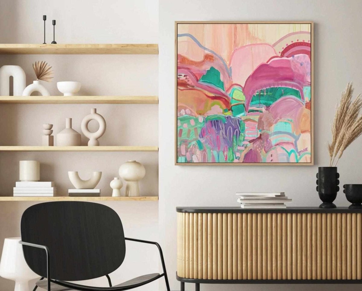
2026 Colour Landscape – The New Neutrals and Beyond
Paint companies set the tone for interior colour trends, and their 2026 announcements point to a rich, nuanced palette:
-
Moody Neutrals – Silhouette & Universal Khaki:
Benjamin Moore’s Silhouette blends charcoal and espresso, while Sherwin‑Williams’ Universal Khaki offers a balanced beige‑taupe. These shades introduce depth and sophistication without overpowering a room. They pair well with natural materials and can anchor art collections featuring softer accents. -
Creamy & Warm Whites – Melodious Ivory:
Dutch Boy’s Melodious Ivory is a warm, yellow‑tinged white. It functions as a forgiving backdrop for colourful or textured art, making it ideal if you want to experiment with bold prints but keep walls serene. -
Smoky & Jewel Greens – Warm Eucalyptus & Hidden Gem:
Valspar’s Warm Eucalyptus (a moody sage) and Behr’s Hidden Gem (a smoky jade) represent a shift toward “new neutrals” that exude calm and sophistication. People associate these hues with peace and comfort, and they pair beautifully with botanical art and nature photography. -
Dramatic Reds & Oxblood – Divine Damson & Warm Mahogany:
Graham & Brown’s Divine Damson and Glidden’s Warm Mahogany introduce intensity and luxury. Use these tones sparingly in art or frames to add richness without overwhelming a space. -
Champagne & Wood Tones – Epernay & Special Walnut:
C2 Paint’s Epernay offers a champagne‑inspired neutral, while Minwax’s Special Walnut celebrates wood finishes. These hues emphasise craft and authenticity, complementing art printed on natural fibres or framed in reclaimed timber. -
Rhythms of Blue:
Dulux’s “Rhythm of Blues” collection includes royal, navy and pale blues. Blues continue to dominate because they soothe and refresh. Pair azure artwork with khaki or ivory walls for balance.
Macro Design Trends Shaping Wall Art in 2026
Warm Minimalism and Natural Comfort
The relentless minimalism of the 2010s is giving way to “warm minimalism,” where pared‑back spaces are layered with earthy colours, soft textiles and natural wood. Art plays a crucial role in this evolution:
-
Earth‑toned abstracts: Choose pieces that blend khaki, terracotta and clay. These integrate seamlessly with the warm neutral palettes predicted for 2026.
-
Subdued botanicals: Soft leaf prints or monochrome florals add organic charm without clashing with a neutral scheme.
Biophilic Beauty and Botanical Revival
The movement to bring nature indoors is not slowing down. Trend analysts cite biophilic design and “natural comfort” as key themes for 2026. This shows up in wall art through:
-
Botanical illustrations and herbariums: Prints of eucalyptus sprigs, olive branches or wildflowers tie into the Warm Eucalyptus and Hidden Gem colour trends.
-
Landscape photography: Coastal vistas, forest scenes and mountain views evoke calm and expand visual space.
-
Organic colour palettes: Mossy greens, olive, sage and dusty blues resonate with the desire for wellness and sustainability.
Freehand Artistry and Craftsmanship
Decorilla’s 2026 interior trends spotlight “freehand artistry,” celebrating hand‑painted brushwork and expressive imperfection. In wall art, this translates into:
-
Painterly strokes and visible textures: Look for prints that showcase brush marks, layered pigments and a sense of movement. Abstract expressionist styles feel personal and one‑of‑a‑kind.
-
Collage and mixed media: Combining paper cut‑outs, fabric or embroidery adds dimension and depth.
-
Artisanal framing: Frames made from reclaimed wood, brass or woven fibres emphasise craftsmanship.
Modern Heritage and Vintage Revival
Good Housekeeping notes that “modern heritage”—a blend of vintage elements and contemporary forms—will be a defining style in 2026. For wall art, this means:
-
Retro palettes: Ochres, burnt sienna, sage and dusty rose feel nostalgic yet current.
-
Classical motifs: Portraits, botanical engravings and architectural prints evoke history.
-
Patina and texture: Art that looks aged or weathered adds character.
Organic Shapes and Fluid Lines
Decorilla also highlights organically flowing wooden silhouettes and freeform artistry. While this trend is more about furniture, it influences art by valuing irregular shapes and fluid lines.
-
Curved compositions: Choose prints where forms meander or loop, echoing the curves of 2026 furniture.
-
Minimalist line art: Monochrome line drawings, especially those inspired by Matisse or Picasso, fit both freehand and heritage trends.
Translating Trends into Your Space – Room‑by‑Room Guidance
Living Room
-
Trend focus: Warm minimalism with a splash of drama.
-
Colour suggestions: Silhouette or Universal Khaki on walls; artwork in terracotta, khaki and oxblood.
-
Art ideas: An oversized neutral abstract canvas paired with a smaller botanical piece. Choose frames made of reclaimed wood or brushed gold.
Dining Room and Kitchen
-
Trend focus: Natural comfort and conviviality.
-
Colour suggestions: Warm Eucalyptus, Hidden Gem, Warm Mahogany.
-
Art ideas: Mediterranean coastal scenes (e.g., sun‑washed villages) and botanical prints with olive branches or citrus fruits. Consider a gallery of three smaller prints along a banquette.
Bedroom
-
Trend focus: Calm and personal sanctuary.
-
Colour suggestions: Melodious Ivory or Epernay walls; art in smoky jade, dusty blue or champagne neutrals.
-
Art ideas: Painterly abstracts with soft greens/blues, freehand line drawings or nature photography that evokes peace (e.g., calm seas or misty forests).
Home Office
-
Trend focus: Biophilic beauty and creative stimulus.
-
Colour suggestions: Hidden Gem or Warm Eucalyptus accents; neutral walls.
-
Art ideas: Botanical herbarium prints, a vintage map or a modern heritage portrait. Choose frames that match your desk (wood or metal) to unify the space.
Entryway & Hallways
-
Trend focus: First impressions and continuity.
-
Colour suggestions: Universal Khaki or Melodious Ivory for walls.
-
Art ideas: A series of organic line drawings or small neutral abstracts. Reflect the palettes of adjacent rooms to create flow.
Featured Olive et Oriel Prints That Capture 2026 Trends
Five On‑Trend Art Prints for 2026 (from Olive et Oriel)
To illustrate these forecasts, here are five specific pieces from Olive et Oriel’s 8,000‑plus designs. Each print aligns with a different 2026 trend and colour palette—helping you visualise the future of wall décor.
1. Emerald Pool Side | Art Print

-
Trend fit: Jewel‑tone greens & warm minimalism.
-
Description: This print depicts an overhead view of classic green‑and‑white striped pool umbrellas against lush foliage. The deep emerald stripes echo the smoky jade and Warm Eucalyptus hues forecasted for 2026.
-
How to style: Hang it above a sofa with khaki or taupe cushions; pair with rattan furniture to emphasise its resort vibe.
2. Cosmopolitan Cocktails | Art Print

-
Trend fit: Warm pops & modern heritage.
-
Description: This playful artwork features a pink cosmopolitan cocktail garnished with a lemon wedge. The blush and coral tones hint at the oxblood and Warm Mahogany trend without overwhelming.
-
How to style: Ideal for kitchens, bars or dining nooks. Pair with warm wood furniture, brass accents and vintage glassware for a retro‑chic look.
3. Seagrass Dunes | Art Print

-
Trend fit: Biophilic beauty & neutral abstracts.
-
Description: Soft beige dunes and wispy seagrass sway against a pale horizon. This artwork captures the serenity of coastal landscapes, aligning with the biophilic movement and the new wave of warm neutrals.
-
How to style: Place it in entryways or living rooms with sand‑coloured décor, jute rugs and linen upholstery to create a calming coastal atmosphere.
4. Resort Dreamscape | Art Print

-
Trend fit: Mediterranean inspiration & pastel neutrals.
-
Description: This piece portrays a pastel‑toned hotel framed by swaying palms, evoking holiday dreams. The gentle blend of champagne, blush and pale blue aligns with Epernay and Melodious Ivory palettes.
-
How to style: Perfect for bedrooms or lounges; pair with rattan or cane furniture and airy fabrics to emphasise its resort aesthetic.

5. Summer Cola – Colour | Art Print
-
Trend fit: Photographic dopamine brights.
-
Description: This vibrant print shows a woman wearing a Gucci hat and sipping a drink among lush green leaves. The exclusive photographic style and vivid colours (emerald, lime, peach) embrace the unique artistry and dopamine décor trend- a movement toward expressive, mood‑lifting hues.
-
How to style: Use in a home office or creative space to inspire energy. Balance the bright print with neutral walls and a few coordinating accessories (e.g., green plants or peach ceramics).
How to Incorporate 2026 Trends in Your Home
-
Build your palette: Choose one or two forecasted colours (e.g., smoky jade and warm mahogany) and repeat them subtly throughout your décor—through art, cushions and tableware.
-
Layer textures: Pair crisp photographic prints with painterly abstracts or mixed‑media pieces. Texture adds depth and supports the freehand craftsmanship trend.
-
Mix styles intentionally: Don’t be afraid to display a neutral abstract next to a vibrant figurative piece. Contrast can tell a richer story.
-
Think sustainably: Opt for prints on FSC‑certified paper and frames made from reclaimed wood to align with the sustainability ethos driving design.
-
Rotate seasonally: Keep your home feeling fresh by swapping prints as new trends and seasons arrive—cool blues and coastal pieces in summer, warm neutrals and botanicals in winter.
Conclusion – Curate a Future‑Ready Gallery
The 2026 wall‑art landscape is rich and varied: think moody neutrals, jewel‑toned greens, warm terracottas and expressive brights. Styles range from neutral abstracts and biophilic botanicals to vintage‑inspired scenes and freehand, textural pieces. By understanding these trends and selecting artwork that resonates with them, you can curate a home that feels both timeless and forward‑looking. Olive et Oriel’s extensive catalogue—over 8,000 designs strong—offers countless options to align your décor with the coming year’s aesthetic. Explore prints like Emerald Pool Side, Cosmopolitan Cocktails, Seagrass Dunes, Resort Dreamscape and Summer Cola to infuse your home with 2026’s colours and spirit.

